Project 2, Exercise 4: Photography and land art

The question posed in this exercise is whether photographs of a work of 'land art' are the documentation of the art or the art itself.

After working through the readings associated with this portion of the course (such as John A. Walker's piece on "Context as a Determinant of Photographic Meaning"), I am not sure that this is an 'either-or' question. Given the role that context plays in understanding the layers of meaning for a particular piece, it seems to me that the proper response is 'both-and.'

The original work of land art or installation is certainly a work of art, but so is the subsequent recording or documenting of the piece or installation. The original piece had its context—place, time, etc.—but any resulting photographs of the piece contain the results of decisions made about format, light, focal length, angle of view and framing. Artistic decisions have been made about what to include, what to leave in and how to present it. And the results of these decisions are then seen in a new frame, and a range of new contexts (particularly if the photographs appear in different settings and times), particularly when photographic processes are used to introduce the perspective of time to the way the work is viewed.

A good example of this is Keith Arnatt’s Self-burial (Television Interference Project). In this case, the performance doesn't really make sense unless it is seen as a series of photographs. A spectator watching the development of Arnatt's self-burial would have seen the artist climbing in and out of a hole that was being progressively deepened. It would have taken a long time and might well have been incomprehensible. Viewed as a planned sequence, however, the work takes on greater meaning as a coherent whole—as a photographic work more than as a live performance.

If anything, then, the photographs of a work of a land art are a new thing: based on the land art and sharing a kind of heritage or lineage with it, but a work with its own integrity and layers of meaning.

Research point: Documenting a journey

Paul Graham, A1: The Great North Road

http://www.paulgrahamarchive.com/a1.html

From the publisher:

Photographer Paul Graham spent two years completing this documentary on the life and landscape of the Great North Road. Throughout 1981 and 1982 he made numerous trips along the A1, crossing and recrossing the length of the nation to record every aspect of life at the verge of this great road. The photographs reproduced in this book build not only into a significant documentary of the A1, but also provide a thread along which we can travel the Great North Road, deep into the nation’s heart, and weave a picture of England in the 1980s.

Stephen Shore, American Surfaces

http://stephenshore.net/photographs/seven/index.php?page=1&menu=photographs

From the publisher:

In 1972, Stephen Shore left New York City and set out with a friend to Amarillo, Texas. He didn't drive, so his first view of America was framed by the passenger's window frame. He was taken aback by the fact that his experience of life as a New Yorker had very little in common with the character and aspirations of Middle America. Later that year he set out again, this time on his own, with just a driver's licence and a Rollei 35 - a point-and-shoot camera - to explore the country through the eyes of an everyday tourist.

The project was entitled American Surfaces, in reference to the superficial nature of his brief encounters with places and people, and the underlying character of the images that he hoped to capture. Shore photographed relentlessly and returned to New York triumphant, with hundreds of rolls of film spilling from his bags. In order to remain faithful to the conceptual foundations of the project, he followed the lead of most tourists of the time and sent his film to be developed and printed in Kodak's labs in New Jersey.

The result was hundreds and hundreds of exquisitely composed colour pictures, that became the benchmark for documenting our fast-living, consumer-orientated world. The corpus of his work - following on from Walker Evans' and Robert Frank's epic experiences of crossing America - influenced photographers such as Martin Parr and Bernd & Hilla Becher, who in turn introduced a new generation of students to Shore's work.

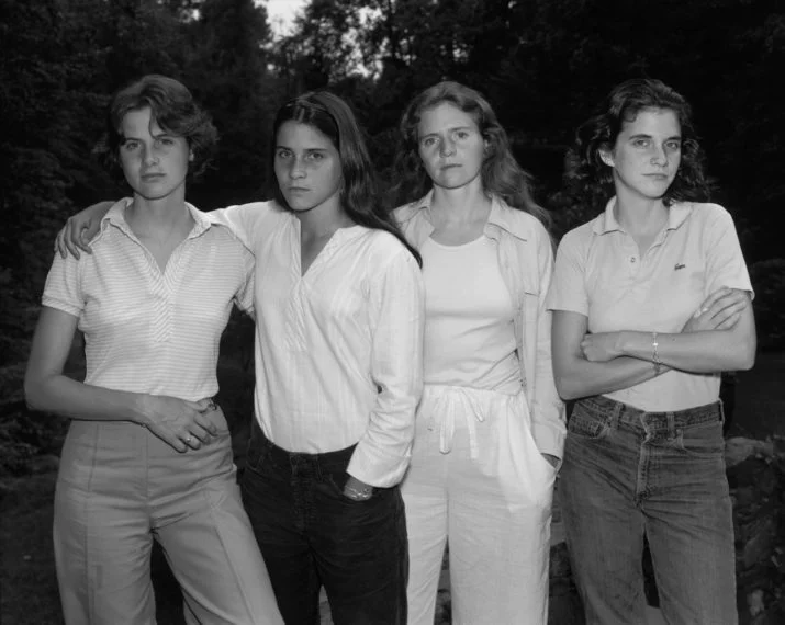
Alec Soth, Sleeping by the Mississippi

http://alecsoth.com/photography/?page_id=14

From the publisher:

Evolving from a series of road trips along the Mississippi River, Alec Soth's "Sleeping by the Mississippi" captures America's iconic yet oft-neglected "third coast". Soth's richly descriptive, large-format color photographs present an eclectic mix of individuals, landscapes, and interiors. Sensuous in detail and raw in subject, "Sleeping by the Mississippi" elicits a consistent mood of loneliness, longing, and reverie. "In the book's 46 ruthlessly edited pictures," writes Anne Wilkes Tucker, "Soth alludes to illness, procreation, race, crime, learning, art, music, death, religion, redemption, politics, and cheap sex." Like Robert Frank's classic "The Americans", "Sleeping by the Mississippi" merges a documentary style with poetic sensibility. The Mississippi is less the subject of the book than its organizing structure. Not bound by a rigid concept or ideology, the series is created out of a quintessentially American spirit of wanderlust.

Robert Frank, The Americans

https://steidl.de/Artists/Robert-Frank-1013194243.html

From the publisher:

First published in France in 1958, then in the United States in 1959, Robert Frank’s The Americans changed the course of twentieth-century photography. In eighty-three photographs, Frank looked beneath the surface of American life to reveal a people plagued by racism, ill-served by their politicians, and rendered numb by a rapidly expanding culture of consumption. Yet he also found novel areas of beauty in simple, overlooked corners of American life. And it was not just Frank’s subject matter—cars, jukeboxes, and even the road itself—that redefined the icons of America; it was also his seemingly intuitive, immediate, off-kilter style, as well as his method of brilliantly linking his photographs together thematically, conceptually, formally, and linguistically, that made The Americans so innovative. More of an ode or a poem than a literal document, the book is as powerful and provocative today as it was fifty-six years ago.

Kevin McElvaney, #Refugeecameras

http://kevin-mcelvaney.com/refugeecameras/

Photographer Kevin McElvaney gave refugees cameras in Izmir, Lesbos, Athens and Idomeni. Of the 15 cameras he distributed, seven were returned and McElvaney displayed the resulting images on his website. The goal for the project was to ensure that refugees were able to describe their trip from their own perspective, rather than from the viewpoint of an outsider who did not share the experience. I found this a very compelling series and wondered how different our documentary and news narratives would look if they were told from within rather than from without.

24 Photography

http://www.24photography.org/about/

This project is organized around a rule of “24 hours. 24 photographers. 24 images. 24 years.” Starting in 2004, a collective of 24 then-student photographers documented the first 24 hours of each New Year in multiple locations—in other words, a documented journey through both time and space. Although many of the photographs are taken in the UK a substantial number are not, and the organisation of the project demonstrates that while we share a common calendar there are many other things that we do not share. It is a fascinating visual trip to work through the years and see the points of convergence and divergence.

Project 2, Exercise 3: The image as document

Why do you think that photographs are such a significant part of our lives? Write down how you feel about photos – or videos – from your family’s past.

  • Photographs are tangible artifacts that promise to preserve memories intact and changeless across time. Faces and places are of particular importance to us, so anything that can channel their likenesses to us is meaningful. We can preserve other kinds of keepsakes like letters or personal possessions, but they don't seem to have quite the same power. Perhaps this is because relate to people is more important than relating to inanimate objects, and to relate to a person most often means reading his or her face where we look for recognition, what is familiar and loved, and characteristic expressions and signs of mood.
  • I look at pictures and videos of my family's past to remember how people and things were. Sometimes they help me to recall a particular, mood or feeling, but it is hard to view them without adding on a layer of everything that has happened since the time the picture was taken. I also find that I feel differently about pictures taken of family members that I know than those that I have never known. Pictures of family members from generations that went before me are interesting in a curious (are those eyes like mine?) or historical (so that's where and how our family lived) way, but they do not have the same personal appeal—they both are and are not part of my story.

Will this archiving be affected by the digital revolution?

  • Digital photography has many advantages over film-based photography, but one of its downsides is the fact that I print so few images now. I realize that none of my children has probably had the experience of poring over a family album because there isn't one. There are now thousands more images in the house but they are not as easily available and we are not likely to sit looking at them together. (Although we did happen to do this recently and it occurred to me how much I missed looking at family pictures together, even those taken just a few years ago.)
  • Looking at screen-based imagery is not the same as looking at a photographic print: we are used to digital images being transitory and are more likely to browse rather than contemplate them. If we need to research or consume images, digital is much faster. If we want to take time over a picture there is no substitute for a print you can hold in your hand. I wouldn't call one approach better than the other—it is more a question of being appropriate to the task.

Project 2, Exercise 2

Does this make photography a medium uniquely suited to portraying time and the passage of time?

Yes, I think it does. Whether we look at images that allow for a longer passage of time than the eye can record (Trillo and Lartigue in the last exercise) or a shorter passage (Edgerton and Muybridge), photography has been uniquely able to extend the boundaries of the way we perceive, record and portray time.

Can other creative art forms deal with the concept of time to the same extent?

Other forms of art are able to portray or capture time in different ways, but few of them are able to do it with the flexibility of photography. Furthermore, I think that artists working in different forms and media recognize this themselves—and it is why so many conventions for portraying time in the other arts have been influenced by both still photography and moving images.

Project 2, Exercise 1: It's about time

Derek Trillo, Passing Place, Manchester, 2006

  • Conveys movement by using a slow shutter speed to capture two figures walking toward one another on a staircase. The resulting blur is effective, particularly because it works well with the silhouetted figures and the background colours—I think I can see some multicoloured fringing that gives the impression of speed.

Harold Edgerton, Bullet and Apple, c.1964

  • A high-speed flash has been used to freeze a bullet as it exits an apple stuck on a shell casing. This is also effective not because it allows movement to blur, but because it freezes an event that the eye cannot possibly see (the previous image also used a camera to portray an event in a way that the eye cannot naturally perceive). The entry and exit 'wounds' to the apple have only just been made and show the bullet's explosive speed and power.

Harold Edgerton, Multiflash tennis serve, 1949

  • Edgerton used a stroboscopic effect to slice up a moment that would have been visible to the eye (a tennis serve). Again, the technical properties of photography are effective in allowing us to 'see' an event in a way that would otherwise be impossible: this time a single, fluid movement portrayed as a series of discrete steps.

Jacques-Henri Lartigue, Ma cousine Bichonnade, 1905

  • Lartigue's picture of his cousin is also effective in showing movement through a relatively short exposure, although it gives the impression that the subject is flying. In that sense, though, it is no more unnatural than any of the other images—each one of them portrays movement in a way that is foreign to us, but that tells us something interesting about movement and the passage of time.


Research Point: Dealing with the flood

For me, photography has been a hobby and not something I have used in the context of my work life. I have had pictures published in magazines and sold a few prints, but I use social media daily and regularly post images on several different platforms: Flickr (I've had an account for 12 years), Instagram, Twitter, Facebook and this website. I post pictures to share with friends and family (some publicly, some privately), to document my travels, to illustrate some of the things I write, to learn with other photographers, to keep a record of my own progress and, frankly, because I feel the need to share the things I see.

Some of my pictures are 'social' in nature (friends, family, events), but most have been for my own interest. In that sense, I suppose many of them could be viewed as leaning toward the artistic side, although I have never used that term myself. (A friend did once tell me, however, that she didn't 'get' my pictures but understood that they were 'meant to be artsy-fartsy.' I wasn't sure what she meant at first but gradually realized that, for her, a good photograph usually has family members in it.)

Social media have contributed to the democratization of photography, along with other technologies, particularly the availability of digital cameras and the vastly-improved quality of sensors in mobile phones. I have heard photographers and critics complain about the sheer volume of trivial and poor pictures and am sometimes sympathetic to their concerns (I get tired of seeing pictures of cats, selfies, garish sunsets and cups of coffee), but I don't think that they devalue photography. The cream rises to the top and a remarkable image still stands apart from the pack without the help of photo snobbery.

I suppose this means that I am contributing to the flood and it occasionally occurs to me that the world doesn't really need another mediocre picture. Nevertheless, I get pleasure out of taking, editing and sharing pictures and enjoy seeing the work of others, too. None of us will improve our photographic and artistic skills without practice, so I will continue to make photographs—they may not be the best, but I can see my progress.

Project 1, Exercise 2

  • When I review the pictures I have taken over the last year or so, I realize that many—but not all—of them were taken on trips.
  • Those that don't fall into that category are often pictures of family taken at events like birthdays and other gatherings. The family pictures rarely betray any interest in being 'artistic'. Instead they are meant to document the event and the people present for the sake of memories or creating a record. Sometimes they are also meant for sharing with people who were there or those who couldn't attend.
  • The travel pictures too, are sometimes meant to document a time, place or mood ('this is where we stayed,' 'this is the view we saw that day,' 'this is the place we visited').
  • In quite a few of the travel pictures, though, I can see that I have tried to do something different—I've looked for an interesting angle, a form/shape/abstract, an unexpected juxtaposition, or some beautiful light.
  • I can also see that the quality of my picture-taking changes depending on whether I am alone or with other people. When I am with others I am usually very aware that photography is my interest, not theirs, and that I can't take all the time that I would like to work a scene. When I travel alone I have much more latitude in the time that I can spend on creating an image and can stay with it, trying different things until I am satisfied.
  • My 'alone' pictures tend to be more self-consciously 'artistic' because I can devote the time to them that I would like. I can develop an idea or an approach both practically or technically, as well as thinking my way through it. I usually find these images much more satisfying than the other kinds mentioned above.

Research point: Context and meaning

Notes on John A. Walker, "Context as a Determinant of Photographic Meaning"

  • Walker distinguishes between 'immanent structure' (immediate, local context) and the broader context outside the frame of an artwork. The frame itself is a form of self-containment or bracketing of meaning and can lead us to ignore the wider context within which a work appears and is understood.
  • A given work can have multiple contexts. These have different impacts on the connotations of a work but are less likely to affect denotation.
  • When context changes there is potential for a 'third-effect' meaning created by relationships with items in the surrounding context.
  • Change of context became particularly important as artworks were less often attached to a specific place. (John Berger makes the same point in "Ways of Seeing," noting that it used to be common for works to be created for, and installed in, specific settings. Often, these were places of worship.) Now, media context is more important than 'architectural setting.'
  • Walker uses the terms 'circulation' and 'currency' to describe the ebbs and flows in the life of a work as it changes contexts.
  • The different locations in which Jo Spence's project—Beyond the Family Album, Private Images, Public Conventionshas been seen demonstrate the impact that context has for setting an interpretive frame.
  • Walker states that if we are going to talk about the "efficacy" of the exhibit we would need to know about the viewers. But which viewers? Spence's 'ideal viewer' or someone else? I don't know how useful this would be as a line of inquiry. If we can't always be sure about the intent of the artist (as though there were just one and the artist herself could articulate it perfectly), and context has an important role in the creation of meaning, why do we think that knowing about the 'viewer' (as though there were just one) is helpful?
  • Just as context can shape interpretation of a work, so the work can shape interpretation of its context. This is a good point and Walker's example is worth copying here:

If display context can influence the meaning of a photograph, the photograph
can influence the meaning of the context. This reasoning lay behind John X.
Bcrger's comment at a Hayward Gallery evening discussion that the socialist and
feminist photography 'had radicalised the gallery space'. But the influence is twoway:
it could also be argued that the gallery—a High Art cultural institution
serving the interests of the bourgeoisie—had de-radicalised radical photography!

  • Walker then describes the 'mental context' of the viewer. Much of this seems like basic communications or rhetorical theory: how is the viewer/listener disposed to the work/message? He then spends a few paragraphs pointing out that we are not all just individuals but share common opinions, values and viewpoints. In other words, there must be sufficient commonality between communicator and audience to allow communication to happen. 
  • This seems like a fairly obvious point to me, but it may still need to be made explicit. People regularly claim that advertising has no effect, but it must: commercial enterprises and governments wouldn't pay what they do if advertising had no impact. Perhaps this is a more insidious side of imagery if we are not even aware of its effects.
  • Walker closes his article with a brief discussion of the frustration that some artists have of losing control of the meaning of their work, given that they cannot always choose the context within which it will be viewed. (Sounds to me to be a bit like having children. We bring them into the world and do our best to raise them well, but we don't own them and we cannot control them. You must accept it.)

Project 1, Exercise 1

What, in your view, makes photographs unique as an art form?

I think the primary thing that makes photography unique as an art form is that the camera is a powerful tool for abstracting time. At its most basic, the camera is a box with light-sensitive material that can exposed to light for a wide range of times. Only because of photography are we able to see a single scene in a way that our eye could never capture in a single glance—either for an abnormally long period (minutes, hours or days) or for an abnormally short period (thousands of a second). The camera changes our ability to perceive, capture and represent time in a way that other artistic tools cannot.

Because we can now perceive change differently, our understanding of our world has changed and, with it, our perception of motion and change in the physical world. While working of some of the assignments in Part 3: Visual Communications, it occurred to me that some of the visual conventions we now take for granted very likely owe their existence to photography, whether still or moving images. Where did "speed lines" or distortion of a moving object come from in illustration without having seen motion captured on film? And were cartoon cells influenced by the individual frames of a motion picture?

To me, this suggests that every photographic image—by its very nature—is an abstraction of our perception and that it has fundamentally changed the way we see our world, permanently.

It occurs to me that abstraction is also present in the moment of creating a photograph. Unlike most (all?) other arts, the photographer is a step or two removed from his or her creation—we cannot normally see the film as it is being exposed and we can only see a mediated representation of the a digital image as it is being captured. There is little or no immediate possibility of a direct, manual or sensory creation with the thing being produced.

Think of the production of artworks in relation to time: photographs are always in the present – they are captured not synthesised. Think also about what we mean by ‘photographic image’. Does it have to be something permanently fixed? Does a photograph have to exist in hard copy? Is there a difference between a printed photograph and a digital image that sits virtually on someone’s device, for instance?

I'm not sure I completely understand the distinction being made: photographs "are captured not synthesised." Since the early days of photography it has been possible to synthesise photographs by combining or otherwise altering images whether in-camera or in post-production. It is so common now that it is not always clear if the image we are looking at is a 'photograph' that was 'always in the present,' a purely digital creation or some combination of techniques.

I'm also not sure about a photograph having to be permanently fixed or to exist in hard copy. My work on re-appropriating images for Assignment Three showed me that photographs can persist powerfully in people's memories and imaginations, whether they have access to the 'original' (assuming there is just one) or not. Once frozen in a photograph—or perhaps in a striking sequence from a movie or video—I think that the memories they leave can become 'fixed' in the imagination. Not only that, but it seems to me that those images in the imagination have the power to shape and reinterpret memory itself. More than once I have seen family members 'remember' an event because they had seen a photograph of it, only to be informed that they had not been present or perhaps even alive when the photograph is taken.

I don't think the great distinction in photography lies between prints and digital images. There is indeed a difference in experiencing a print versus viewing a digital image on-screen or as a projection, but I think that there is something qualitatively different between an image that started out as a piece of film—there is or was an original, physical artefact that had been exposed to light—rather than the output from a digital sensor which is a mathematical representation of captured and interpreted data.

Beyond these considerations, though, I think that the most important distinction to be made in photography is between images that are still and images that move. They are captured differently, show different things and are perceived and remembered differently by their viewers.

Project 1, Research Point

William Henry Fox Talbot, The Pencil of Nature, 1844-1846

Fox Talbot's cameras, collection of the National Museum of Photography, Film and Television 

Fox Talbot's cameras, collection of the National Museum of Photography, Film and Television 

Fox Talbot (1800-1877) was originally inspired in his experiments by his difficulties in assisted-drawing with a Camera Lucida. Not being able to master the technique involved, he began to consider how he might permanently fix the images on paper produced by a Camera Obscura. Fox Talbot sees both techniques as aids to drawing but hints at how fixed images derived from photographic techniques might have potential beyond 'naturally' recording images. Although he is interested as a scientist in achieving consistent results, he allows room for esthetic concerns:

These tints, however, might undoubtedly be brought nearer to uniformity, if any great advantage appeared likely to result: but, several persons of taste having been consulted on the point, viz. which tint on the whole deserved a preference, it was found that their opinions offered nothing approaching to unanimity, and therefore, as the process presents us spontaneously with a variety of shades of colour, it was thought best to admit whichever appeared pleasing to the eye, without aiming at an uniformity which is hardly attainable.
— William Henry Fox Talbot, The Pencil of Nature, Section ii.

It seems clear to me that photography is both mechanical and creative and I don't see any inherent contradiction in that. Any art—and perhaps any human product—involves the use of tools, materials and processes, some of which may be mechanical and some not. Photography is far from being the objective 'pencil of nature' and some of Fox Talbot's early work already shows an awareness of the role the human operator plays in creating the camera, preparing the paper, mixing the chemicals, timing the exposure and positioning the camera. The camera and its related processes may be more complex than those employed in some arts, but the roles of imagination and human action are no less important.

Prep work for Assignment 3: Re-appropriating images

  • Look at the original image and do a semiotic analysis. Describe its contents (denotation) and possible meanings (connotation) as you did in Part Three. Extend your enquiry by researching the original context of the image. Why was it produced, where and when was it originally located, and how might audiences have interpreted it?
Publicity still for The Seven Year Itch, by Sam Shaw.

Publicity still for The Seven Year Itch, by Sam Shaw.

The image is a picture of a woman who appears to be trying to push her dress down as it is being blown up. The background is very dark and it would appear that it is nighttime. Nevertheless, she is very well lit and stands out from the background, both because she is dressed in white and because of artificial lighting that is directed upon her. Although she is holding her dress down, she is smiling, has her eyes closed and does not appear to be concerned. Although it is dark she is dressed for warm weather in a light halter dress and high-heeled sandals with no stockings. She is also carefully made up and wearing earrings that complement her clothes. It looks as though she may be dressed for an evening out.

In terms of connotation, this is a young, attractive woman who appears to be confident and enjoying herself on a warm evening. She is relaxed and well-dressed and is standing over a grate or grille. Her clothing suggests that she may be comfortably wealthy, but this could be misleading. She is dressed all in white—shoes, dress, underwear and earrings; even her hair is blonde—a colour that in the West has long connoted purity or innocence. Her legs are being exposed and she is both aware of it and not overly perturbed. And she is being watched: in the mid-left portion of the frame there is the reflection of a camera, so the woman is not only being lit and photographed from the front but her image is being recorded from behind. This is a performance with an audience that wishes to capture her and she is participating.

It doesn’t take much research at all to know that this is a picture of Marilyn Monroe, still one of the most recognizable people in the world. And anyone who has a passing interest in movies will know that this image is taken from an (in)famous scene in The Seven-Year Itch. The picture may have been taken while the scene was being filmed or may have been a recreation of the moment of filming. It exists in multiple versions that were shot from different angles: the director, Billy Wilder, attempted to film the scene on a New York sidewalk but it had to be shot on a soundstage because the filming attracted too much attention. The still images shot by Sam Shaw reveal more of Ms. Monroe than those that appear in the film.

Although the word “iconic” is overused to describe many images and other phenomena, this image has earned that title since the movie was released. Images of this scene were used to promote the movie when it was released in June 1955 and the dress itself sold for some US$5.6M when it came up for auction in 2011.

At this point in the movie Ms. Monroe’s character is out for a walk on a hot summer evening in New York City accompanied by her neighbour, a man whose wife and children have already escape the heat of the city for a summer at the ocean. Along the way she stops to enjoy a blast of (relatively) cool air from a grate in the street as a subway train passes below. The updraft lifts her skirt up and exposes her legs, but there is an innocence in the moment because Monroe’s character appears blissfully unaware of the effect that she has on those around her. She seems both knowing and unknowing. As with Venus—a comparison made by a number of commentators—Monroe is naked but not nude in the way expressed by John Berger: “To be naked is to be oneself; to be nude is to be seen naked by others and yet not recognised for oneself. A nude has to be seen as an object in order to be a nude. Nakedness reveals itself, Nudity is placed on display.”

I referred to the image as “infamous” because of the reaction of both Joe DiMaggio, Marilyn Monroe’s husband at the time, and of some American organizations and newspapers. The film was approved for wide release, however, and a 52-foot cutout of the famous scene decorated the facade of the cinema in Times Square where the movie opened. Many would have found the image titillating and some would have disapproved—the whole movie was banned in Ireland as indecent.

  • Also reflect on where the original is currently located. Where did you access it? Did you see the original or have you seen a reproduction in print, online or elsewhere? What does this tell you about our modern relationship to the example you’ve chosen? Does it highlight any change in attitudes or approaches to visual communication more broadly?

It is difficult to say where the original is located because, in a sense, there is no “original.” There are multiple versions of the image that have been taken from the film and from the many still image recreations afterward. I have seen the image so many times that I cannot remember which I saw first, the movie or the still (most likely).

This suggests several things to me:

  1. That iconic images such as this one are, by definition, ubiquitous and it becomes impossible for us to know when or where we first saw them or how we reacted to them. I am certain that if anyone saw any one of these images they would insist that they knew “it” and had seen it before, whether they had or not. In that sense, it is the presence of Marilyn Monroe, her pose and the dress that are famous, rather than any specific instance of the image.

  2. That there are multiple layers of meaning and context that come to be laid on famous images. It becomes almost impossible to view the image as a thing in itself independent of the stories that we associate with it. Do we even see the image anymore?

  3. That memory is unreliable and we are very suggestible. The things we think we know or remember can be false and influenced by images and the layers of meaning we have subsequently built upon them. (I have seen family members “remember” events in a photograph, only to be told that they were not alive when the image was taken. It is the photograph that they remember and they have written a false narrative around it that includes themselves.)

  • Now reflect on your chosen re-appropriated image. Why was it produced, how has it been shown to audiences and what do you think their interpretations are?
The 500-Year Itch, 1992, by Shelley Niro.

The 500-Year Itch, 1992, by Shelley Niro.

The 500-Year Itch is a photograph created by artist Shelley Niro. Both the title of the work and its visual elements indicate that it was designed to reference the famous pictures of Marilyn Monroe from The Seven-Year Itch. It has been shown to audiences as a photographic print in galleries and was in a private collection for some years before being donated to the National Gallery of Canada. I saw a print of it recently as part of a Gallery exhibit entitled Photography in Canada: 1960–2000 and then again in the printed catalogue for the exhibit. I imagine that most viewers will encounter the image the way that I did: as part of the National Gallery’s retrospective on Canadian photography in the second half of the twentieth century. In this context, think that people will recognize the reference to Marilyn Monroe and find it a humorous take on images of female beauty. They may also think of the image as somewhat outdated, given that The Seven-Year Itch was filmed in the mid-1950s and that the current show is a retrospective that shows the work of Canadian artists, many of whom are now old or dead. The ongoing fascination with anything to do with Marilyn Monroe may help to give the image continued currency for viewers, however.

  • Make a comparison between the two images. You may want to place the two versions side by side and annotate the visual similarities, differences and other comparisons you make. How does the new work make reference to the old? Does it maintain, subvert or alter the original message in any way and, if so, how does this take place visually? Think about the visual elements of the two items. How is image, composition, typography, visual narrative or any other element used to construct Meaning?

Visually, the two images are similar only in very broad strokes: the curly blonde, the dress, a smiling woman and a source of air from below. The photograph by Shelley Niro references the Monroe images but her pose does not copy any of them exactly. The garment in Niro’s image is a white, sleeveless halter dress but it is not pleated and the material looks heavier. Niro’s shoes are not white sandals, but dark with a different heel, Niro is wearing glasses, a beaded necklace and a bracelet. If she is wearing earrings, they cannot be seen. Niro is also wearing a wig. Instead of Monroe’s subway grate, she stands astride an electric fan with a trailing cord. She also holds a remote control in her hand that we assume is used to trigger the camera taking the shot. Finally, the shots of Monroe have been produced as contrasty black and white images that nevertheless have a wide tonal range in the dress and skin. Niro’s photograph is either in colour or is a hand-tinted black and white. Her makeup has been accentuated on the print and items coloured yellow (wig, necklace and bracelet) especially so.

Niro’s image subverts Monroe’s in a number of ways. Although both photographs have been carefully created (one on a soundstage, the other most likely in a studio), Niro goes out of her way to highlight the artificiality of the moment: her hair is obviously a wig and its colour has been heightened like a poster or cartoon; she stands over an electric fan turned clumsily on its back; and she holds a remote control while looking directly at the viewer. Monroe participates with viewers (likely men) who capture her image; Niro fabricates her own patently false image and is in control of all its elements, from conception to the tripping of the shutter. In this sense, Monroe is an object while Nero is a subject.

  • Try and make connections between how the original and the re-appropriated image relate to one another both in terms of their visual construction and their context. This might lead to thoughts about wider cultural and social change, as well as differences in the use of visual communication and media at different times.

If we paid attention only to the visual content of the two images, Shelley Niro’s image could be read as a feminist critique of gender roles and sexism in image-making. It could also be seen as a comment on the mores of an earlier time and how some attitudes have changed while others have not.

The title of Niro’s work, however—The 500-Year Itch—points to another layer of intent and interpretation. The photograph was produced in 1992, so the ‘500 years’ in question would be 1492: the year of Columbus’ arrival in the Americas. For Indigenous North Americans, such as Shelley Niro, that event is a kind of shorthand for the arrival of Europeans and their impact upon the cultures that lived here. The combined effect of the work and its title, then, is a response not only to stereotypical views of women in general, but more specifically to historical and more contemporary views on Indigenous women in North America.

I have also learned that the The 500-Year Itch has been displayed both as a standalone image and also as part of a triptych. The triptych makes the point much more clearly about stereotypical portrayals involving Indigenous women than does the standalone “Marilyn” shot, showing a picture of Niro’s mother in a fashionable dress and heels from the 1940s, bracketed by a picture of Niro as Marilyn and another of Niro barefoot in a shirt and jeans.

The 500-Year Itch, 1992, triptych by Shelley Niro.

The 500-Year Itch, 1992, triptych by Shelley Niro.

Gallery visit: Musée des arts décoratifs

During my February trip to Paris I visited the Musée des arts décoratifs to take in an exhibition entitled L’esprit du Bauhaus. Having had the chance to visit the site of the Bauhaus in Dessau, Germany a number of years ago, I wanted to learn more about this fascinating school and the impact of its brief history (1919–1933).

I was most struck by the scope of the vision of founder Walter Gropius and his ability to draw others to participate in it, either as students or as teachers. Comprising a number of “schools” of artistic and design pursuits—cabinetmaking, textiles, metalwork, typography and photography, for example—Gropius used his own disciple of architecture as a unifying theme to draw the various threads of the programs together. There may not have been a single aesthetic, but there was a shared commitment to reunite design and manufacturing which had grown apart rapidly as industrialization took greater and greater hold on the Western world. This commitment could be seen in the way that students began their studies in foundational courses examining materials and colour theory and in the Bauhaus motto, "Art into Industry." The school did not disdain manufacturing; it aimed to give new life to mass production for the modern world.

The second half of the exhibit comprised more recent works by artists and designers who had been invited to create original works inspired by the ethos of the Bauhaus. I found this portion of the visit somewhat disappointing because it seemed to me that most participants had honoured the 'art' portion of the brief but had neglected the 'into industry' aspect: they had missed L'esprit du Bauhaus. Many of the pieces were visually interesting, but it was hard to imagine them being useful objects in the home or workplace.

Project 4, Exercise 4: Cutting Edge

The third dimension

Many, if not all, of the examples of what is "cutting edge" in visual communications are directly linked to the digital revolution. In one sense, this has been somewhat limiting because it implied that the "edge" was largely limited to those forms of visual communication that could be digitized for two-dimensional printing and/or viewing on a monitor. With the advent of 3D printing, however, more digitized visual communications will have the added benefit of depth as well as shape.

More and more artists are now working in the area of 3D printing of their art, making it possible to transmit exact copies of their work anywhere in the world and to scale the work to a client's desired dimensions. Examples of 3D sculpture and wearables (with the potential to create scripted or spontaneous visual 'communications') can be seen on many sites across the Web. Here are just a few examples:

Intelligent typefaces

One of the more interesting items I found during my search was the self-adjusting typeface called Futuracha. Inspired by art deco design, its intelligent properties can be seen in a video for a fund-raising campaign. Each letter in the typeface automatically adjusts to the preceding and following letters to create beautiful ligatures and typographic designs.

A sample of text in the Futuracha typeface showing self-adjusting ligatures and letter combinations.

A sample of text in the Futuracha typeface showing self-adjusting ligatures and letter combinations.

Could it be that typefaces will self-adjust not only to graphical form within words, but to the content of the words themselves? In other words, intelligent text would not only enhance the appearance of words visually but perhaps help to communicating the meaning of a passage?

Visual representation of data

Now that virtually every phenomenon can be recorded and digitized directly or indirectly, we are swimming in rapidly-expanding seas of data. Many of these datasets are so large that is impossible to find meaning within them quickly or effectively. And the democratization of data—in the sense that data are created by and about  a much wider section of the population and affect our lives—means that more of us need help to understand what all this information means. New techniques of visual representation are being developed to make sense of data and to tease out the "stories" they can tell.

"Data visualization" is becoming a specialized field of trained individuals who can interpret the work of quantitative analysts and make it accessible to a broader audience in a way that is both accurate and aesthetically appealing. "Infographics" tell a static and relatively simple data story in graphic form, while more detailed visualizations are often dynamic and designed to allow the end user to monitor evolving data and make decisions.

An infographic describing social web involvement. www.globalwebindex.net

An infographic describing social web involvement. www.globalwebindex.net

A dynamic visualization providing sales information. www.lintao-dashboards.com

A dynamic visualization providing sales information. www.lintao-dashboards.com

The Histography website is a particularly powerful example of visualization of a huge dataset, showing the span of human history as a timeline drawn from every entry on Wikipedia

The next step beyond data visualization allows viewers not only to view data representations passively, but to actively manipulate data in graphical form. A visual interface makes it possible for non-specialists to conduct complex mathematical and statistical computations while exploring large datasets and creating models with them as images.

Data exploration and modelling example. SAS Visual Analytics.

Data exploration and modelling example. SAS Visual Analytics.

Virtual reality

Virtual reality (VR)—an immersive, computer-generated 3D environment—is not new in itself, having been around since the middle of the 20th century. What is cutting-edge, however, is how the necessary equipment to create and experience VR is now within the reach of people outside of laboratories and production studios. It is possible to buy purpose-built VR headsets for hundreds of dollars, but it is also possible to adapt an iPhone or similar device to experience VR. Most VR content has been designed for gaming, but there is nothing to prevent developers from opening up a broader world of travel and art at relatively low cost and easy distribution.

The Zeiss VR One, a virtual reality headset with a slide-out tray for the iPhone 6 (Photo: Will Shanklin/Gizmag.com).

The Zeiss VR One, a virtual reality headset with a slide-out tray for the iPhone 6 (Photo: Will Shanklin/Gizmag.com).

Reflection

Looking at this collection of new forms of visual communication, some are admittedly more cutting-edge than others. What makes them of interest to me, however, is the way that they open up new possibilities and often to a broader range of people. Whether it is making it possible for ordinary people to understand and ask questions of enormous amounts of data, allowing us to have the sensation of travelling beyond our own time and place, or helping us to communicate more powerfully, each of these innovations can extend our reach as individuals and as a society. They give us new tools to persuade, to inform, to develop and expand identity, to interact and, where necessary, to call into question facts or narratives.

Project 4, Exercise 3: Visual conventions for time and place

Frame-by-frame storytelling

The best example of this type of storytelling is the classic cartoon strip that has been in use for over 100 years and is still employed in graphic novels. It is understood that time passes from one frame to the next and, in some case, place also changes (as can be seen from changes in the illustrated background in each frame).

Boys Will Be Boys, created in 1909 by Harry Grant Dart.

Unbroken chain of narrative

Before the frame-by-frame approach demonstrated above, some historical narratives were related in an unbroken visual story that was read sequentially. In many cases, the story was told only in images while others included text. The Sainte-Chapelle stained glass windows below show the narrative of the Old and New Testaments without words, while in the Bayeux Tapestry key elements of the narrative are described in Latin text.

Sainte-Chapelle, Paris

Sainte-Chapelle, Paris

A detail from the Bayeux Tapestry showing Latin narrative

Motion or speed lines

Commonly seen in cartoons, "motion lines" or "speed lines" clearly indicate direction and speed of a moving object. The more rapid the implied motion, the longer and more severe the lines which can be reinforced by blurring or elongating the moving figure. The cartoon here reminded me of a well-known photograph by Jacques-Henri Lartigue that distorts movement because of the technical characteristics of the shutter in the camera he used. I suspect that a number of the conventions we use to show motion did not exist before the invention of the camera, because the unaided human eye would simply not seen movement this way. (No doubt someone has already written about this at length...).

Use of speech bubbles

Portrayal of clocks, calendars, hour glasses

Maps

By themselves, maps generally provide a visual representation of a particular place. When coupled with lines or other interpretive overlays they can also indicate movement or other changes over time.

A map showing the journey of the Israelites out of Egypt and into Canaan, facsimile of an image from the Geneva Bible of 1560 (engraving)

A map showing the journey of the Israelites out of Egypt and into Canaan, facsimile of an image from the Geneva Bible of 1560 (engraving)

Map of Toronto subway system. Toronto Transit Commission.

Map of Toronto subway system. Toronto Transit Commission.

Changing light and/or season for passage of time

We are so attuned to the change of seasons—and even the changes of the hours of the day—that we sometimes take for granted how we constantly read the quality of light associated with a particular hour, or the colours connected with a particular month or season. But we read them all the time and they have great interpretive and emotional weight for us.

Illustration showing the changing of seasons on a single tree from www.planet-science.com

Illustration showing the changing of seasons on a single tree from www.planet-science.com

Subject or background movement

Even without the leading lines described above, we associate blurring of an image with movement. And we instantly make judgements about which planes are moving relative to others based on what appears to be sharp and what appears blurred. For example, when the foreground is sharp and the background is blurred—especially when a frame appears in the image—we generally assume that we are on a moving platform or in a vehicle.

Train Window - Green Pine{车窗-青松]. Zhang Xiaogang 张晓刚2010

Train Window - Green Pine{车窗-青松]. Zhang Xiaogang 张晓刚2010

Stages of life, aging

We take for granted that all living things age, die and decay. When we see a series of images that show people or other living things at different stages of life we are able to set them in chronological order without too much effort. The annual images Nicholas Nixon has made of four sisters since 1975 (two of which appear below) is an example of this: we know which picture was taken first and which later.

The Brown Sisters, 1975. Nicholas Nixon.

The Brown Sisters, 1975. Nicholas Nixon.

The Brown Sisters, 2012. Nicholas Nixon.

The Brown Sisters, 2012. Nicholas Nixon.

Signposts, place names

Although perhaps a bit obvious and maybe overlooked, the simplest way to designate a place is to put a sign on it. Our built environment is so full of signs that we might be overwhelmed by them, or register only those that stand out, as in the street scene in Las Vegas. The image below, taken in Iceland, has only one sign but it is intended to give information and a framework for understanding the geology of the place in front of the viewer.

Fremont East District, Las Vegas. 2016.

Fremont East District, Las Vegas. 2016.

Hvannadalshnjúkur, Iceland. 2015.

Hvannadalshnjúkur, Iceland. 2015.

Reflection

I've found that image-making as a whole has gone through important changes, but I think that some of the most significant changes may be related to the technology we have available to us, Those technological conventions have then been carried over into the visual arts. For example, the cartoon above that shows motion lines reminded me of a well-known photograph by Jacques-Henri Lartigue that distorts the shape of a car wheel because of the technical characteristics of the shutter in the camera he used. I suspect that a number of the conventions we use to show motion did not exist before the invention of the camera, because the unaided human eye would simply not seen movement this way. (No doubt someone has already written about this at length...). In the same way, I wonder if the use of frame-by-frame narration was connected with the invention of animation techniques.

Grand Prix of the Automobile Club of France, Course at Dieppe, 1912. Jacques-Henri Lartigue.

Grand Prix of the Automobile Club of France, Course at Dieppe, 1912. Jacques-Henri Lartigue.

In terms of researching this piece, I have to admit that I found it frustrating at times. It wasn't so much the process itself—starting with initial search terms, reviewing the results, refining and combining search terms to get more useful and illustrative results—it had more to do with copyright limitations on images on particular websites and/or the limitations of search engines on the websites of major galleries and image collections. In general, it is far easier to use a powerful search engine like Google that is much more configurable and fast, although the fact that it pulls up everything can be a downside: whose image is this? Can I use it for study purposes? Is this a good representation? Is the information about the image accurate?

Project 4, Exercise 2: Knitting patterns

An initial mind map on knitting

Examples of knitting and knitwear

Many of the historical images I found online (and this is only a representative sample) followed a fairly stereotypical pattern: while both women and men wore knitwear, it was largely made by women, often in groups or in cozy domestic settings. I did manage to find some historical images of men knitting, but there are far fewer of them and they often go out of their way to show men knitting in ways that underline their masculinity (as in the group of men in uniform, above).

It is easier to find contemporary images of men knitting, but a significant number still show the men in ways that otherwise confirm their masculinity (men in uniform, sports figures or actors with a rough edge). It is sometimes hard to tell if these men really knit, or if the image is meant to be ironic.

Another important difference between historical and contemporary images of knitting is the move from a concentration on utility to artistic pursuits. Earlier images of knitted products show almost exclusive interest in items of clothing. More current images show greater imagination in pattern and use of colour in knitwear, and are also much more likely to feature knit items that are solely decorative or clearly intended to be art. Much of this can probably be attributed to a wider variety of knitting tools and materials available, as well as to greater affluence and/or time for leisure activities. 

Gallery visit: Musée du Louvre

During a recent visit to Paris I made a point of visiting a number of galleries and museums and will write them up as I have time over the days to come. It would probably have been better to document my thinking at the time, but I was in "holiday mode" and not ready to spend hours writing. Nevertheless, I did reflect on my experiences and made notes that I will draw from.

The first gallery I visited was the Musée du Louvre, something I have wanted to do for years. I was overwhelmed by the sheer scale of the museum and it is difficult to know where to start describing the visit. From outside it is easy to think that the collection is housed only in the older building that surround the central square, not realizing how extensive the complex is and how much of it lies underground. It is massive and would take several visits to even pretend to have covered all the exhibition space at a rapid pace. I tried to see as much as I could but I became aware that I wasn’t giving many of the works their due because of a desire to keep moving. I was also surprised at the number of visitors in February: if this is what the crowds are like during the off season, I can not imagine what it must be like when all the tourists arrive in the spring and summer. I quickly realized that I was “consuming” art rather than viewing a collection properly. After four hours, my feet decided that I had seen enough for this trip.

I was particularly taken with the portraits painted by Jacques-Louis David. I have seen a number of David’s paintings before, both on TV/video and in person at the Palais de Versailles. Many have qualities that appeal to me: technical skill, a clear story and sometimes a hint of humour or pathos. It seems to me that there is something very human about his paintings, although I know that sounds silly: all paintings are produced by humans. Somehow, though, there is a connection with the viewer that I don't necessarily sense in other painters of the period. I’ll need to think more about this, because I’m aware that I'm not expressing myself well.

I was also fascinated by the Fayum funeral masks in the Louvre's collection: these were striking because of the quality of the work and its state of repair. How much restoration has been performed on these pieces? The portraits and masks seemed representative enough that one could believe they were good likenesses of the deceased. But were they or were they idealized representations, perhaps built on some notion of the ideal or divine man or woman? Whatever the case, these were clearly meant for people of some means and it seems apparent that people millennia ago were as interested in honouring memory and leaving a good visual representation of themselves and their loved ones.

The Mona Lisa and the selfie: from contemplating the other to fixating on one’s self. By the time I had followed the signs to the gallery where this piece is hung behind a protective glass, it was obvious that I was going to visit a celebrity. Few works in the museum have their own signposts so that you can find them from several galleries away. I could have waited my turn in the long line to see the painting from a couple of metres away, but it seemed to me that the crowd itself had become the story. Many visitors, having queued up to see the painting, turned their backs on it as soon as they were in front of it so that they could take a selfie. I understand that people want to document their experiences, but many of them spent no time at all contemplating one of the world’s most famous pieces of art. They were oblivious to the object in front of them, which had little or no significance of its own. Instead it was there to validate their importance or experience. It didn't point to anything grander, more beautiful, nobler, more challenging or universal than… me.

Can a large museum be too much of a good thing, or does it require a different kind of strategy to be useful?

Project 4, Exercise 1: The next big thing

For this particular piece of contemporary visual communication, I have chosen the logo that was designed to represent the 150th anniversary of the Confederation of Canada (1867–2017). The logo was created by Ariana Cuvin, who won a design competition held by the Government of Canada.

According to the Department of Canadian Heritage,

The logo is composed of a series of diamonds, or “celebratory gems”, arranged in the shape of the iconic maple leaf. The four diamonds at the base represent the four original provinces that formed Confederation in 1867: Ontario, Quebec, New Brunswick and Nova Scotia. Additional diamonds extend out from the base to create nine more points—in total representing the 13 provinces and territories.

The logo has been made available in a number of visual treatments that can be used to complement the particular use to which it is put. For illustrative purposes, here are just four of the available visual treatments:

What characterises it as ‘new’? How does it fit within wider contemporary trends?

The logo appears 'new' in at least two senses. First, graphical representations used by the Government of Canada are relatively limited, closely guarded and are well-known by the Canadian public from communications materials, federal buildings and government correspondence. Best known among these are the 'Canada Wordmark' and the graphic representations of Canada's government departments whose uses are governed by the Federal Identity Program. The 'Canada 150' logo is a clear visual departure from these very familiar symbols and graphical representations.

The Canada Wordmark

The Canada Wordmark

A second reason that the 'Canada 150' appears new is that it has been designed with a contemporary aesthetic. Although government communications are rarely known for their daring, this logo is not out of place with other current corporate logos and images.

Are there any direct lines of influence from other contemporary artefacts – or historical ones?

There is indeed an obvious point of comparison or line of influence from an historical artefact: the official logo of Canada's Centennial year in 1967, as seen below:

Canada's Centennial logo, designed by Stuart Ash

Canada's Centennial logo, designed by Stuart Ash

Although not identical, the two logos clearly share a heritage in that their respective creators have chosen to represent Canada's provinces in territories through the elements of a stylized maple leaf.

What factors may lead to your example becoming ‘last year’s thing’? What aspect of the design will age first? What do you think will replace it?

The 'Canada 150' design will become 'last year's thing' very quickly, because it has built-in obsolescence. The logo is explicitly tied to the sesquicentennial year—2017—and will be out of date by 2018. It will live on in some of the promotional items that people will buy to commemorate the anniversary and will eventually become a nostalgia piece for those who are young now, just as the Centennial logo stirs up memories for those who were schoolchildren in 1967.

The 'Canada 150' text will age first. Without it, the graphic could probably have had a longer shelf-life even though it is so clearly tied to the sesquicentennial. And because these events by definition only happen every fifty years or on other significant anniversaries, nothing will be created to replace it. The logo is a one-off and will fade as quickly as the t-shirts on which it is printed.

Project 3, Exercise 2: Join the Navy

Denotation: Richard Babcock's wartime recruitment poster features a male sailor riding a moving torpedo. Aside from the splashing of the torpedo's wake, there is very little other detail in the image. The legend under the image appears to be hand-painted in bold capitals, in red and blue lettering. There are two wavy lines under the word "the" and the text is underlined by a solid gold or yellow line, roughly the same colour as the torpedo. 

Richard Fayerweather Babcock, Join the Navy, c. 1917

Richard Fayerweather Babcock, Join the Navy, c. 1917

Blue, gold and watery green are the most common colours in the painting, so the red text reading "Join the Navy" stands out. The simple graphic and bold capitals of the message mean that the poster would likely be easily read and from some distance.

Connotation: The sailor's position and the placement of his hands and legs suggest that he is riding a bucking horse in a rodeo, a scene that would be played out many years later by a character in the movie Dr. Strangelove.

Actor Slim Pickens in a still from Dr. Strangelove. Columbia Pictures, 1964.

Actor Slim Pickens in a still from Dr. Strangelove. Columbia Pictures, 1964.

The message of the poster seems to be that life in the navy is a great adventure for "fighting men." Unlike some other recruitment posters, there is no mention of duty to king, country or family—the only motivation appealed to is a desire for action. There is no reference to the flag, although the red and blue primary colours might help to recall the Stars and Stripes. Overall, the poster played to ideals of masculinity and the sporting life at the time.

It's possible that the torpedo served as a phallic symbol, but other examples of Babcock's posters that I have been able to find do not seem to draw on sexual overtones. At the same time, sexual symbolism and innuendo are not recent arrivals in the visual arts and there is no way to know what connotations the artist may have had in his mind.

What is more striking to me is that the poster represents a naive—and blatantly misleading—American outlook. By 1917, European armies had been in the trenches of WWI for three years and would no longer see enlistment as a call to action and adventure. While British posters insisted on duty, a cowboy riding live ordnance was designed for young men who did not know what was waiting for them.

Another example: The Big Whopper

Burger King advertisement, 1960s.

Burger King advertisement, 1960s.

I chose this second example because of the simplicity of its design. 

Denotation: The poster is a painting with a relatively limited colour palette, bearing the image on a white background of a young girl holding a hamburger and looking at it with excitement (mouth open and eyes wide). The image contains the legend "A Meal in Itself" and the lower quarter of the poster is a red rectangle with the words "The Famous Burger King Whopper" in all-caps. The painting looks as though it has been executed quickly (the fingers on the hamburger bun look somewhat clumsy) and there is more attention to detail in the hamburger ingredients than there is in the girl's face.

Connotation: The style of the poster might have been meant to appear unsophisticated and winsome. Although it evokes the excitement of a child, the image's tagline "A Meal in Itself" was probably aimed at parents and perhaps, more specifically, mothers. Children don't normally think of fast food in those terms, and the attention given to the hamburger ingredients (a fresh bun, well-cooked meat, tomatoes, lettuce and cucumbers) is designed to show that the little girl is indeed about to eat a complete and nutritious meal. The poster is presented in a deceptively simple style (reduced palette, unsophisticated art and limited text), but it is communicating visual messages that show the food both as desirable or exciting for children and reassuring for parents.

As a parent and now grandparent, I understand wanting to make sure that one's family has nutritious meals and I also understand that busy families sometimes opt for fast food. It is natural to want to be reassured that a "fast" option doesn't mean that I am feeding children something unhealthy. The poster might have been effective in its day, but its artwork is now dated, the figure of the little girl unappealing and we know much more about what goes into the meals prepared in fast food restaurants. The hamburger might be "a meal in itself," but I would be less confident that it is a good meal. To suggest that this was a nutritious choice for a child might have been the biggest "whopper" in the poster.

Another person I showed this image to remarked immediately on the size of the hamburger relative to the girl's head: she is dominated by the product in front of her. The portrayal of the product is more important than that of the child; the hamburger is truly the subject of the art. The same individual also mentioned that the apparent era of the poster reminded her of a particular episode of Mad Men (a television series centred on the advertising industry of the 1960s) when fast food was taking on a larger role in the lives of families. The fast food restaurant was supplanting the family table and began to market itself in this way to draw customers by easing their guilt over not cooking at home.

Project 3, Exercise 1: What does this apple mean?

The story of the fall in the Garden of Eden as told in the Book of Genesis has been painted by many artists. Although the biblical text speaks only of Eve eating and subsequently offering Adam "fruit," Hendrick Goltzius—like every other artist—has represented the fruit in question as an apple. Because of this portrayal, the apple has come to represent a pleasing temptation that leads to sin and dire consequences.

Hendrick Goltzius, The Fall of Man. Oil on canvas, 1616.

Hendrick Goltzius, The Fall of Man. Oil on canvas, 1616.

Centuries later, Disney Studios used the offer of an apple again as a signifier of a tempting threat with terrible consequences, as the evil Queen in disguise holds up shining, red fruit that Snow White is unable to resist.

Still from Snow White. Disney Studios, 1937.

Still from Snow White. Disney Studios, 1937.

For all the association of the apple as a signifier of temptation and evil since biblical times, it has also been used in the Christian tradition to different effect. Lucas Cranach the Elder, for example, uses the apple theologically to make the point that Christ has overcome the effects of the Fall. Seen this way, the apple signifies new life and fruitfulness through salvation rather than death and despair through disobedience.

Lucas Cranach the Elder, The Virgin and Child under an Apple Tree. 1525–1530.

Lucas Cranach the Elder, The Virgin and Child under an Apple Tree. 1525–1530.

The Belgian surrealist painter, René Magritte, takes a different direction altogether with the apple. In his painting, The Son of Man, an unidentified male figure in business attire has his features concealed by a large green apple with leaves still attached. Only the very edges of the man's eyes may be seen. The scene might be mundane except for the fact that one of the man's elbows appears to bend the wrong way and the apple floats in mid-air. The apple is full of life but serves only to conceal. It is one of the smallest visual elements in the picture but it covers exactly what we want to see: the man's face. It is a frustrating painting, then, because it conceals information rather than furnishing it. If the apple is a signifier, it is one that points to less meaning, rather than more. We think we know what we are looking at, but we understand less than we should. (Magritte would take a similar approach with the figure of a dove—another rich symbol—in Man in a Bowler Hat, also painted in 1964.)

René Magritte, The Son of Man. 1964.

René Magritte, The Son of Man. 1964.

More recently, a stylized apple has become instantly recognizable as the corporate logo for Apple Inc. Although it was originally multi-coloured, the apple is now most often seen in monochrome but is just as easily recognized because of its distinctive outline. The outline is said to be missing a bite in order to give the apple scale (relative to the size of a human bite) to ensure that the figure would not be mistaken for a cherry. In this case the signifier points simply to the name of the company—chosen because of Steve Jobs' work in an apple orchard—rather than having symbolic weight.

First official Apple corporate logo, used from 1977 until 1998

First official Apple corporate logo, used from 1977 until 1998

Even in this small collection of examples, the range of things signified by the figure of an apple is wide. Most of the potential meanings depend on relationship to other systems of signs (myth and story; other artistic works; knowledge of corporate names) and the apple can be used to designate the extremes of risk or health. A thread running through a number of the uses point to the apple's ability to conceal: what it appears to be may not be what it contains. Or the figure of the apple itself may conceal the face that lies behind it. Or the outline of a natural fruit may give a friendlier face to the reality of the high-tech corporation that lies behind it.

Project 2, Exercise 3: Film posters

Sing Street poster, 2016.

I have chosen to discuss the poster for the 2016 film Sing Street because it is a relatively recent movie and because of the stylized artwork.

The film is a coming-of-age story set in Dublin of the 1980s. The protagonist has a crush on a young woman and decides that being in a band is the best way to get her attention. As a result, a lot of the movie is taken up with those two themes: the development of the relationship and the influence of the popular music of the time.

The poster captures both themes well. The two main characters dominate the artwork and their fashion sense and hairstyles recall the 1980s. They are clearly young—both from the way they are dressed and the pinkness of their skin and lips. The lead is playing a guitar and singing, although the young woman is looking off somewhere else—the future? perhaps she has ambitions—and is dressed much like Madonna in the 1985 film, Desperately Seeking Susan.

Madonna in a production still image from Desperately Seeking Susan, 1985. Orion Pictures.

Madonna in a production still image from Desperately Seeking Susan, 1985. Orion Pictures.

The image is not straight photography but has been posterized, with reduced tones, heightened contrast and saturated colours. In this way it references the look, colour palette and blocks of colour of the music imagery of the same period, as can be seen in the picture of The Cure, below. The type and typefaces are simple and bold, and are also in keeping with poster art from the 1980s.

The Cure

The Cure

Taken as a whole, the different elements of this poster for Sing Street combine to make an effective visual communication. They telegraph the major themes of the movie while evoking the spirit of the period in which it is set.