For this particular piece of contemporary visual communication, I have chosen the logo that was designed to represent the 150th anniversary of the Confederation of Canada (1867–2017). The logo was created by Ariana Cuvin, who won a design competition held by the Government of Canada.
According to the Department of Canadian Heritage,
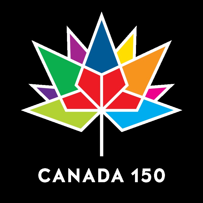
The logo is composed of a series of diamonds, or “celebratory gems”, arranged in the shape of the iconic maple leaf. The four diamonds at the base represent the four original provinces that formed Confederation in 1867: Ontario, Quebec, New Brunswick and Nova Scotia. Additional diamonds extend out from the base to create nine more points—in total representing the 13 provinces and territories.
The logo has been made available in a number of visual treatments that can be used to complement the particular use to which it is put. For illustrative purposes, here are just four of the available visual treatments:


What characterises it as ‘new’? How does it fit within wider contemporary trends?
The logo appears 'new' in at least two senses. First, graphical representations used by the Government of Canada are relatively limited, closely guarded and are well-known by the Canadian public from communications materials, federal buildings and government correspondence. Best known among these are the 'Canada Wordmark' and the graphic representations of Canada's government departments whose uses are governed by the Federal Identity Program. The 'Canada 150' logo is a clear visual departure from these very familiar symbols and graphical representations.

The Canada Wordmark
A second reason that the 'Canada 150' appears new is that it has been designed with a contemporary aesthetic. Although government communications are rarely known for their daring, this logo is not out of place with other current corporate logos and images.
Are there any direct lines of influence from other contemporary artefacts – or historical ones?
There is indeed an obvious point of comparison or line of influence from an historical artefact: the official logo of Canada's Centennial year in 1967, as seen below:

Canada's Centennial logo, designed by Stuart Ash
Although not identical, the two logos clearly share a heritage in that their respective creators have chosen to represent Canada's provinces in territories through the elements of a stylized maple leaf.
What factors may lead to your example becoming ‘last year’s thing’? What aspect of the design will age first? What do you think will replace it?
The 'Canada 150' design will become 'last year's thing' very quickly, because it has built-in obsolescence. The logo is explicitly tied to the sesquicentennial year—2017—and will be out of date by 2018. It will live on in some of the promotional items that people will buy to commemorate the anniversary and will eventually become a nostalgia piece for those who are young now, just as the Centennial logo stirs up memories for those who were schoolchildren in 1967.
The 'Canada 150' text will age first. Without it, the graphic could probably have had a longer shelf-life even though it is so clearly tied to the sesquicentennial. And because these events by definition only happen every fifty years or on other significant anniversaries, nothing will be created to replace it. The logo is a one-off and will fade as quickly as the t-shirts on which it is printed.