Project 3: A sense of place

In the case of Ian Berry’s images of Whitby, removing the people from the frames would take away a number of things:

  • a natural human interest in the subject matter;
  • a sense of the era in which the pictures were taken (based on clothing, glasses, hairstyles, etc.);
  • some identifiers about the place (people playing cricket and men in flat caps suggest a UK location);
  • an idea of the time of year (warm enough for sitting in the grass, wearing short sleeves and paddling in the sea); 
  • a sense of scale in the landscape, based on human proportions in it; and
  • a hint at why the photographer may have taken these images (to document people enjoying their leisure time together).

Without these indicators the pictures would be much less interesting and tell a very different story about Whitby: it would look quite lifeless and bleak.

When familiar figures are missing (pp.168–169) we are lacking crucial information that helps us to establish scale, depth, proportion and perspective. What would otherwise 'read' as three-dimensional appears flat and of uncertain size.

Research point: Documenting a journey

Paul Graham, A1: The Great North Road

http://www.paulgrahamarchive.com/a1.html

From the publisher:

Photographer Paul Graham spent two years completing this documentary on the life and landscape of the Great North Road. Throughout 1981 and 1982 he made numerous trips along the A1, crossing and recrossing the length of the nation to record every aspect of life at the verge of this great road. The photographs reproduced in this book build not only into a significant documentary of the A1, but also provide a thread along which we can travel the Great North Road, deep into the nation’s heart, and weave a picture of England in the 1980s.

Stephen Shore, American Surfaces

http://stephenshore.net/photographs/seven/index.php?page=1&menu=photographs

From the publisher:

In 1972, Stephen Shore left New York City and set out with a friend to Amarillo, Texas. He didn't drive, so his first view of America was framed by the passenger's window frame. He was taken aback by the fact that his experience of life as a New Yorker had very little in common with the character and aspirations of Middle America. Later that year he set out again, this time on his own, with just a driver's licence and a Rollei 35 - a point-and-shoot camera - to explore the country through the eyes of an everyday tourist.

The project was entitled American Surfaces, in reference to the superficial nature of his brief encounters with places and people, and the underlying character of the images that he hoped to capture. Shore photographed relentlessly and returned to New York triumphant, with hundreds of rolls of film spilling from his bags. In order to remain faithful to the conceptual foundations of the project, he followed the lead of most tourists of the time and sent his film to be developed and printed in Kodak's labs in New Jersey.

The result was hundreds and hundreds of exquisitely composed colour pictures, that became the benchmark for documenting our fast-living, consumer-orientated world. The corpus of his work - following on from Walker Evans' and Robert Frank's epic experiences of crossing America - influenced photographers such as Martin Parr and Bernd & Hilla Becher, who in turn introduced a new generation of students to Shore's work.

Alec Soth, Sleeping by the Mississippi

http://alecsoth.com/photography/?page_id=14

From the publisher:

Evolving from a series of road trips along the Mississippi River, Alec Soth's "Sleeping by the Mississippi" captures America's iconic yet oft-neglected "third coast". Soth's richly descriptive, large-format color photographs present an eclectic mix of individuals, landscapes, and interiors. Sensuous in detail and raw in subject, "Sleeping by the Mississippi" elicits a consistent mood of loneliness, longing, and reverie. "In the book's 46 ruthlessly edited pictures," writes Anne Wilkes Tucker, "Soth alludes to illness, procreation, race, crime, learning, art, music, death, religion, redemption, politics, and cheap sex." Like Robert Frank's classic "The Americans", "Sleeping by the Mississippi" merges a documentary style with poetic sensibility. The Mississippi is less the subject of the book than its organizing structure. Not bound by a rigid concept or ideology, the series is created out of a quintessentially American spirit of wanderlust.

Robert Frank, The Americans

https://steidl.de/Artists/Robert-Frank-1013194243.html

From the publisher:

First published in France in 1958, then in the United States in 1959, Robert Frank’s The Americans changed the course of twentieth-century photography. In eighty-three photographs, Frank looked beneath the surface of American life to reveal a people plagued by racism, ill-served by their politicians, and rendered numb by a rapidly expanding culture of consumption. Yet he also found novel areas of beauty in simple, overlooked corners of American life. And it was not just Frank’s subject matter—cars, jukeboxes, and even the road itself—that redefined the icons of America; it was also his seemingly intuitive, immediate, off-kilter style, as well as his method of brilliantly linking his photographs together thematically, conceptually, formally, and linguistically, that made The Americans so innovative. More of an ode or a poem than a literal document, the book is as powerful and provocative today as it was fifty-six years ago.

Kevin McElvaney, #Refugeecameras

http://kevin-mcelvaney.com/refugeecameras/

Photographer Kevin McElvaney gave refugees cameras in Izmir, Lesbos, Athens and Idomeni. Of the 15 cameras he distributed, seven were returned and McElvaney displayed the resulting images on his website. The goal for the project was to ensure that refugees were able to describe their trip from their own perspective, rather than from the viewpoint of an outsider who did not share the experience. I found this a very compelling series and wondered how different our documentary and news narratives would look if they were told from within rather than from without.

24 Photography

http://www.24photography.org/about/

This project is organized around a rule of “24 hours. 24 photographers. 24 images. 24 years.” Starting in 2004, a collective of 24 then-student photographers documented the first 24 hours of each New Year in multiple locations—in other words, a documented journey through both time and space. Although many of the photographs are taken in the UK a substantial number are not, and the organisation of the project demonstrates that while we share a common calendar there are many other things that we do not share. It is a fascinating visual trip to work through the years and see the points of convergence and divergence.
Project 4, Exercise 3: Visual conventions for time and place

Frame-by-frame storytelling

The best example of this type of storytelling is the classic cartoon strip that has been in use for over 100 years and is still employed in graphic novels. It is understood that time passes from one frame to the next and, in some case, place also changes (as can be seen from changes in the illustrated background in each frame).

Boys Will Be Boys, created in 1909 by Harry Grant Dart.

Unbroken chain of narrative

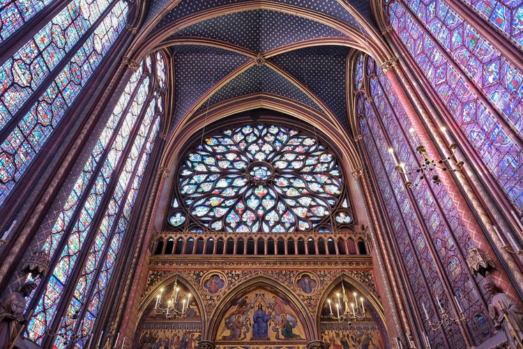
Before the frame-by-frame approach demonstrated above, some historical narratives were related in an unbroken visual story that was read sequentially. In many cases, the story was told only in images while others included text. The Sainte-Chapelle stained glass windows below show the narrative of the Old and New Testaments without words, while in the Bayeux Tapestry key elements of the narrative are described in Latin text.

Sainte-Chapelle, Paris

Sainte-Chapelle, Paris

A detail from the Bayeux Tapestry showing Latin narrative

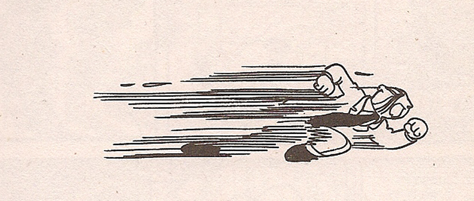
Motion or speed lines

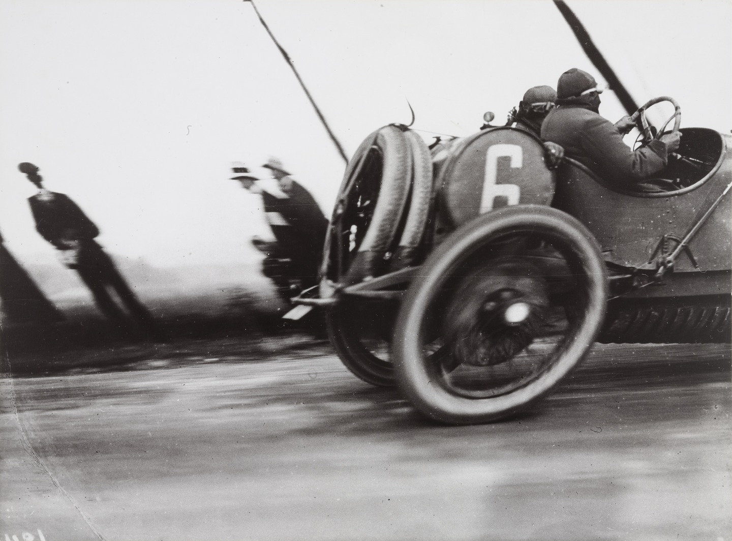
Commonly seen in cartoons, "motion lines" or "speed lines" clearly indicate direction and speed of a moving object. The more rapid the implied motion, the longer and more severe the lines which can be reinforced by blurring or elongating the moving figure. The cartoon here reminded me of a well-known photograph by Jacques-Henri Lartigue that distorts movement because of the technical characteristics of the shutter in the camera he used. I suspect that a number of the conventions we use to show motion did not exist before the invention of the camera, because the unaided human eye would simply not seen movement this way. (No doubt someone has already written about this at length...).

Use of speech bubbles

Portrayal of clocks, calendars, hour glasses

Maps

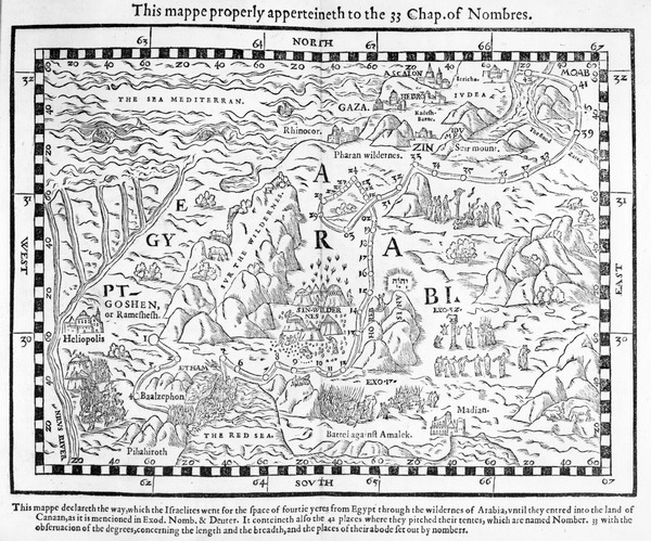
By themselves, maps generally provide a visual representation of a particular place. When coupled with lines or other interpretive overlays they can also indicate movement or other changes over time.

A map showing the journey of the Israelites out of Egypt and into Canaan, facsimile of an image from the Geneva Bible of 1560 (engraving)

A map showing the journey of the Israelites out of Egypt and into Canaan, facsimile of an image from the Geneva Bible of 1560 (engraving)

Map of Toronto subway system. Toronto Transit Commission.

Map of Toronto subway system. Toronto Transit Commission.

Changing light and/or season for passage of time

We are so attuned to the change of seasons—and even the changes of the hours of the day—that we sometimes take for granted how we constantly read the quality of light associated with a particular hour, or the colours connected with a particular month or season. But we read them all the time and they have great interpretive and emotional weight for us.

Illustration showing the changing of seasons on a single tree from www.planet-science.com

Illustration showing the changing of seasons on a single tree from www.planet-science.com

Subject or background movement

Even without the leading lines described above, we associate blurring of an image with movement. And we instantly make judgements about which planes are moving relative to others based on what appears to be sharp and what appears blurred. For example, when the foreground is sharp and the background is blurred—especially when a frame appears in the image—we generally assume that we are on a moving platform or in a vehicle.

Train Window - Green Pine{车窗-青松]. Zhang Xiaogang 张晓刚2010

Train Window - Green Pine{车窗-青松]. Zhang Xiaogang 张晓刚2010

Stages of life, aging

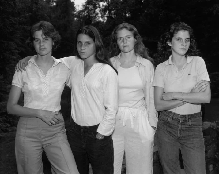
We take for granted that all living things age, die and decay. When we see a series of images that show people or other living things at different stages of life we are able to set them in chronological order without too much effort. The annual images Nicholas Nixon has made of four sisters since 1975 (two of which appear below) is an example of this: we know which picture was taken first and which later.

The Brown Sisters, 1975. Nicholas Nixon.

The Brown Sisters, 1975. Nicholas Nixon.

The Brown Sisters, 2012. Nicholas Nixon.

The Brown Sisters, 2012. Nicholas Nixon.

Signposts, place names

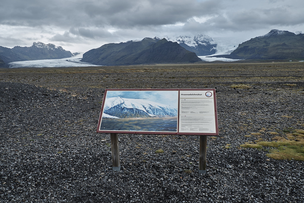
Although perhaps a bit obvious and maybe overlooked, the simplest way to designate a place is to put a sign on it. Our built environment is so full of signs that we might be overwhelmed by them, or register only those that stand out, as in the street scene in Las Vegas. The image below, taken in Iceland, has only one sign but it is intended to give information and a framework for understanding the geology of the place in front of the viewer.

Fremont East District, Las Vegas. 2016.

Fremont East District, Las Vegas. 2016.

Hvannadalshnjúkur, Iceland. 2015.

Hvannadalshnjúkur, Iceland. 2015.

Reflection

I've found that image-making as a whole has gone through important changes, but I think that some of the most significant changes may be related to the technology we have available to us, Those technological conventions have then been carried over into the visual arts. For example, the cartoon above that shows motion lines reminded me of a well-known photograph by Jacques-Henri Lartigue that distorts the shape of a car wheel because of the technical characteristics of the shutter in the camera he used. I suspect that a number of the conventions we use to show motion did not exist before the invention of the camera, because the unaided human eye would simply not seen movement this way. (No doubt someone has already written about this at length...). In the same way, I wonder if the use of frame-by-frame narration was connected with the invention of animation techniques.

Grand Prix of the Automobile Club of France, Course at Dieppe, 1912. Jacques-Henri Lartigue.

Grand Prix of the Automobile Club of France, Course at Dieppe, 1912. Jacques-Henri Lartigue.

In terms of researching this piece, I have to admit that I found it frustrating at times. It wasn't so much the process itself—starting with initial search terms, reviewing the results, refining and combining search terms to get more useful and illustrative results—it had more to do with copyright limitations on images on particular websites and/or the limitations of search engines on the websites of major galleries and image collections. In general, it is far easier to use a powerful search engine like Google that is much more configurable and fast, although the fact that it pulls up everything can be a downside: whose image is this? Can I use it for study purposes? Is this a good representation? Is the information about the image accurate?

Exercise 2: Developing your research skills

Katie Paterson Vatnajökull (the sound of) 

This piece is a site-specific installation in Iceland. It makes available a continuous feed of amplified sound from the Vatnajökull glacier via telephone. An audio loop is available as a sample on the artist's website and appears to consist mainly of ice cracking and the running of meltwater.

Unlike Longplayer, another audio installation, there is a greater sense of distance between the source of the sound and the listener. This is not just because of the physical distancye between Iceland and wherever the listener might be in the world, but because the source of the sound does not seem as obvious. In the case of Longplayer the video gives the listener something to look at and a sense of being "present" at something recognizable as a performance, even if the musical notes may someday be sounded by computer rather than musicians. With Vatnajökull, on the other hand, we do not have the same sense of immediacy or agency: what does the installation look like and how was it done? Is there really a continuous feed of sound from the glacier 24/7, or are we listening to a very long audio loop that repeats? Is there really an installation at all? Put another way, is there really a "there" there or are we being tricked?

Nevertheless, we can be fairly confident that Katie Paterson is playing fair with her audience because she has shown such great care in researching and producing her other pieces. Whether it is Future Library or Fossil Necklace, Paterson has painstakingly worked to create objects and happenings that are rooted in specific places and times. If anything, her work is often preoccupied with an interest in very long stretches of time and cosmic dimensions, such as can be seen in Ancient Darkness TV and All the Dead Stars.

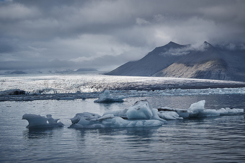
On the face of it, Vatnajökull is largely about place, being named for a large, well-known ice cap. It is the source for Iceland's famous glacier lagoon visited by many thousands of tourists each year and, even without having visited the site, most people could conjure up something like it in their imaginations supported by the sound of moving ice and water droplets alone.

On reflection, however, Vatnajökull is also very much about the passage of time. Even though Katie Paterson's use of text in the piece is very limited and provides few interpretive clues, glaciers are all about time. The formation of an ice sheet takes many hundreds of years and I remember the tour guide at Jökulsárlón telling me that the pure glacial ice she handed me to taste was over 1,000 years old. While it was still in my mouth, it dawned on me that Vikings were roaming Iceland when the snow fell that created the icy diamond! But the constant dripping and cracking we hear in Paterson's piece reminds us that the ancient ice sheet is melting at an ever-increasing pace because of global warming. And, as we look forward, we can imagine a time when there may be no Vatnajökull at all -- along with the related climactic, economic and social impacts that we really don't understand yet.

In this way, there is both a strong, ancient character to the work blended with a warning about the fragility of all natural things that are subject to the passing of time and the effects of human activity.  

Jökulsárlón at the foot of Vatnajökull (taken Septermber 23, 2015)

Jökulsárlón at the foot of Vatnajökull (taken Septermber 23, 2015)