Project 2, Research point 2

  • What is their craft and how do they approach it in their work?

I have decided to look at the work of Marcela Rosemberg, a glass-fusion artist who lives in Cobourg, Ontario. My family and I met Marcela and had the chance to tour her studio a number of years ago when she lived on Prince Edward Island.

  • Do they adhere to the ideas of Slow Design? To what extent does this allow them to take risks, experiment and innovate?

I have not been able to find any explicit reference by Marcela to Slow Design, but some of the things she says about her own artistic practice are reminiscent of the movement's commitments and principles. The following passage from the "About" page on her website is a good example: 

Beauty, simplicity, elegance and functionality are essential components in Marcela Rosemberg’s designs. At her studio, she’s always looking for that special blend of colour and texture that leads her to each piece of art she carefully designs. She treats glass as if it were a human being, by respecting it and not pushing it. This allows her to understand its flow, displacement, behavior, and action up to its most intricate inner part… Its core. That is why Marcela always says: “Each time a piece leaves my studio I feel a little bit of my soul is going with it”.  

I remember very clearly from the studio tour that Marcela is constantly experimenting with combinations of colours and pigments to be used in her fused glass creations, as well as with new forms and purposes for the finished products. She was good enough to show us some of the less successful efforts that she still had on-hand, so it was clear that she was indeed trying new things and taking risks.  

  • Is their story or the story of their work important? Why?

Marcela's story is clearly very important to her and to the artistic identity she has established over the years. As her website explains, "[t]he ocean and her Jewish faith are the main sources of inspiration in her sculptural and functional current work."

Her website goes on to explain how when Marcela left her native Argentina she relocated in Atlantic Canada and that "her colours and designs are still standing strong on the East coast where she created a brand for herself."

Marcela Rosemberg, Dancing Vessel

Marcela Rosemberg, Dancing Vessel


The importance of her Jewish heritage can be seen in the beautiful pieces that are clearly designed for the Jewish community

Marcela Rosemberg, Miracle Menorah

Marcela Rosemberg, Miracle Menorah

Marcela's emphasis on her considered and hand-made approach to her work, as well as the emotional attachment that she has to her pieces will no doubt be a part of her story that is significant to her clientele, both those who are already clients and those who would like to feel that they are buying a unique creation directly from the designer-maker.

  • Do you value ‘craft’ and craftsmanship? Why or why not?

 Certainly. I get a great deal of pleasure from seeing the work of someone who has perfected their art or craft to a high degree -- I appreciate both the amount of work that has gone into making difficult things look effortless, as well as the finished product itself (whether that is an object or a performance). And this is not a recent thing for me: I remember being fascinated at the age of 12 by the skill of a backhoe operator who was excavating the hole for the pool that was being installed in our backyard. He operated a piece of heavy machinery like it was a surgeon's scalpel, working quickly to remove earth by following a spray-painted line on the grass, never once making a false cut. I thought of that craftsman years later when I read Aristotle's view that virtue is the practised skill of living well.

  • Is there room for craft in modern society?

 No question. Dedication to 'craft' is needed in so many areas of our society, not only in the arts, but also in the world of work more broadly. All work has value if it is approached with an attention to perfection of a craft and the pursuit of excellence. This extends from ensuring that ancient and traditional kinds of 'know-how' are not lost, to reminding us that the mass-produced may have brought us economies of scale but that there is still great value in considered, skillful and sustainable design and making. And this is true both for the maker and for the one who receives the made good. We cannot all be craftspeople in every field and inexpensive consumer goods have their place, but we are all richer when each of us has something in our life that we pursue as a craft, for our benefit and for the benefit of others.

Project 2, Exercise 1

  • Do you believe there is a demand for hand-made objects and work? Why do you think that some consumers seek out these qualities in the objects they buy?

Yes, there is certainly a demand for the hand-made. Some consumers are looking for a perceived improvement in quality; others would like to support craftspeople; and others again have a philosophical or ethical commitment to hand-made goods.

  • Do you think the desire for hand-made products is based on a romantic perception of the hand-made and a sense of ‘post-industrial nostalgia for the pre-industrial’? Why or why not?

I think this is probably the case for at least some of the interest in hand-made goods. I consider that it is a similar type of attraction that some people have for music on vinyl or analogue/film photography—there is a romantic attachment to a physical artifact that is not entirely dependent on hi-tech to make it accessible or to be enjoyed. Some of the attraction may also be based on aesthetics: some people believe vinyl has a 'warmth' that digital audio does not; some believe that there is superior quality to photographic film or that it too has a warmth not available in a digital image.

  • Do you feel that hand-made products are viewed as luxury or value-added products? How do hand-made items compare with mass-produced items, in terms of their value, life cycle, cost and ethics?

Hand-made products do not necessarily have to be more expensive than mass-produced items, but they often are because of the limited scale of production and how labour-intensive the production is. So, yes, hand-made items are often viewed as luxury items—it is often less expensive to buy the mass-produced item (which is generally better marketed, too). It is hard to compare the value, life cycle, cost and ethics of hand-made goods versus the mass-produced—I think it depends largely on the item in question. I don't believe hand-made is inherently superior, but I believe it has a cachet that mass-produced items do not.

  • Reflect on any hand-made item you own (not necessarily textiles). Can you remember why you were drawn to it? Did the fact that it was hand-made make it feel ‘special’ or did you just buy it because you liked the design? How did its price compare with the industrially-produced equivalent?

When I travel with my family we often buy one or two items to bring home with us. These are not strictly 'souvenirs' but they do remind us of the place we have visited and we lean toward hand-made goods. We—rightly or wrongly—have the feeling that the hand-made item has a greater connection to the place and the people we have seen. And the hand-made item often has a uniqueness or a particularity about it that does not come through in a mass-produced piece. The price of the hand-made item may be more expensive than a factory-made 'souvenir' (usually made overseas), but this is not a factor in our choice—we always opt for the local item.

For example, when we visited Belgium for a month a number of years ago, we could have bought tourist souvenirs in any number of shops. Instead, we chose to buy a small figure made by sculptor Lut Brackx. The figure sits in our living room and reminds us of our time in Belgium and the side street in Antwerp where we came upon Ms. Brackx's shop by accident and chatted with her husband for a while. A mass-produced item would not elicit quite the same feeling for us.

Project 2, Research point: Slow design

  • What are the guiding principles of this movement?

'Slow Design' is an offshoot of the broader 'slow' movement which began with the interest in Slow Food. One description of Slow Food runs as follows:

Slow Food envisions a world in which all people can access and enjoy food that is good for them, good for those who grow it and good for the planet.

Our approach is based on a concept of food that is defined by three interconnected principles: good, clean and fair.

GOOD: quality, flavorsome and healthy food
CLEAN: production that does not harm the environment
FAIR: accessible prices for consumers and fair conditions and pay for producers
— 'Our philosophy' at slowfood.com (https://www.slowfood.com/about-us/our-philosophy/ accessed 15 July 2017)

A similar approach can be seen on the website of Slow Swiss-made Watches, where the company describes the philosophy behind its single-hand, 24-hour timepieces:

slow watches were created to shift the way people read time. So rather than focusing on the second or the minute we have produced an instrument that measures the moment.

slow does not describe a speed…. It’s a mindset that most of us somehow lost. As a result of our busy lifestyles, we often forget that we actually have a choice of how to live. The slow watch (we named it slow Jo) is a subtle reminder that time is the most precious thing we have so we should enjoy everything we do and stop chasing every minute.
— slow-watches.com (accessed 15 July 2017)

Since the advent of Slow Food, the 'slow' label has been applied to wide range of cultural practices and phenomena such as aging, religion, education, fashion, media, science, photography and travel, to name just a few.

Slow Design has many practitioners and descriptions, but it shares commitments with the broader Slow movement around simple living, work-life balance, concern for time-poverty, and sustainability of materials and process. The ever-growing manifesto of just one Slow Design company, Deep Craft, is a useful illustration of how 'Slow' can be applied in design and fabrication. The first 11 principles (out of a list of 67 on 15 July 2017) from the manifesto are:

  1. Market = Material Provenance
  2. Maintenance = Improvement
  3. The functional lifespan of a constructed thing should mimic the lifecycle of its principle material.
  4. Entropy adds value: The functionality of a thing by definition incorporates/embodies its decomposition.
  5. Handwork may be the bedrock of innovation, but nostalgia for handwork is quicksand.
  6. Prepare for unintended consequences.
  7. Optimize beneficial end use.
  8. All vessels originate with an imagined voyage.
  9. Perfection is impossible to maintain.
  10. The tool shapes us as much as we shape the tool.
  11. Craft practices and products simultaneously preserve knowledge and resources.
  • Do you believe this approach to design and making could have a positive impact on our consumption of products?

Yes, I do believe this, but I expect that the impact will be relatively limited. From what I have observed, the Slow approach is most often promoted by people who are fairly well-heeled. It might be nice to know exactly where the wood for a new piece of furniture was sourced, that the piece itself was hand-carved and that a new tree was planted to replace the one that was felled, but this is production by the few, for the few. The Slow movement may wear humble clothing, but it is currently an indulgence for the wealthy, largely because hand-crafted items are usually much more expensive than those mass-produced. For Slow to have a real impact on the consumption of products, it would need to touch all sectors of society, be affordable to a broader range of people, and transfer more of its profits back down the production chain to the source.

  • Would you place more value on a product that has been created with this principle in mind? Why or why not?

I might, but it would depend on a calculation of 'value' to me and to my family. I would love to be able to buy beautiful, practical hand-crafted goods (although hand-crafting is not an immediate guarantee of superior quality), but sometimes we just need something 'good enough' that we can afford within our overall household budget.

I am sympathetic to the commitments of the Slow movement, but there are numerous factors to take into account.

Project 2, Exercise 4: Photography and land art

The question posed in this exercise is whether photographs of a work of 'land art' are the documentation of the art or the art itself.

After working through the readings associated with this portion of the course (such as John A. Walker's piece on "Context as a Determinant of Photographic Meaning"), I am not sure that this is an 'either-or' question. Given the role that context plays in understanding the layers of meaning for a particular piece, it seems to me that the proper response is 'both-and.'

The original work of land art or installation is certainly a work of art, but so is the subsequent recording or documenting of the piece or installation. The original piece had its context—place, time, etc.—but any resulting photographs of the piece contain the results of decisions made about format, light, focal length, angle of view and framing. Artistic decisions have been made about what to include, what to leave in and how to present it. And the results of these decisions are then seen in a new frame, and a range of new contexts (particularly if the photographs appear in different settings and times), particularly when photographic processes are used to introduce the perspective of time to the way the work is viewed.

A good example of this is Keith Arnatt’s Self-burial (Television Interference Project). In this case, the performance doesn't really make sense unless it is seen as a series of photographs. A spectator watching the development of Arnatt's self-burial would have seen the artist climbing in and out of a hole that was being progressively deepened. It would have taken a long time and might well have been incomprehensible. Viewed as a planned sequence, however, the work takes on greater meaning as a coherent whole—as a photographic work more than as a live performance.

If anything, then, the photographs of a work of a land art are a new thing: based on the land art and sharing a kind of heritage or lineage with it, but a work with its own integrity and layers of meaning.

Project 2, Exercise 3: The image as document

Why do you think that photographs are such a significant part of our lives? Write down how you feel about photos – or videos – from your family’s past.

  • Photographs are tangible artifacts that promise to preserve memories intact and changeless across time. Faces and places are of particular importance to us, so anything that can channel their likenesses to us is meaningful. We can preserve other kinds of keepsakes like letters or personal possessions, but they don't seem to have quite the same power. Perhaps this is because relate to people is more important than relating to inanimate objects, and to relate to a person most often means reading his or her face where we look for recognition, what is familiar and loved, and characteristic expressions and signs of mood.
  • I look at pictures and videos of my family's past to remember how people and things were. Sometimes they help me to recall a particular, mood or feeling, but it is hard to view them without adding on a layer of everything that has happened since the time the picture was taken. I also find that I feel differently about pictures taken of family members that I know than those that I have never known. Pictures of family members from generations that went before me are interesting in a curious (are those eyes like mine?) or historical (so that's where and how our family lived) way, but they do not have the same personal appeal—they both are and are not part of my story.

Will this archiving be affected by the digital revolution?

  • Digital photography has many advantages over film-based photography, but one of its downsides is the fact that I print so few images now. I realize that none of my children has probably had the experience of poring over a family album because there isn't one. There are now thousands more images in the house but they are not as easily available and we are not likely to sit looking at them together. (Although we did happen to do this recently and it occurred to me how much I missed looking at family pictures together, even those taken just a few years ago.)
  • Looking at screen-based imagery is not the same as looking at a photographic print: we are used to digital images being transitory and are more likely to browse rather than contemplate them. If we need to research or consume images, digital is much faster. If we want to take time over a picture there is no substitute for a print you can hold in your hand. I wouldn't call one approach better than the other—it is more a question of being appropriate to the task.

Project 2, Exercise 2

Does this make photography a medium uniquely suited to portraying time and the passage of time?

Yes, I think it does. Whether we look at images that allow for a longer passage of time than the eye can record (Trillo and Lartigue in the last exercise) or a shorter passage (Edgerton and Muybridge), photography has been uniquely able to extend the boundaries of the way we perceive, record and portray time.

Can other creative art forms deal with the concept of time to the same extent?

Other forms of art are able to portray or capture time in different ways, but few of them are able to do it with the flexibility of photography. Furthermore, I think that artists working in different forms and media recognize this themselves—and it is why so many conventions for portraying time in the other arts have been influenced by both still photography and moving images.

Project 2, Exercise 1: It's about time

Derek Trillo, Passing Place, Manchester, 2006

  • Conveys movement by using a slow shutter speed to capture two figures walking toward one another on a staircase. The resulting blur is effective, particularly because it works well with the silhouetted figures and the background colours—I think I can see some multicoloured fringing that gives the impression of speed.

Harold Edgerton, Bullet and Apple, c.1964

  • A high-speed flash has been used to freeze a bullet as it exits an apple stuck on a shell casing. This is also effective not because it allows movement to blur, but because it freezes an event that the eye cannot possibly see (the previous image also used a camera to portray an event in a way that the eye cannot naturally perceive). The entry and exit 'wounds' to the apple have only just been made and show the bullet's explosive speed and power.

Harold Edgerton, Multiflash tennis serve, 1949

  • Edgerton used a stroboscopic effect to slice up a moment that would have been visible to the eye (a tennis serve). Again, the technical properties of photography are effective in allowing us to 'see' an event in a way that would otherwise be impossible: this time a single, fluid movement portrayed as a series of discrete steps.

Jacques-Henri Lartigue, Ma cousine Bichonnade, 1905

  • Lartigue's picture of his cousin is also effective in showing movement through a relatively short exposure, although it gives the impression that the subject is flying. In that sense, though, it is no more unnatural than any of the other images—each one of them portrays movement in a way that is foreign to us, but that tells us something interesting about movement and the passage of time.


Project 2, Exercise 3: Film posters

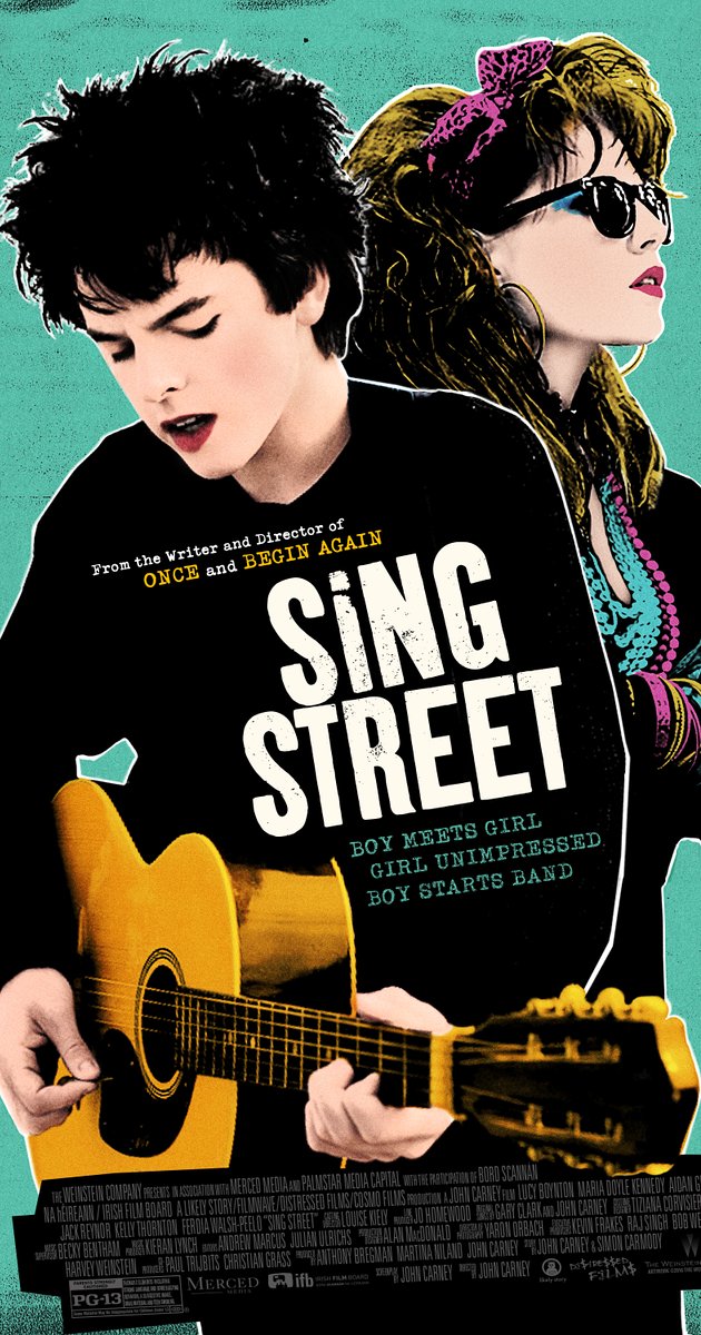
Sing Street poster, 2016.

I have chosen to discuss the poster for the 2016 film Sing Street because it is a relatively recent movie and because of the stylized artwork.

The film is a coming-of-age story set in Dublin of the 1980s. The protagonist has a crush on a young woman and decides that being in a band is the best way to get her attention. As a result, a lot of the movie is taken up with those two themes: the development of the relationship and the influence of the popular music of the time.

The poster captures both themes well. The two main characters dominate the artwork and their fashion sense and hairstyles recall the 1980s. They are clearly young—both from the way they are dressed and the pinkness of their skin and lips. The lead is playing a guitar and singing, although the young woman is looking off somewhere else—the future? perhaps she has ambitions—and is dressed much like Madonna in the 1985 film, Desperately Seeking Susan.

Madonna in a production still image from Desperately Seeking Susan, 1985. Orion Pictures.

Madonna in a production still image from Desperately Seeking Susan, 1985. Orion Pictures.

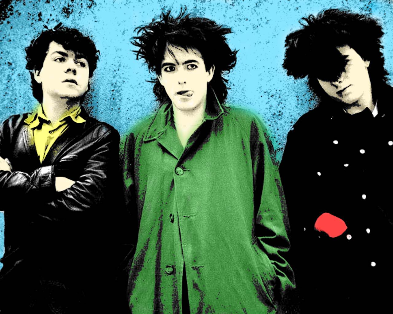
The image is not straight photography but has been posterized, with reduced tones, heightened contrast and saturated colours. In this way it references the look, colour palette and blocks of colour of the music imagery of the same period, as can be seen in the picture of The Cure, below. The type and typefaces are simple and bold, and are also in keeping with poster art from the 1980s.

The Cure

The Cure

Taken as a whole, the different elements of this poster for Sing Street combine to make an effective visual communication. They telegraph the major themes of the movie while evoking the spirit of the period in which it is set.


Project 2, Exercise 2: Re-contextualising images

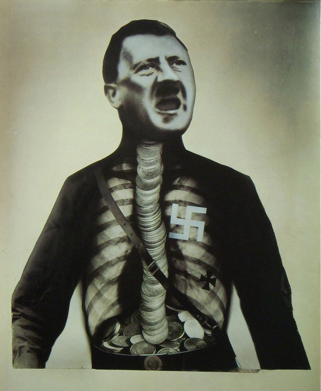
John Heartfield

  • http://www.johnheartfield.com/John-Heartfield-Exhibition/
  • Born Berlin 1891 as Helmut Herzfeld but anglicized his name during WWI in response to anti-British sentiment in Germany.
  • Politically active, a proponent of Dada and an originator of photomontage as a means of artistic and political expression. Also built theatre sets for Bertolt Brecht.
  • Fled Berlin for Prague in 1933 to avoid arrest by the SS after sustained criticism of the Nazi movement. Fled Czechoslovakia in 1938 when the country was invaded by Germany.
  • Lived during WWII in Britain and returned to Berlin in 1950 where he was viewed with suspicion by the East German government. Died 1968.
© 2016 Heartfield Community of Heirs. All Rights Reserved.

© 2016 Heartfield Community of Heirs. All Rights Reserved.

Peter Kennard

  • http://www.peterkennard.com/
  • Born London 1949 and based there. Artist and academic at the Royal College of Art.
  • Politically-active in left-leaning causes, turned to photomontage as a means of expression. Produced work in support of the Committee for Nuclear Disarmament.
  • Uses more modern photomontage tools (Photoshop) than were available to Heartfield (scissors and glue). As a result, some of his pieces are mistaken for "real" images and the potential for the image to affect perception of a mass audience can be heightened. A more deliberate effort to affect not only public discourse but perceptions: "We were trying to portray Iraq as it happened and not wait until afterwards and make a history painting" [The Guardian].
"Photo Op" by kennardphillipps/Reuters. 2005.

"Photo Op" by kennardphillipps/Reuters. 2005.

Hannah Höch

  • http://www.theartstory.org/artist-hoch-hannah.htm
  • Born 1889 Gotha, Germany. Died 1978 Berlin.
  • Became friends with Raoul Hausmann, a fellow-participant in the Berlin Dada group and with him became a pioneer of photomontage.
  • A strong advocate for contemporary women artists, she seems to have been undervalued by many of her male colleagues in the artistic community. Her photomontages often criticized the fashion and beauty industries, as well as the ideal of the Weimar New Woman, and frequently challenged gender roles by fusing images of male and female bodies.
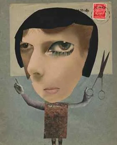
  • Her work appears to be just as political as Heartfield's, although small "p" political rather than partisan. Her technique is also rougher, in that the components of her images are often torn from papers or magazines rather than being neatly cut with scissors. Her images are very abstract and distinct from Heartfield's—often bizarre—"realism".
  • Höch's works were seen as "degenerate" during the Nazi period and seldom shown. Although she was freer to exhibit after the war it seems that she never achieved the same degree of attention.
Hannah Höch, Self portrait.

Hannah Höch, Self portrait.

Martha Rosler

  • http://www.martharosler.net/
  • Born Brooklyn, 1943.
  • Works in video, photo-text, installation, and performance, as well as writing about art and culture. Rosler’s work is centered on everyday life and the public sphere, often with an eye to women's experience. Recurrent concerns are the media and war, as well as architecture and the built environment, from housing and homelessness to systems of transport. [Wikipedia].
  • Influential artist, lecturer, professor and writer.
  • “My art is a communicative act,” Martha Rosler says, “a form of an utterance, a way to open a conversation.” [www.artsy.net]
  • Her work is reminiscent of Kennard's and the two share an interest in protesting warfare. Whether it is coincidence or whether Kennard's 2005 image was influenced by Rosler's piece from the year before, each has produced a photomontage named "Photo Op" (above and below) depicting an individual taking a cellphone selfie, oblivious to the scene of fiery destruction behind them. Kennard indicts Tony Blair for the UK's role in Iraq, while Rosler broadens the critique to include a non-politician too caught up in her comfortable surroundings to notice the bodies behind her and the armoured tank outside in the garden.
Martha Rosler. Photo Op, 2004

Martha Rosler. Photo Op, 2004

II. A recontextualised image of my own: Discover unspoiled Iceland!

I'm happy with the results of this collage because I was able to create what I had in mind and I believe it expresses my idea well. I have created meaning through the use of exaggeration of a real situation, which is the impact of ballooning tourism on Iceland's small and fragile ecosystem. Although the text in the collage may not be strictly necessary, I wanted to be sure that the ironic line made the point difficult to miss. Iceland—and especially its international airlines—are marketing the country heavily as an unspoiled place of wild beauty. The more successful these efforts are, although they are crucial to the country's economy at the moment, the less likely Iceland will be to remain beautiful.

Although all of this is a bit heavy-handed, I think it is in keeping with the approach of artists who work in collage or photomontage. What seems to vary, however, is the extent to which the artist attempts to create work that is "realistic." Kennard's Photo Op comes close to photorealism—close enough that some viewers were inclined to believe it was a real photograph (although this may have happened because they were predisposed to think the worst of Tony Blair). Rosler's Photo Op, on the other hand, is unlikely to be mistaken for a real image for a number of reasons: the repetition of the female figure, the positions of the bodies behind her, and the strange mixed lighting throughout the scene. It looks artificial and this is clearly Rosler's intent—perhaps the artificiality of the image underlines the artificiality of a lifestyle that encourages preoccupation with appearance and self, while ignoring the damage around us.

Collage is a powerful tool for creating images and lends itself to communicating a political message ("political" in the broadest sense of the term). It takes existing graphic elements and rearranges them in a way which can be deceptive or plainly incongruous—almost as if holding up fragments of the given world and showing their brokenness or contradiction. They can take what is "real" and show it to us in all its reality or unreality. It is a tool that was born in modernity, with the photograph and high-speed printing, and perhaps for this reason it is ideally suited for protest and criticism in the era of mass communication. The Dadaists were onto something.

Project 2, Exercise 1: Mixed messages

Messages communicated by the writing

  • Enjoy your stay: the message of the words is inviting, but the formal (Gothic?) script seems to work against the message. Perhaps, though, this is meant to be an appeal to a sense of the traditional or old-fashioned. If that is the case the message and typeface might work together. Context and audience would play important parts in how such a message would be read.
  • DO NOT FEED THE ANIMALS / THEY ARE DANGEROUS: the use of all capital letters communicates a sense of the urgency of the message, which is an important one for anyone concerned about their safety. The typeface, however, might be seen as less than serious. Why not choose a simple, sans serif typeface that communicates less ambiguously?
  • We are professionals: the typewriter script is something we no longer see very often, except perhaps in advertising or on book covers. Perhaps the use of such an "old school" typeface is meant to be ironic, to evoke a particular kind of office work, or to give the reader confidence that the writer has older (and reliable?) values.
  • LUXURY: the typeface aims to be exotic and might be successful in advertising a luxury good (perfume, perhaps?). At the same time, the type is probably a little less legible than it could be—although this could have the beneficial effect of encouraging a potential buyer to slow down and read more carefully.
  • hand made: the text in lowercase, sans serif type is very legible and gives a sense of lack of pretension. It could be an effective way of presenting a hand made product with an air of honesty. In that way, text and type would work together very well.

In each of these examples, context and audience would be important factors in judging the effectiveness of the visual communication. Any one of the examples could be effective or ineffective, depending up the use to which it is put.

Additional examples where text and typeface do not complement each other:

font-choices-op4.jpg

Additional examples where text and typeface do complement each other:

bnd-trebuchet-ms.png

Project 2, Exercise 2: archetypes

Archetypes

The word archetype, "original pattern from which copies are made", first entered into English usage in the 1540s[1] and derives from the Latin noun archetypum, latinisation of the Greek noun ἀρχέτυπον (archetupon), whose adjective form is ἀρχέτυπος (archetupos), which means "first-molded",[2] which is a compound of ἀρχή archē, "beginning, origin",[3] and τύπος tupos, which can mean, amongst other things, "pattern," "model," or "type."[4]

Usage of archetypes in specific pieces of writing is a holistic approach, which can help the writing win universal acceptance. This is because readers can relate to and identify with the characters and situation, both socially and culturally. By deploying common archetypes contextually, a writer aims to impart realism[5] to his work. According to many literary critics, archetypes have a standard and recurring depiction in a particular human culture and/or the whole human race that ultimately lays concrete pillars and can shape the whole structure in a literary work.

[material downloaded from Wikipedia article "Archetype," 15 October 2016]


Character archetypes, their roles in a narrative and examples:

  • the hero: is generally virtuous, admirable and has the power to save or put things to right (example: Odysseus; Hercules)
  • the anti-hero: is not the antagonist to the hero, sharing many of the hero's characteristics but with flaws (example: characters played by Clint Eastwood in virtually every one of his roles; the title character in the book/movie Shane)
  • the artist: imagines, dreams and creates things that do not exist (example: the classical figure Achilles and a very long list thereafter)
  • the Christ figure: is a hero who suffers for heroism, sometimes to the point of offering/sacrificing his/her life for the person rescued (example:  most obviously the character Aslan in The Lion, the Witch and the Wardrobe, but also Simon in The Lord of the Flies, Neo in The Matrix Trilogy, Dr. Who, others)
  • the trickster / joker: a useful character who can change the direction of the plot by introducing the unexpected or capricious (example: Loki in Norse mythology)
  • the fool: takes shelter behind humour and/or simple-mindedness to speak truth in situations when no one else would dare (example: Fool in King Lear)
  • the sage: a figure who can be consulted to provide insight or wisdom not possessed to others (example: Gandalf in The Lord of the Rings)
  • the king / the queen: the figure who holds ultimate power or authority, for good or for ill (example: Neptune in mythology; Mufasa in The Lion King; the Queen of Hearts in Alice in Wonderland)
  • the villain: usually the antagonist, helps drive the plot by opposing the hero or by making it necessary for a hero to arise (example: see any Bond movie... Goldfinger, Hugo Drax, Le Chiffre, Rosa Klebb, Scaramanga, Dr. No...)
  • the maiden: represents virtue, youth and/or innocence that usually need to be protected (example: Athena, Rapunzel, Snow White)
  • the crone / witch: an older woman who has some kind of power, whether of knowledge/experience or magic; could be good or evil, depending upon the story (example: the witches in The Wizard of Oz)
  • the hunter: one who pursues and thereby helps to drive the narrative (example: Diana / Artemis of Greco-Roman mythology)
  • the patriarch: the father-figure, with all the potential for love, protection, wisdom or control that that might entail (example: Zeus in mythology; Atticus Finch in To Kill a Mockingbird)
  • the matriarch: the mother-figure, with all the potential for love, protection, wisdom or control that that might entail (example: Hera of mythology)
  • the teacher / mentor: one who guides and imparts knowledge, wisdom or know-how that enables the hero or others in the narrative (example: Yoda in Star Wars)
  • the rich man / woman: has the power to reward, inspire envy and/or demonstrate the advantages and dangers of wealth and privilege (example: Croesus in Greek history / mythology)
  • the mastermind / architect: one who plans and builds and/or has practical wisdom that can be applied to problems (example: Sherlock Holmes)
  • the rebel: one who bucks the established order, whether for good or for ill (example: Arnold Schwarzenegger as The Terminator; Guy Montag in Fahrenheit 451)

  • the traitor: a disguised antagonist who undermines the hero or others (example: Fredo Corleone in The Godfather, Part II; Peter Pettigrew in Harry Potter and the Prisoner of Azkaban)

  • the beauty: one whose attractive appearance can mirror inward virtue or demonstrate the deceptive nature of outward form (example: Helen of Troy; Sleeping Beauty)
  • the orphan: the child alone in the world, vulnerable without love or resources (example: Dickens' character, Oliver Twist)
  • the coward: in contrast to the hero, demonstrates the less-admirable side of being human (example: the Cowardly Lion in The Wizard of Oz; Count Rugen in The Princess Bride; Ichabod Crane in The Legend of Sleepy Hollow)
  • the innocent / ingenue: sometimes a demonstration of vulnerability that must be protected, but can also be a warning about the dangers of failing to learn and mature (example: Tiny Tim in A Christmas Carol; Ophelia in Hamlet)


Archetype versus stereotype

The tidiest description I found of the difference between the two "types" runs as follows: "Although both archetype and stereotype draw from a "type" of person to create character, the difference is that the archetype will use the template as a starting place, and the stereotype uses it as the end point." ["Archetype versus Sterotype," consulted online 15 October 2016]

Following this line of thinking, the archetype draws upon shared cultural or mythical knowledge that the reader already has to help move character and plot development along. There should be a sense of recognition about the function of the character in the story but that function could play out in many different ways -- or may even play against type. To be a true stereotype, however, the character can never be anything but a stock set of exaggerated and fixed attributes that will also spark recognition but will not allow for exploration, novelty or growth.

Research point: postmodernism

I bought and read Christopher Butler's Postmodernism: A very short introduction (Oxford: Oxford Paperbacks, 2002) and found it a very helpful overview of the shape and impact of postmodernist thought. I was familiar with much of the content from earlier studies in theology and literature, but the material on the arts was newer to me. I appreciated the fact that Butler didn't content himself with just describing the contours of postmodernism but also offered some reflection and criticism.

It seems to me that postmodernist thought has been of real benefit in identifying power relationships in various discourses and in questioning totalizing metanarratives. But then it runs into difficulty. As Butler points out a number of times, postmodernism's hermeneutic of suspicion is an effective tool of deconstruction but it makes any constructive effort difficult, if not impossible.

Where do we go as a society after postmodernism? Do we simply opt for power politics? Do we shut our eyes and fall back on an uncritical romanticism? Both? Neither?

And where does this leave the arts? Do they have anything new and constructive to say or should artists content themselves with exposing and questioning? How long can irony and detachment be satisfying?

51tI+JrlbML._SX315_BO1,204,203,200_.jpg

Exercise 2: Interpreting video art

I found Sam Taylor-Wood's Still Life unappealing when I first started watching the time lapse video of rotting fruit. The fruit sits on a plate on a table against a dull, neutral background and gradually does what any living thing does when it dies: it decays. The camera stays in a fixed position during the shoot, meaning that the only movement to register in the frame is that of the subject itself.

Surprisingly, it does move. And this is what sets it apart from the "still life" tradition of painting that Taylor-Wood references both in the way she presents the fruit and in the title she gives the work. While still life paintings often hint symbolically and statically at decay, the artist uses time and technology to show the process at work. A plastic pen lying on the table belongs to the contemporary world and does not change during the video: its material has no life in it, or on it (as far as we can see). 

The movement in the video also suggests that even in the face of death there is "still life" present: spores and insects live on the host and change its shape while consuming it. There are ebbs and flows of mini "circles of life" taking place on and within the dead fruit. 

The key to seeing all this is the ability to play with time photographically, which allows us to remain attentive through a process for which we wouldn't usually have the patience or interest. Taylor-Wood might be saying to us, "Slow down: you're missing a lot of life." 

The same attentiveness to the passing of time and uncomfortable detail is present in a number of Taylor-Wood's other video works, such as A Little Death (2002; a time-lapse of a rotting rabbit's corpse), Pieta (2001; a real-time observation of a couple mirroring the pose of Michelangelo's sculpture), and Hysteria (1997; a video of a woman who seems to move gradually from joyous laughter to hysterics... and back again?).

The subject matter of Taylor-Wood's Still Life (and other works) does not always appeal to me but I can appreciate the way she uses time in her pieces. 

Case study: interpreting sound—Longplayer

The performance of Longplayer at the Roundhouse in 2009 was an invitation to step out of regular time. The piece represents a break from music most of us are familiar with in terms of pace, rhythm and lack of discernible repetition.

The sounds are rich and varied with a purity of tone created by Tibetan singing bowls that have likely been made of materials built to last. A team of musicians travels from bowl to bowl, striking them at intervals that might be scripted.
The music produced is reminiscent of long, interplanetary voyages in sci-fi films. It is contemplative and in no great hurry: the notes reverberate, have a slow decay, combine and overlap. There is no sense of the “progress” that we usually expect in a piece of music—we’re not building toward the resolution of a melody or theme.

We play no part in the performance but observe it from above. And in this position we can see that the bowls are arranged in a series of concentric circles that do remind us of the planets in their orbits. Or perhaps we are looking at the inner workings of a vast lock, with the bowls spaced at irregular intervals in their courses. Designed to run without repetition for a millennium, Longplayer’s orbits are independent of one another and, like any circle, have neither beginning nor end.

The music lulls the listener for a time but leaves us with more questions than answers. Where does the movement come from? Are musicians or listeners necessary? And how long can we listen without a sense of direction, achievement or satisfaction?

Exercise 1: The fourth dimension

This exercise marks the beginning of Project 2: Time and time-based media.

Make notes on your own thoughts about time

As someone who has done graduate work in theology and learned to read a couple of ancient languages I have certainly thought about time. I learned through those studies to pay close attention to issues of history, culture and language, all of which are directly affected by time. The understanding of ancient texts is aided by giving care to the history of interpretation and the realization of the distance that exists between our time and that of the first writers and readers or hearers. We have to be conscious of the temptation to project our own views onto the past and the future and resist making our own period normative. To interpret an ancient document faithfully is to try to inhabit—however imperfectly—the world of the text.

Even without formal study, the process of aging must encourage most people to think about time and its passing. It happens to us all (birth, growth, maturity, decline and death) and comes close to home as we see our children gain strength and our parents gradually lose theirs. And talking with family members has made me conscious of the malleability of memory as we realise from each other that the accuracy of the things we remember can change with the years. And that our frame of reference may not be theirs. Or completely reliable.

Have you thought about time in relation to artwork before?

Much of what I wrote above applies to artworks as well as to ancient texts: the role of time in shaping culture and interpretation, and even the decaying effect that it can have on physical materials. The further in time we are from the moment a piece was created, the more our world is not the world of the artist.

I also have a particular interest in photography which owes much of its power and interest to the way that the camera can play with time: 1/1000 of a second for this frame; four hours for this one. Photography allows us to experience and abstract time beyond the way our senses usually allow. A camera is a time machine.

Have you already come across pieces that explore what time is?

Again, photography is the obvious answer, whether it is Eadweard Muybridge's pictures of human and animal movement or Harold Edgerton's images of bullets frozen mid-way through fruit and playing cards. Time-lapse shots of passing clouds, waves and even passing seasons demonstrate how the camera can capture much longer periods. Painters also play with time for effect, whether subtly in the  memento mori pieces mentioned earlier in this course or more obviously in Salvador Dali's melting clocks.

In the last segment, the videos and articles on Damien Hirst's works also mentioned the effect that time can have on artistic materials themselves: sharks can rot even when swimming in formaldehyde.