Project 4, Exercise 1: Fashion image

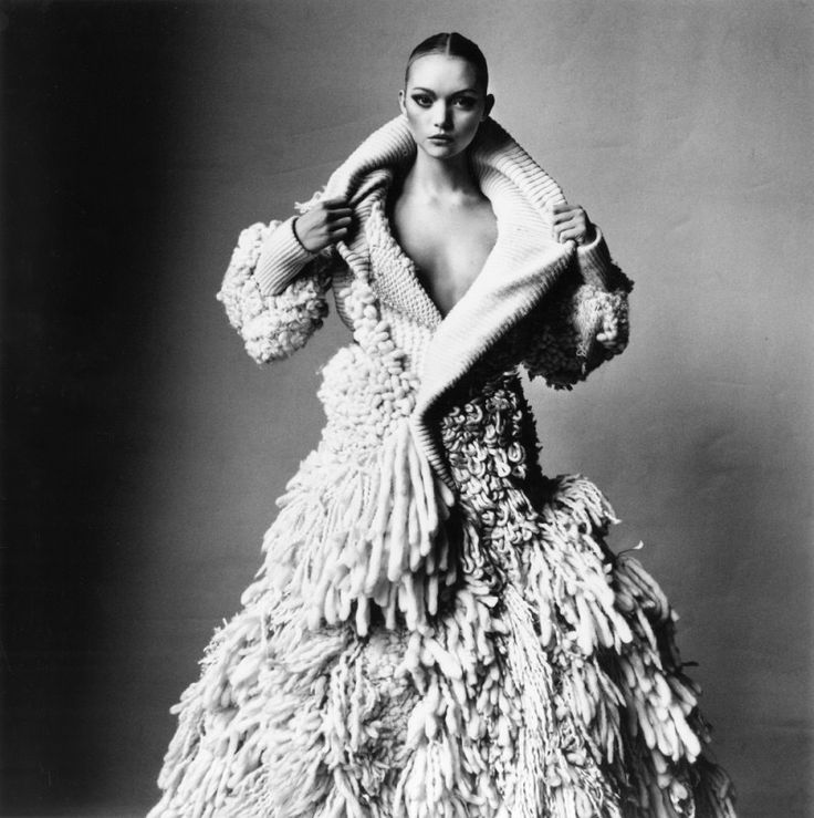
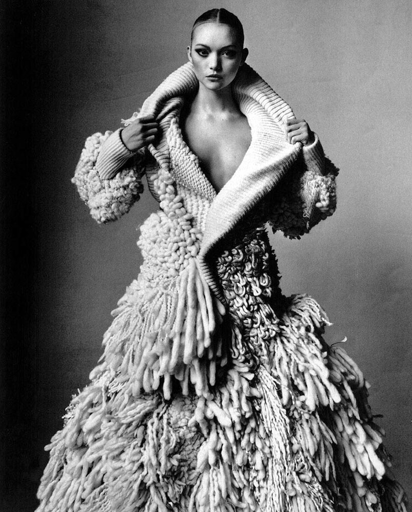
I have chosen an image taken by Irving Penn in 2005.

Balenciaga Yeti Coat (A), By Ghesquiere, New York, 2005Gelatin silver print mounted to board10 1/4 x 10 1/4 in., Edition of 7© The Irving Penn Foundation

Balenciaga Yeti Coat (A), By Ghesquiere, New York, 2005
Gelatin silver print mounted to board
10 1/4 x 10 1/4 in., Edition of 7
© The Irving Penn Foundation

  • The silhouette of this particular piece is very full and indistinct, as it appears to be made from many individual strands of bulky wool. The textiles look to be soft and probably trap warm air close to the body, keeping the wearer warm in colder weather. The Yeti Coat is full length and features a wide collar like a cowl. The bulky fibres that make up much of the coat do not appear appear around the neck or at the ends of the sleeves, probably to allow for freedom of movement and to avoid irritating the wearer. The presentation of the coat exaggerates the wearer's size and makes the body seem large and imposing—it is a striking garment.
  • Because of the bulky materials used for most of the coat, its volume is considerable and the garment looks as though it would be heavy. This could be deceptive, depending on the materials used to make the coat—if this is wool (as it appears to be), it would be a very heavy piece to wear. It would probably not be suitable for a shorter person to wear, because the volume would be unflattering without the necessary height to give it scale. This is a garment for a tall, confident and—ideally—slim person who can carry off the look without appearing to be overwhelmed by it.
  • Again, because of the seeming weight and bulk of the materials used, the drape of the coat is heavy and does not conform easily to the shape of the body, as a filmier fabric might. Instead, the garment conceals much of the shape of the body, although it is much fuller at the bottom and narrower at the waist which helps to ensure that the wearer's form is not completely lost.
  • Because of the weight of the garment, it would likely muffle fine movements by the wearer. Instead, the individual might seem to move as a monolith of wool, perhaps with some subtle shaking of individual strands.
  • It is not possible to tell the coat's colour from the monochrome image, but it seems to be uniform and light in tone, without print or pattern. This means that the form of the coat is not broken up but appears as a single unit, with the only exceptions being the absence of heavy strands at the neck and sleeves. At the same time, the strands appear to vary in thickness and length, so there is still some variation in appearance that give more visual interest to the Yeti Coat.

Looking at the image as a fashion photograph, it is clear that Penn has used sidelighting effectively to emphasize the garment's form and texture, its most important qualities. The monochrome treatment keeps the focus on this features and does not allow colour to distract the viewer—the image was made in 2005, so a black and white image was a deliberate stylistic choice.

I find the image striking and the coat bold. It is as much a statement about its wearer as it is protection against the cold. I'd be happy to see if being worn on the street this winter but, as I mentioned above, it would need to have the right wearer to carry off the look without looking awkward. For this reason, the choice of model (slim, elongated body) is important and the photographer has helped to break up the chunky look by opening the neck and creating a v-shape the lengthens the neck and highlights the model's face. The model's hair is also swept back, which keeps her hair from competing with the texture of the coat or being lost against it.
Project 4, Research point: Print and pattern

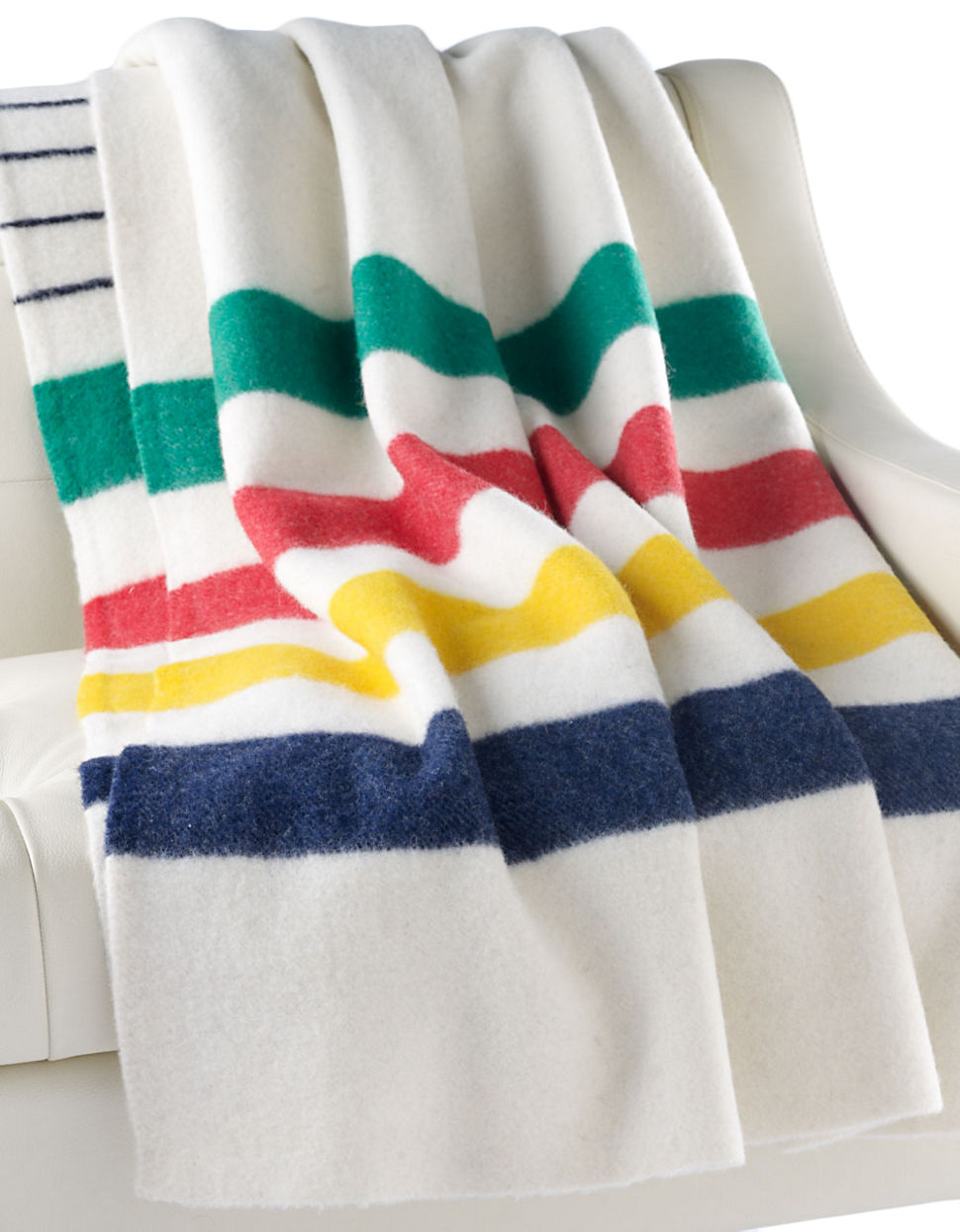
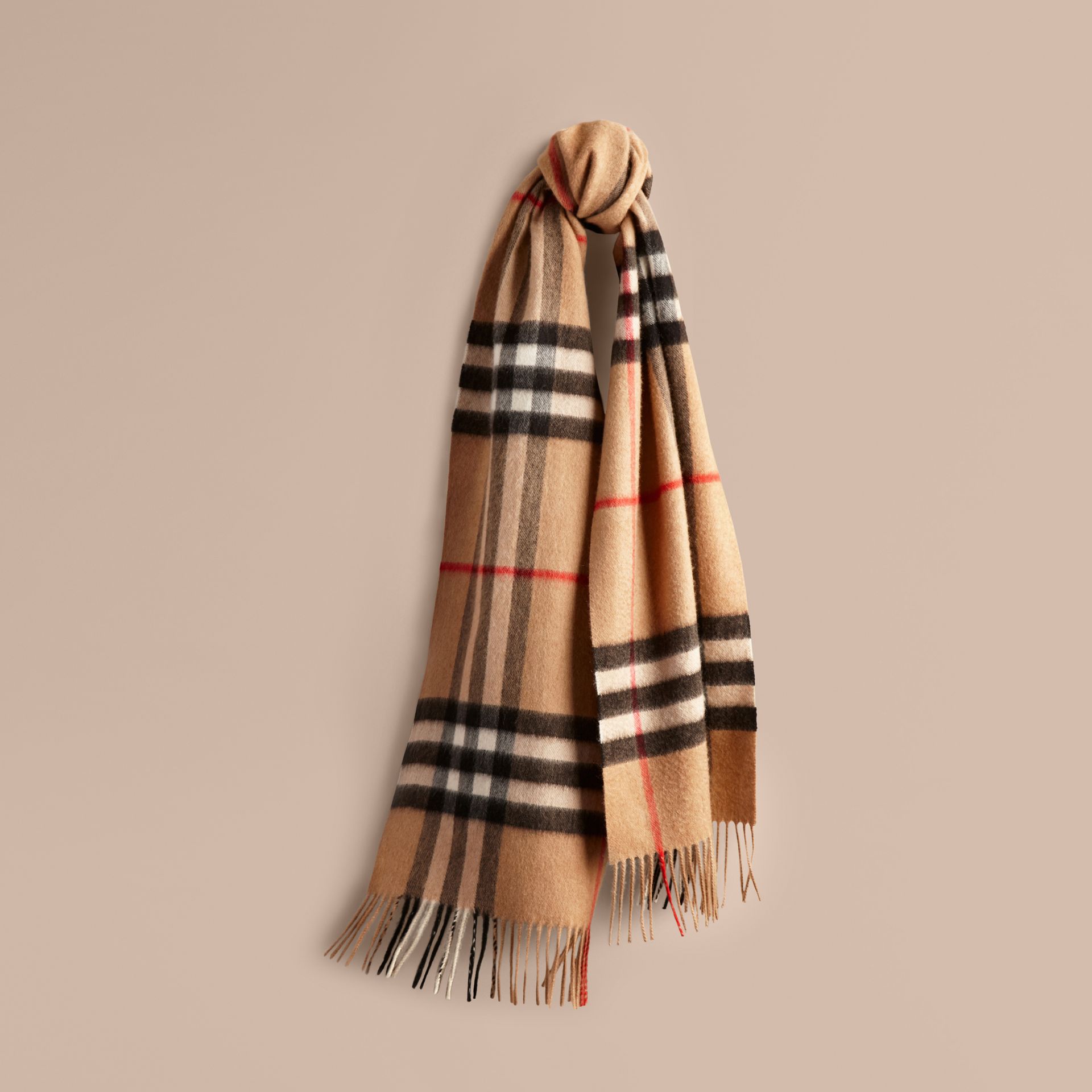
Two examples of the use of print and pattern come to mind immediately, one on either side of the Atlantic: Burberry's trademark scarf (below left, UK) and the Hudson Bay Company's signature blanket (below right, Canada).

Both patterns are immediately recognizable and both have been imitated. The two companies have worked hard to use the pattern to identify a unique product line that denotes tradition and high-quality, although sometimes with unintended effects. Burberry had to endure years of its pattern being associated with anti-social behaviour ("Burberry versus The Chavs") and Hudson's Bay has been accused of appropriating Indigenous culture ("HBC’s ‘Colonial Barbie’ comes with some baggage"). Both companies have extended the use of their pattern to other items.

Mary Katrantzou

The article cited on Greek fashion designer in the course materials does not seem to be available anymore. There is, however, a useful review of her 2011 Spring Ready-to-Wear show in the online edition of Vogue (accessed 22 August 2017).

As Katrantzou works on her creations she "designs in 3-D"—that is, she plans the form, volume and drape of the garment at the same time that she develops the pattern / illustration that will be screen-printed onto the fabric.

"I thought I was going to do a collection about the seventies photographs of Guy Bourdin and Helmut Newtonall those women in incredible rooms. But then I started to look at the rooms more, and suddenly, I was putting the rooms on the women instead!"

By this, I think Katrantzou meant that rather than have women serve almost as visual accessories within exotic locations, the locations could serve the women by drawing attention to their own appearance. She achieved this through the design process described above that allowed her to digitally print striking architectural images on to the clothes she created. The clothed woman is the centre of attention, not the backdrop in which she is placed (slideshow of garments in the 2011 collection, accessed 22 August 2017).

Examples from Mary Katrantzou's Spring 2011 collection

Examples from Mary Katrantzou's Spring 2011 collection

Project 4, Research point 1: Fashion images

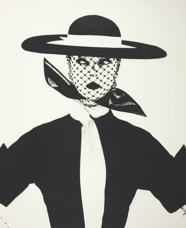
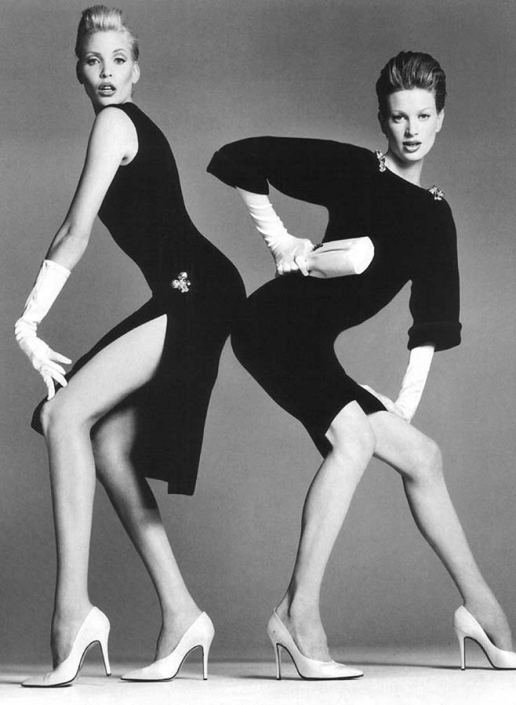
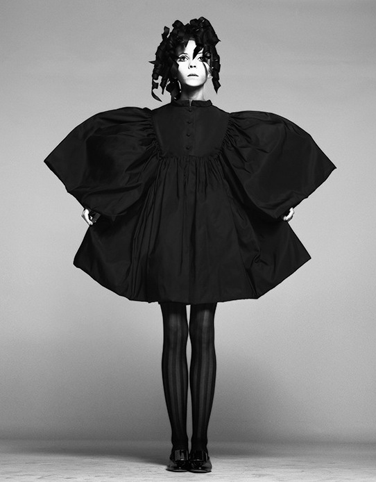
Irving Penn


Mario Testino


Richard Avedon


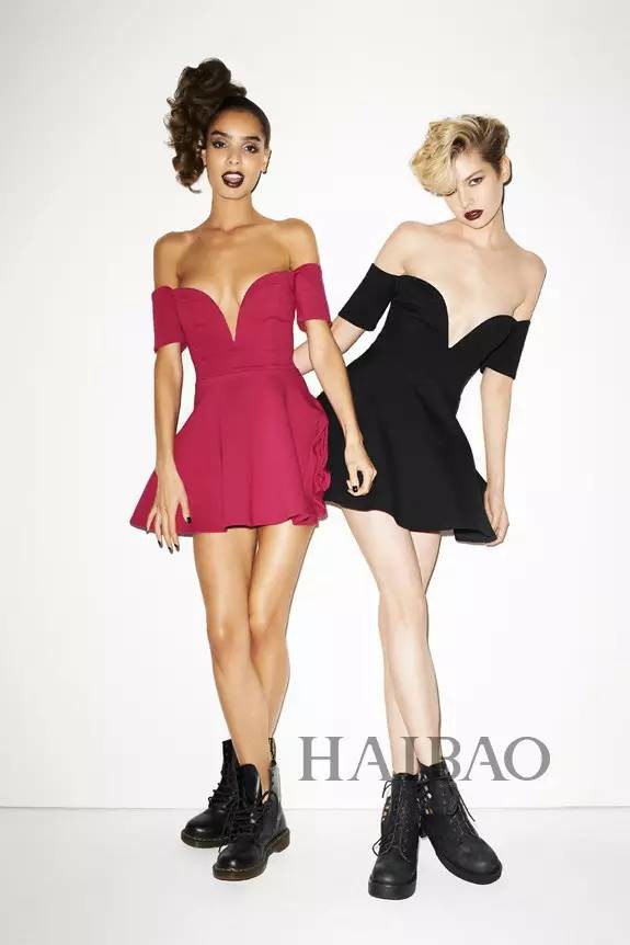
Terry Richardson


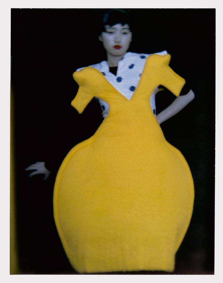
Sarah Moon


David Lachapelle

Project 3, Research point 1: Christian Boltanski

Christian Boltanski's Personnes; image from Traffic Magazine

Christian Boltanski's Personnes; image from Traffic Magazine

Analysis by terms / categories:

  • Art: this is an installation that is meant to be visited in an exhibition space.
  • Temporary: the installation was in place in Paris for just over a month. 
  • Large scale: the piece is large enough to dominate and overwhelm visitors, which is likely part of the desired effect.
  • Form: Personnes formed its own shapes, in regular rectangular deposits of clothing.
  • Immersive and Distant: the installation is large enough to walk around in, but also draws some of its power from the ability to stand back and take in its scale.
  • Repetition and Shape: the work is laid out as a series of regular rectangles of clothing lying on a concrete floor.

The media release for Personnes described it as "social, religious and humanistic exploration of life, memory and the irreductible individuality of each and every human existence – together with the presence of death, the dehumanisation of the body, chance and destiny. Conceived as a work in sound and vision, Personnes takes up a new theme in Boltanski’s work, building on his earlier explorations of the limits of human existence and the vital dimension of memory : the question of fate, and the ineluctability of death. Personnes transforms the entire Nave of the Grand Palais through the creation of a coherent, intensely moving installation conceived as a gigantic animated tableau. Personnes is a one-off, ephemeral work. In accordance with the artist’s wishes, the components of the piece will all be recycled at the end of the exhibition."

Without knowing anything about the installation, my first glances at pictures of it reminded me of the large piles of sorted clothes, shoes and eyeglasses confiscated from Jewish victims of the Nazi death camps. The empty (de-personalised) clothes cannot help but speak to us of the absence of the people who once wore them. And the rectangular piles on the floor suggested to me both that the missing people were less important than their clothes and that a rational mind had created the arrangement with deliberate purpose. The use of a crane to move the clothes makes the arrangements even more mechanistic and dehumanised.

The name of the installation—Personnes—is a play on words that reflects the dehumanisation described above: the French word suggests at once the people who would have worn the clothes and their absence ("no ones").


http://vernissage.tv/2010/01/14/christian-boltanski-personnes-monumenta-2010-at-grand-palais-paris-interview-part-1/

http://www.clg-exupery-ermont.ac-versailles.fr/IMG/pdf/fiche_prof_personnes_boltanski.pdf

http://www.domusweb.it/en/art/2010/02/01/monumenta-2010-christian-boltanski.html

Project 3, Exercise 1

Thinking back to Part 3 - Visual Communications, it seems to me that the function of Marianne Straub's textiles is to communicate a number of desirable values and attitudes:

  • The pattern of the materials, particularly when viewed down the length of a bus or a train carriage, creates or supports an identity for the transportation company. Once seen and recognized, the fabric is a constant reminder of a consistent 'brand.'
  • The quality of the materials used speak to the care that the transportation company is trying to show to its patrons. Public transport featured molded plastic seating without fabric for a while, no doubt because the seats were more durable and easier to clean. At the same time, the plastic seats were slippery, uncomfortable in summer (too hot) and winter (too cold) and could be read as a message to patrons that they were dirty and not deserving of better things.
  • The patterns chosen, although they seem outdated or even 'retro' now, would have been meant to convey a sense of modernity. Once again, this is a tacit message about the transportation company: we are a modern, forward-thinking company and we expect our patrons to recognize this and value the service they are paying for.
  • Depending upon the type of pattern chosen, there may also have been a desire to make the connection with the home environment. In this sense, patrons are visually encouraged to see their seat as an extension of their living room, a place to be comfortable and relax (rather than a train or bus crammed with other commuters). The association of the home may also encourage patrons to take better care of their surroundings because they have a personal / emotional connection with them.

Project 3, Research point 4: Wrapped Trees, Kusama, Bouroullec and Straub

Wrapped Trees

Copyright: Wolfgang Volz, ©Christo 1998

Copyright: Wolfgang Volz, ©Christo 1998

  • Starting on Friday, November 13, 1998, 178 trees were wrapped with 592,015 square feet (55,000 square meters) of woven polyester fabric (used every winter in Japan to protect trees from frost and heavy snow) and 14.3 miles (23 kilometers) of rope. The wrapping was completed on November 22. The trees are located in the park around the Fondation Beyeler and in the adjacent meadow as well as along the creek of Berower Park, northeast of Basel, at the German border. The height of the trees varied between 82 feet (25 meters) and 6.5 feet (2 meters) with a diameter from 47.5 feet (14.5 meters) to 3.3 feet (1 meter). [http://christojeanneclaude.net/projects/wrapped-trees?view=info — consulted 7 August 2017]
     
  • The wrapping was removed after a month and the materials recycled. The artists also approached the cities of St. Louis, MO and Paris concerning additional wrapping projects but were denied permission.
  • After reading the quote again in its proper context on the website (that is, it applies to all of Christo and Jeanne-Claude's projects, not just the Wrapped Trees), I can appreciate the focus on the use and properties of textiles rather than on a particular technique. The two use their materials to create and enhance temporarily, large-scale structural forms, some of which exist already and others that are revealed by the application of the textile and its particular properties.

Yayoi Kusama

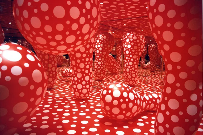
Yayoi Kusama, Dots Obsession, Infinity mirrored Room, 1998. Installation. Les Abattoirs, Tolosa

Yayoi Kusama, Dots Obsession, Infinity mirrored Room, 1998. Installation. Les Abattoirs, Tolosa

  • Art
  • Temporary
  • Large scale
  • Defining and Forming
  • Immersive
  • Pattern, Colour and Repetition

Ronan and Erwan Bouroullec

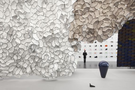
Installation view, Bivouac, Centre Pompidou-Metz, FranceOctober 7, 2011 - July 30, 2012Photo © studio Bouroullec

Installation view, Bivouac, Centre Pompidou-Metz, France
October 7, 2011 - July 30, 2012
Photo © studio Bouroullec

  • Art
  • Permanent
  • Large-scale
  • Transforming
  • Immersive and Distant
  • Pattern, Colour and Shape

Marianne Straub

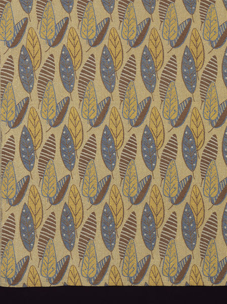
Woven, 1949, British; Straub, Marianne for Helios Ltd. "Brisbane"

Woven, 1949, British; Straub, Marianne for Helios Ltd. "Brisbane"

Marianne Straub OBE (23 September 1909 – 8 November 1994) was one of the leading commercial designers of textiles in Britain in the period from the 1940s to 1960s. She said her overriding aim was: "to design things which people could afford. ... To remain a handweaver did not seem satisfactory in this age of mass-production." [Wikipedia, consulted 7 August 2017]

  • Design
  • Permanent
  • Small-scale
  • Defining
  • Immersive
  • Pattern, Colour and Repetition

Project 3, Research point 3: Christo and Jeanne-Claude

  • The scale of the Surrounded Islands project is impressive. And although the work appears to be simple in concept (surround 11 islands with "floating pink woven polypropylene fabric") it is clear that an enormous amount of imagination, planning, logistical support and money went into the project.
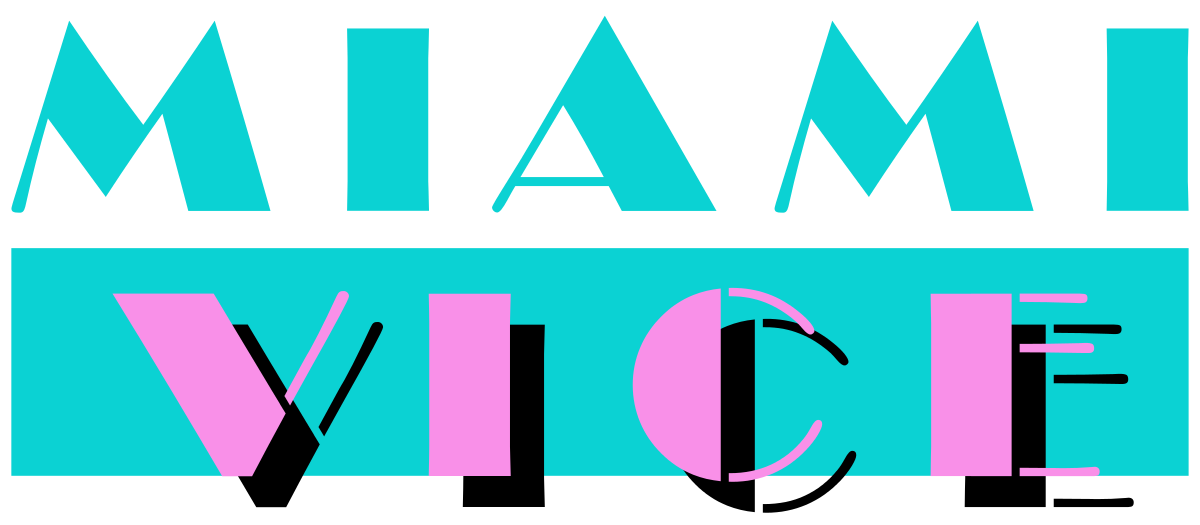
  • "The luminous pink color of the shiny fabric was in harmony with the tropical vegetation of the uninhabited verdant islands, the light of the Miami sky and the colors of the shallow waters of Biscayne Bay." This is all true, but the shade of pink also reminded me of the art deco-revival pink that was often associated with Miami in the 1980s. As just one example, the visual design of the TV show Miami Vice (1984–1990) frequently drew on the same palette:
  • The other item that caught my attention when reading about this installation had to do with the issue of impact on the environment. I wondered about the impact on the bay's wildlife, but did not expect to learn that the local flora and fauna were probably in better shape after the installation than before it. Not only did the artists exercise due diligence with a marine biologist, ornithologists and a mammal expert, but they also removed "some forty tons of varied garbage that included refrigerator doors, tires, kitchen sinks, mattresses and an abandoned boat." My expectations were entirely wrong.
  • I agree with the assessment of the Surrounded Islands project: it is a temporary, large-scale art installation that defines a series of islands by shape (although the role of striking colour should not be undervalued) and meant to be viewed at a distance.

Project 3, Research point 2: architectural uses of textiles

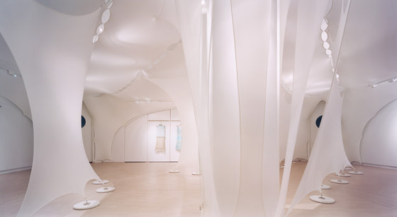
Elie Tahari Showroom, NYC — Photographer: © Michael Moran

Elie Tahari Showroom, NYC — Photographer: © Michael Moran

DAR LUZ installation by Lars Meeß-Olsohn and Ali Heshmati in Eindhoven — Photo © Johan Creemers

DAR LUZ installation by Lars Meeß-Olsohn and Ali Heshmati in Eindhoven — Photo © Johan Creemers

'Tubaloon' by Snohetta Architects for the Kongsberg jazz festival in Norway — Photo © Snohetta

'Tubaloon' by Snohetta Architects for the Kongsberg jazz festival in Norway — Photo © Snohetta

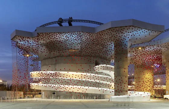
Swiss pavilion at EXPO Shanghai 2010 with X-TEND steel net by Carl Stahl — Photo © iart interactive ag, photographer: Mark Niederman

Swiss pavilion at EXPO Shanghai 2010 with X-TEND steel net by Carl Stahl — Photo © iart interactive ag, photographer: Mark Niederman

Hyparform vertical sails on a Vienna building by Planex

Hyparform vertical sails on a Vienna building by Planex

Project 3, Research point 1: prep for Assignment 5

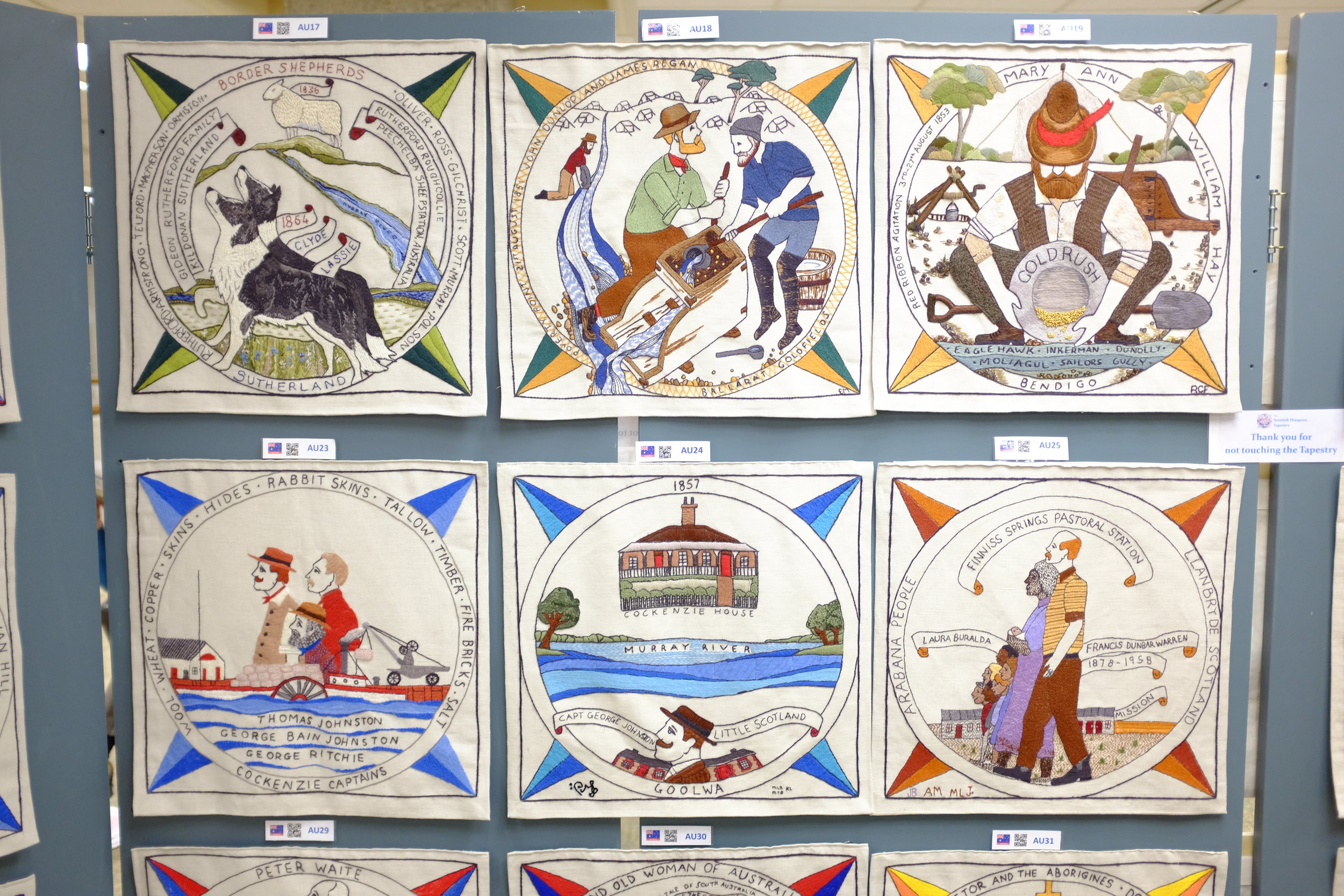
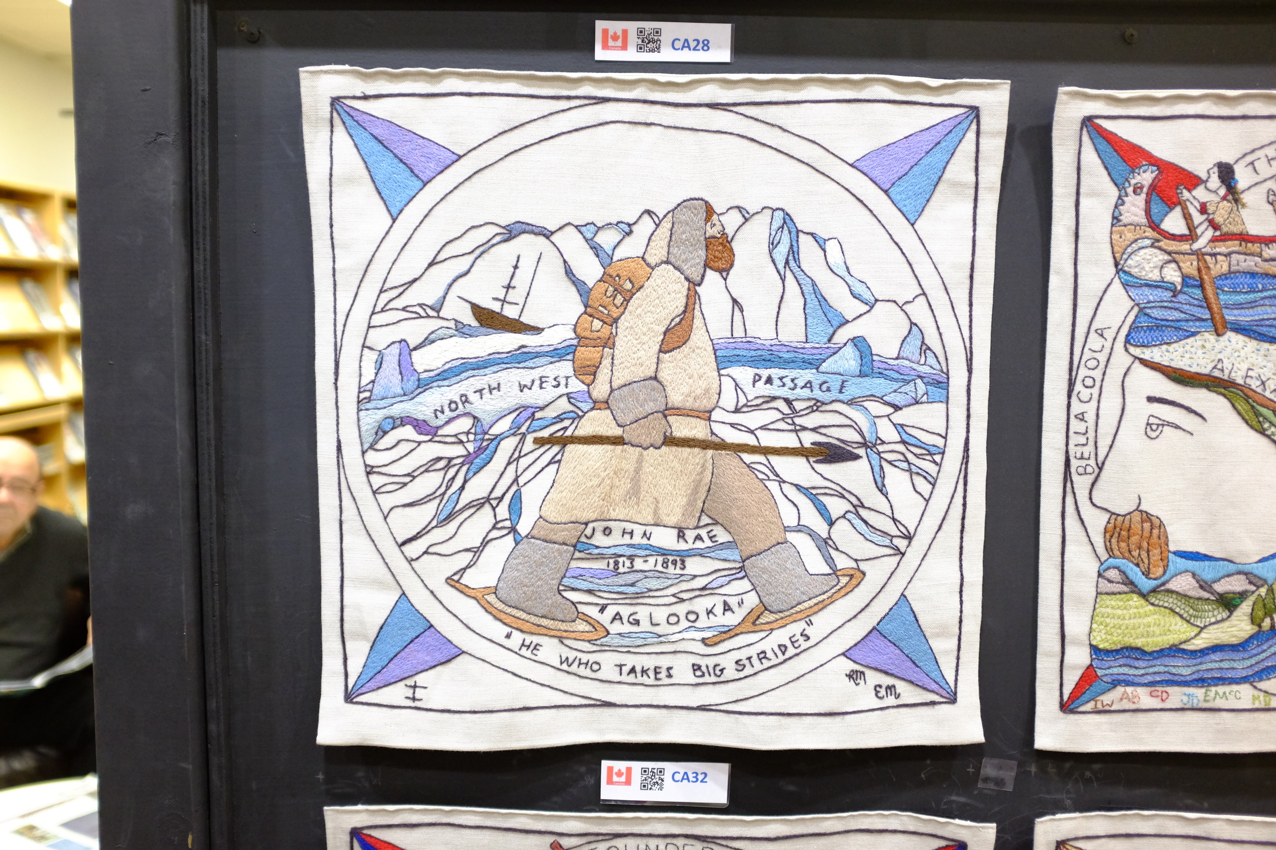
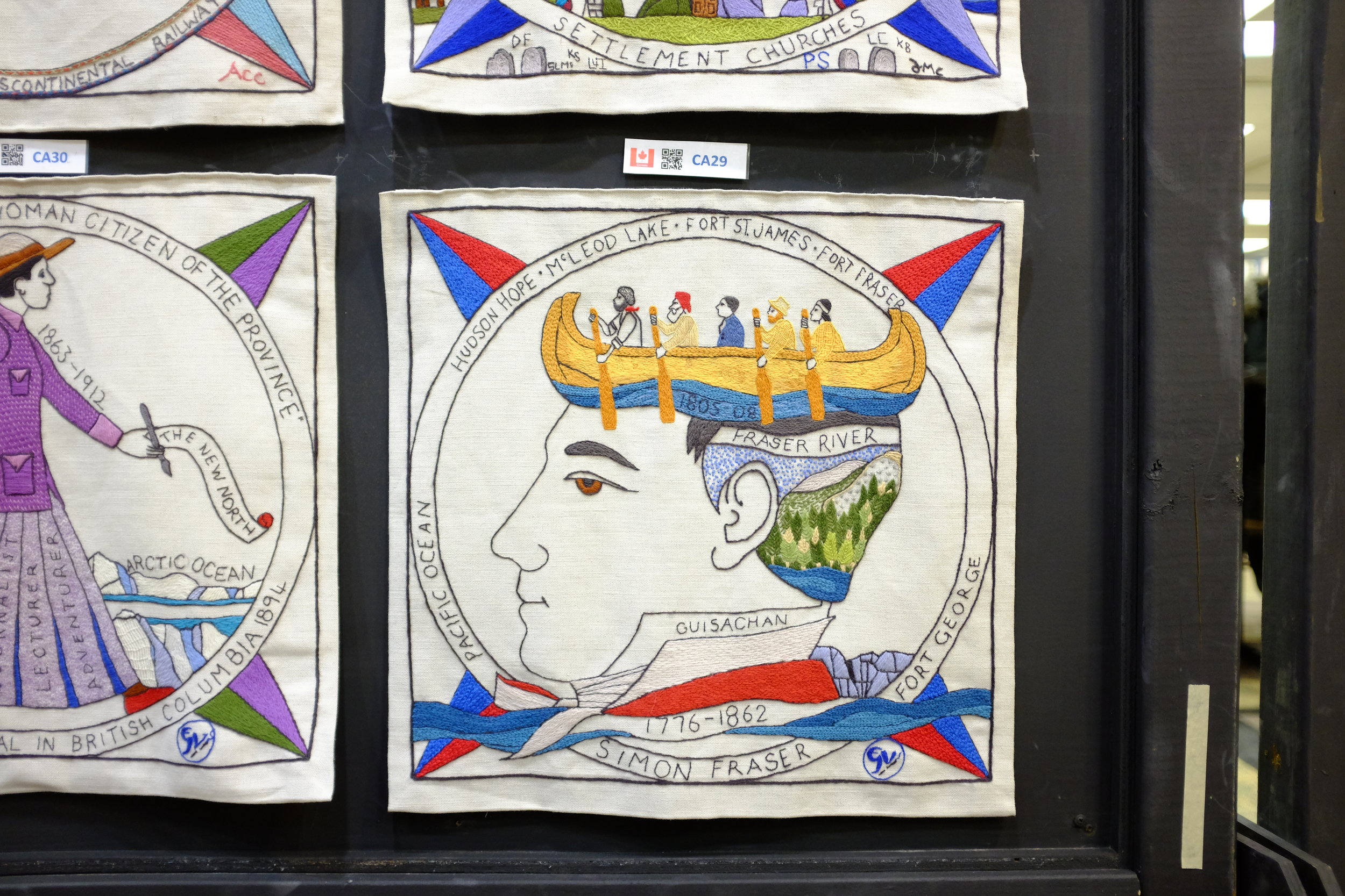
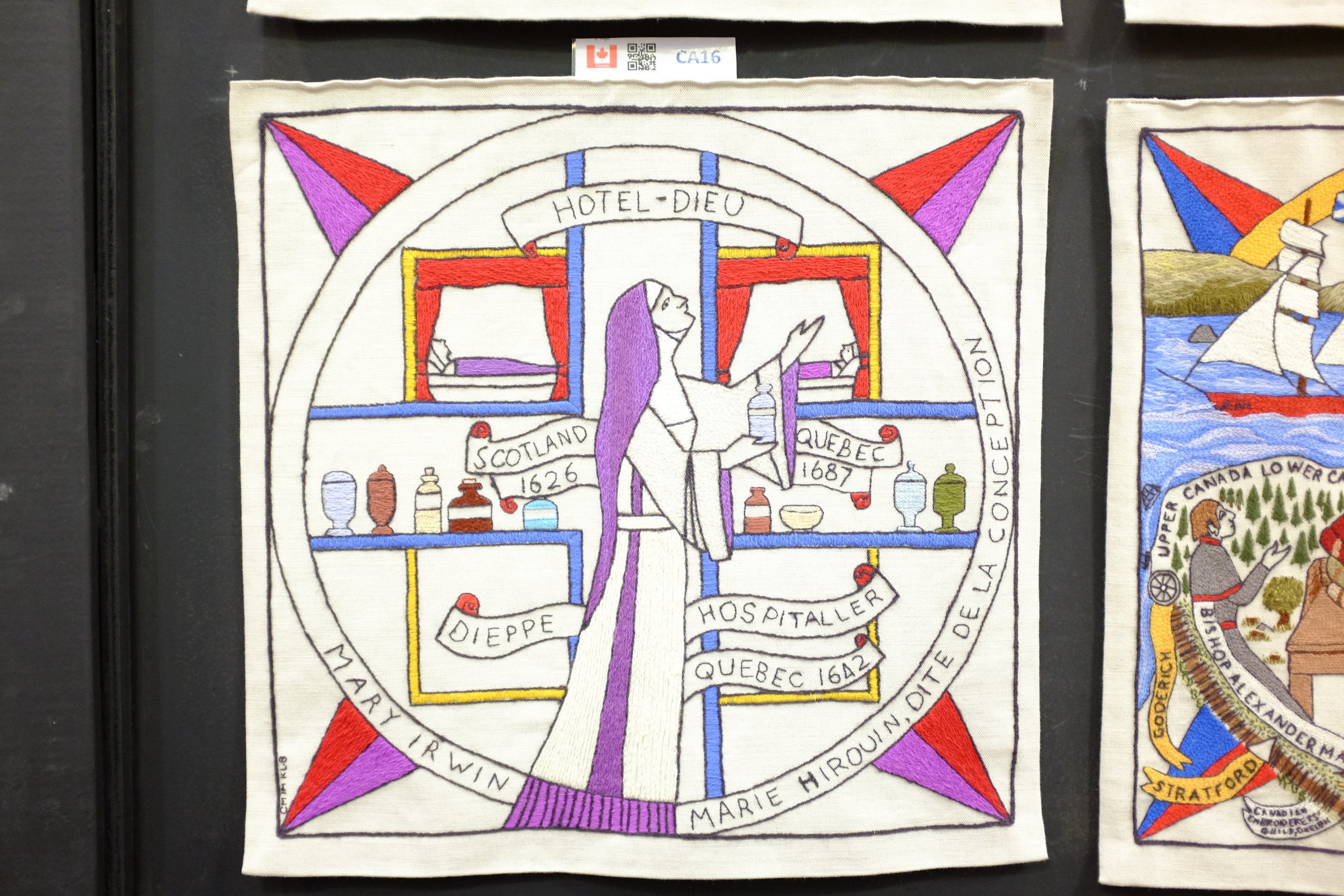
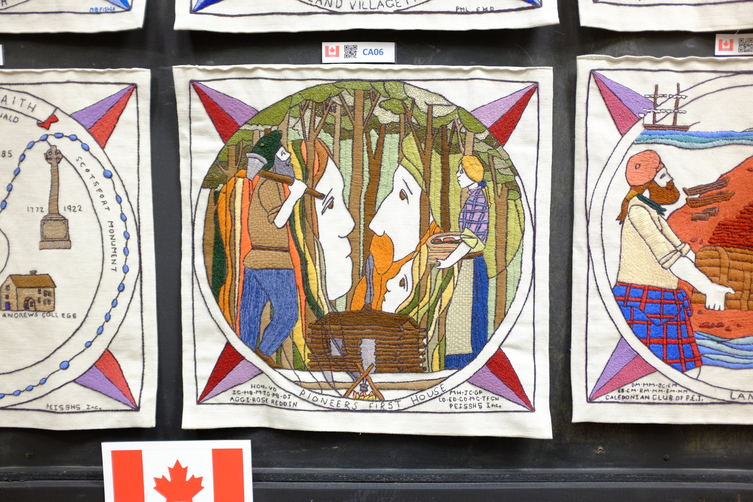
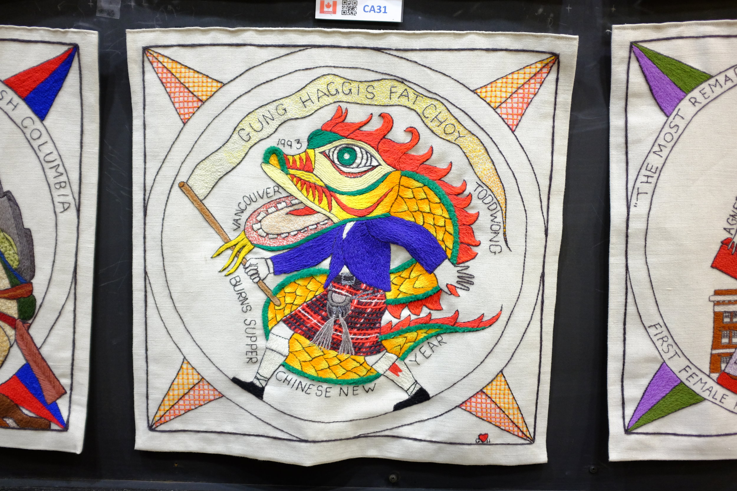
In preparation for Assignment 5 on Textiles, I've decided that I'd like to do work on the the Scottish Diaspora Tapestry. The tapestry was completed in Scotland between 2012 and 2014 and then toured the world via installations in countries with a significant population claiming Scottish heritage. The tapestry will be permanently installed in Prestonpans, Scotland. I had the opportunity to see the tapestry and photograph portions of it in Ottawa during the Canadian leg of its tour in January 2017. Assignment 5 will give me the opportunity to dig more deeply into the textile aspect of the work, rather than just the depictions of Scottish emigration and accomplishments.

A few quick shots I took of tapestry panels. These will be edited and cropped for Assignment 5.

Project 2, Research point 2

  • What is their craft and how do they approach it in their work?

I have decided to look at the work of Marcela Rosemberg, a glass-fusion artist who lives in Cobourg, Ontario. My family and I met Marcela and had the chance to tour her studio a number of years ago when she lived on Prince Edward Island.

  • Do they adhere to the ideas of Slow Design? To what extent does this allow them to take risks, experiment and innovate?

I have not been able to find any explicit reference by Marcela to Slow Design, but some of the things she says about her own artistic practice are reminiscent of the movement's commitments and principles. The following passage from the "About" page on her website is a good example: 

Beauty, simplicity, elegance and functionality are essential components in Marcela Rosemberg’s designs. At her studio, she’s always looking for that special blend of colour and texture that leads her to each piece of art she carefully designs. She treats glass as if it were a human being, by respecting it and not pushing it. This allows her to understand its flow, displacement, behavior, and action up to its most intricate inner part… Its core. That is why Marcela always says: “Each time a piece leaves my studio I feel a little bit of my soul is going with it”.  

I remember very clearly from the studio tour that Marcela is constantly experimenting with combinations of colours and pigments to be used in her fused glass creations, as well as with new forms and purposes for the finished products. She was good enough to show us some of the less successful efforts that she still had on-hand, so it was clear that she was indeed trying new things and taking risks.  

  • Is their story or the story of their work important? Why?

Marcela's story is clearly very important to her and to the artistic identity she has established over the years. As her website explains, "[t]he ocean and her Jewish faith are the main sources of inspiration in her sculptural and functional current work."

Her website goes on to explain how when Marcela left her native Argentina she relocated in Atlantic Canada and that "her colours and designs are still standing strong on the East coast where she created a brand for herself."

Marcela Rosemberg, Dancing Vessel

Marcela Rosemberg, Dancing Vessel


The importance of her Jewish heritage can be seen in the beautiful pieces that are clearly designed for the Jewish community

Marcela Rosemberg, Miracle Menorah

Marcela Rosemberg, Miracle Menorah

Marcela's emphasis on her considered and hand-made approach to her work, as well as the emotional attachment that she has to her pieces will no doubt be a part of her story that is significant to her clientele, both those who are already clients and those who would like to feel that they are buying a unique creation directly from the designer-maker.

  • Do you value ‘craft’ and craftsmanship? Why or why not?

 Certainly. I get a great deal of pleasure from seeing the work of someone who has perfected their art or craft to a high degree -- I appreciate both the amount of work that has gone into making difficult things look effortless, as well as the finished product itself (whether that is an object or a performance). And this is not a recent thing for me: I remember being fascinated at the age of 12 by the skill of a backhoe operator who was excavating the hole for the pool that was being installed in our backyard. He operated a piece of heavy machinery like it was a surgeon's scalpel, working quickly to remove earth by following a spray-painted line on the grass, never once making a false cut. I thought of that craftsman years later when I read Aristotle's view that virtue is the practised skill of living well.

  • Is there room for craft in modern society?

 No question. Dedication to 'craft' is needed in so many areas of our society, not only in the arts, but also in the world of work more broadly. All work has value if it is approached with an attention to perfection of a craft and the pursuit of excellence. This extends from ensuring that ancient and traditional kinds of 'know-how' are not lost, to reminding us that the mass-produced may have brought us economies of scale but that there is still great value in considered, skillful and sustainable design and making. And this is true both for the maker and for the one who receives the made good. We cannot all be craftspeople in every field and inexpensive consumer goods have their place, but we are all richer when each of us has something in our life that we pursue as a craft, for our benefit and for the benefit of others.

Project 2, Exercise 1

  • Do you believe there is a demand for hand-made objects and work? Why do you think that some consumers seek out these qualities in the objects they buy?

Yes, there is certainly a demand for the hand-made. Some consumers are looking for a perceived improvement in quality; others would like to support craftspeople; and others again have a philosophical or ethical commitment to hand-made goods.

  • Do you think the desire for hand-made products is based on a romantic perception of the hand-made and a sense of ‘post-industrial nostalgia for the pre-industrial’? Why or why not?

I think this is probably the case for at least some of the interest in hand-made goods. I consider that it is a similar type of attraction that some people have for music on vinyl or analogue/film photography—there is a romantic attachment to a physical artifact that is not entirely dependent on hi-tech to make it accessible or to be enjoyed. Some of the attraction may also be based on aesthetics: some people believe vinyl has a 'warmth' that digital audio does not; some believe that there is superior quality to photographic film or that it too has a warmth not available in a digital image.

  • Do you feel that hand-made products are viewed as luxury or value-added products? How do hand-made items compare with mass-produced items, in terms of their value, life cycle, cost and ethics?

Hand-made products do not necessarily have to be more expensive than mass-produced items, but they often are because of the limited scale of production and how labour-intensive the production is. So, yes, hand-made items are often viewed as luxury items—it is often less expensive to buy the mass-produced item (which is generally better marketed, too). It is hard to compare the value, life cycle, cost and ethics of hand-made goods versus the mass-produced—I think it depends largely on the item in question. I don't believe hand-made is inherently superior, but I believe it has a cachet that mass-produced items do not.

  • Reflect on any hand-made item you own (not necessarily textiles). Can you remember why you were drawn to it? Did the fact that it was hand-made make it feel ‘special’ or did you just buy it because you liked the design? How did its price compare with the industrially-produced equivalent?

When I travel with my family we often buy one or two items to bring home with us. These are not strictly 'souvenirs' but they do remind us of the place we have visited and we lean toward hand-made goods. We—rightly or wrongly—have the feeling that the hand-made item has a greater connection to the place and the people we have seen. And the hand-made item often has a uniqueness or a particularity about it that does not come through in a mass-produced piece. The price of the hand-made item may be more expensive than a factory-made 'souvenir' (usually made overseas), but this is not a factor in our choice—we always opt for the local item.

For example, when we visited Belgium for a month a number of years ago, we could have bought tourist souvenirs in any number of shops. Instead, we chose to buy a small figure made by sculptor Lut Brackx. The figure sits in our living room and reminds us of our time in Belgium and the side street in Antwerp where we came upon Ms. Brackx's shop by accident and chatted with her husband for a while. A mass-produced item would not elicit quite the same feeling for us.

Project 2, Research point: Slow design

  • What are the guiding principles of this movement?

'Slow Design' is an offshoot of the broader 'slow' movement which began with the interest in Slow Food. One description of Slow Food runs as follows:

Slow Food envisions a world in which all people can access and enjoy food that is good for them, good for those who grow it and good for the planet.

Our approach is based on a concept of food that is defined by three interconnected principles: good, clean and fair.

GOOD: quality, flavorsome and healthy food
CLEAN: production that does not harm the environment
FAIR: accessible prices for consumers and fair conditions and pay for producers
— 'Our philosophy' at slowfood.com (https://www.slowfood.com/about-us/our-philosophy/ accessed 15 July 2017)

A similar approach can be seen on the website of Slow Swiss-made Watches, where the company describes the philosophy behind its single-hand, 24-hour timepieces:

slow watches were created to shift the way people read time. So rather than focusing on the second or the minute we have produced an instrument that measures the moment.

slow does not describe a speed…. It’s a mindset that most of us somehow lost. As a result of our busy lifestyles, we often forget that we actually have a choice of how to live. The slow watch (we named it slow Jo) is a subtle reminder that time is the most precious thing we have so we should enjoy everything we do and stop chasing every minute.
— slow-watches.com (accessed 15 July 2017)

Since the advent of Slow Food, the 'slow' label has been applied to wide range of cultural practices and phenomena such as aging, religion, education, fashion, media, science, photography and travel, to name just a few.

Slow Design has many practitioners and descriptions, but it shares commitments with the broader Slow movement around simple living, work-life balance, concern for time-poverty, and sustainability of materials and process. The ever-growing manifesto of just one Slow Design company, Deep Craft, is a useful illustration of how 'Slow' can be applied in design and fabrication. The first 11 principles (out of a list of 67 on 15 July 2017) from the manifesto are:

  1. Market = Material Provenance
  2. Maintenance = Improvement
  3. The functional lifespan of a constructed thing should mimic the lifecycle of its principle material.
  4. Entropy adds value: The functionality of a thing by definition incorporates/embodies its decomposition.
  5. Handwork may be the bedrock of innovation, but nostalgia for handwork is quicksand.
  6. Prepare for unintended consequences.
  7. Optimize beneficial end use.
  8. All vessels originate with an imagined voyage.
  9. Perfection is impossible to maintain.
  10. The tool shapes us as much as we shape the tool.
  11. Craft practices and products simultaneously preserve knowledge and resources.
  • Do you believe this approach to design and making could have a positive impact on our consumption of products?

Yes, I do believe this, but I expect that the impact will be relatively limited. From what I have observed, the Slow approach is most often promoted by people who are fairly well-heeled. It might be nice to know exactly where the wood for a new piece of furniture was sourced, that the piece itself was hand-carved and that a new tree was planted to replace the one that was felled, but this is production by the few, for the few. The Slow movement may wear humble clothing, but it is currently an indulgence for the wealthy, largely because hand-crafted items are usually much more expensive than those mass-produced. For Slow to have a real impact on the consumption of products, it would need to touch all sectors of society, be affordable to a broader range of people, and transfer more of its profits back down the production chain to the source.

  • Would you place more value on a product that has been created with this principle in mind? Why or why not?

I might, but it would depend on a calculation of 'value' to me and to my family. I would love to be able to buy beautiful, practical hand-crafted goods (although hand-crafting is not an immediate guarantee of superior quality), but sometimes we just need something 'good enough' that we can afford within our overall household budget.

I am sympathetic to the commitments of the Slow movement, but there are numerous factors to take into account.

Project 1, Exercise 2: Sustainable products

I live in a semi-rural area in Western Quebec. We are not connected to the municipal water or sewer systems, so our drinking water comes from a well on our property and our waste water is treated in a septic system buried in our yard. All of this means that we have tried to pay attention to the kinds of products that we use in our house and what we put in our waste water, to avoid polluting our immediate environment.

The dishwashing liquid that we currently use is called "Bio-Vert," whose name and packaging suggest that it is good for the environment.

The label on the front of the squeeze bottle make a number of explicit "green" claims:

  • Gentle on Hands
  • Biodegradable
  • Carcinogen free
  • Hypoallergenic
  • Green Leader since 1984
  • Ecologo from Underwriters Laboratories
  • Produit certifié à impact environnemental réduit

And there are more claims on the back of the bottle:

  • Biodegradable as per the OECD test series 301
  • Safe for septic tanks
  • No animal testing
  • Environmental facts: contains 0% of Formaldehyde, EDTA, Dye, SLES, DEO, APEOs, or Petroleum Solvants
  • Recyclable Container and Labels: 100%
  • Product certified for reduced environmental impact. View specific attributes evaluated: UL.com/EL; UL 2759

That all sounds very impressive, although I don't know what most of it means. And there is still a warning in all caps: "PLEASE KEEP ALL CLEANING PRODUCTS OUT OF REACH OF CHILDREN. IN CASE OF EYE CONTACT, RINSE THOROUGHLY WITH WATER. IF SWALLOWED, DRINK PLENTY OF WATER AND CALL A POISON CENTRE OR A DOCTOR IMMEDIATELY."

As far as I can tell from the company's website, its FAQ page and the accreditation from UL's environmental group, it would seem that the claims made by Bio-Vert are legitimate. To test the claims, however, I would need to spend a considerable amount of time researching the impacts of the chemicals named (what is EDTA?), the standards and tests employed by the various research groups (UL) and quasi-governmental agencies (OECD), the company's practices, its use of the accreditation symbols, and its track record in the marketplace. Even if I had the time to do all of these things, I do not have the necessary technical knowledge and competencies to evaluate all the evidence myself. Like most people, I am obliged to trust the recommendations of specialists and to hope that the company is representing the findings of those specialists fairly and accurately.

Project 1, Exercise 1: Sustainability

How would you define ‘sustainability’? Look it up if you’re not sure.

  • Sustainability is a state or practice of ensuring that processes can continue over long periods in a way that does not drain resources, environments (natural, physical, social/cultural, economic) or peoples.

In what contexts is sustainability an issue? Think more broadly here – not just textiles – and write a list.

  • Sustainability is an issue in any context where there are finite resources in a closed system. It was possible for us to think of the earth's resources as endless when there were fewer of us, when we lived farther apart and were largely ignorant of the consequences of such thinking. It is now clear that much of what we depend for life and the enjoyment of it is not limitless:
     
    • land
    • air
    • fresh water
    • wildlife
    • plant life
    • arable land
    • raw materials
    • fossil fuels

How do you think sustainability might be addressed in relation to the production and consumption of textiles and other manufactured products? Use the stages of the life cycle to help you with this question.

  • Perhaps the starting point for any thought about sustainability has to be an acknowledgement that it must be a collective effort. As individuals we can all make a commitment to living in more sustainable ways, but it will not accomplish much without some form of collective action in all sectors of society, the economy and governments. And even though larger actors—such as governments and larger corporations—wield considerable influence, the results they achieve will only be partial without some sort of groundswell of popular support.
  • All stages of a production cycle—from resource extraction or recovery, to material choice, to refinement, to design, to production / manufacturing, to marketing and sale, to transportation, to consumption and eventual disposal—must be assessed for the way they promote sustainability of life or detract from it:
  1. Agriculture/raw fibre production — Is land use supportive of the local economy? Are agricultural practices based on sound ecological / green principles? Does crop choice exhaust the soil or displace food crops for local farmers?
  2. Ginning — How much energy is consumed during the process? Are there any waste products? If so, how are they treated?
  3. Spinning — Energy consumption? Does automation displace human workers?
  4. Weaving — Energy consumption? Are there jobs for human workers? If so, do they allow for a living wage?
  5. Processing — Energy consumption? How close are processing sites to spinning and weaving locations? Are dyes and other chemical products natural? Are they disposed of appropriately? Could they be toxic or allergenic?
  6. Stitching — Do stitching techniques support a long life for final products or are fabrics designed to fail early to promote repeat consumption?
  7. Distribution/retail — How much energy is consumed and pollution created by transportation? If products are created in volume, will they be used or end up as landfill? Are price markups calculated to benefit all participants in the production chain, or just those at the top?
  8. Use/consumption and end of life — Do consumers care for products? Are they disposed to mending products themselves, or do they discard them quickly? Can products have secondary or tertiary uses or lives? Can materials be recycled easily?
  • The assessment needs to be done at each stage of the process, but must also view the entire chain as a whole. (There is not much point in working only with natural, renewable fibres if transporting and processing them means fouling the environment.) The chain must also be examined at each stage for its impacts on related, but perhaps distinct chains. (Does increased use of a particular textile mean that there is less arable land available for growing a local food crop? Does a more efficient manufacturing process in terms of volume and speed of production have the side-effect of ruining a local labour market?) Where necessary, governments should be ready to use a combination of regulation and incentives to help direct producers and consumers to healthy outcomes. Business must take corporate responsibility seriously. Individuals must inform themselves and place long-term value ahead of short-term savings.
  • All told, there must be commitment across sectors of the economy to operate in a way that promotes human and environmental flourishing, both locally and farther afield. This will not appear overnight, but will require the development of common vision that is sensitive to both place (local and global) and time (the long game).