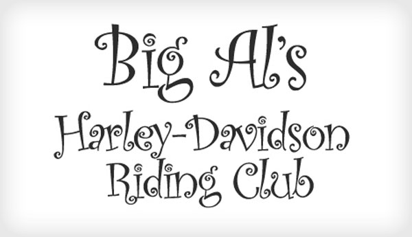
Messages communicated by the writing
- Enjoy your stay: the message of the words is inviting, but the formal (Gothic?) script seems to work against the message. Perhaps, though, this is meant to be an appeal to a sense of the traditional or old-fashioned. If that is the case the message and typeface might work together. Context and audience would play important parts in how such a message would be read.
- DO NOT FEED THE ANIMALS / THEY ARE DANGEROUS: the use of all capital letters communicates a sense of the urgency of the message, which is an important one for anyone concerned about their safety. The typeface, however, might be seen as less than serious. Why not choose a simple, sans serif typeface that communicates less ambiguously?
- We are professionals: the typewriter script is something we no longer see very often, except perhaps in advertising or on book covers. Perhaps the use of such an "old school" typeface is meant to be ironic, to evoke a particular kind of office work, or to give the reader confidence that the writer has older (and reliable?) values.
- LUXURY: the typeface aims to be exotic and might be successful in advertising a luxury good (perfume, perhaps?). At the same time, the type is probably a little less legible than it could be—although this could have the beneficial effect of encouraging a potential buyer to slow down and read more carefully.
- hand made: the text in lowercase, sans serif type is very legible and gives a sense of lack of pretension. It could be an effective way of presenting a hand made product with an air of honesty. In that way, text and type would work together very well.
In each of these examples, context and audience would be important factors in judging the effectiveness of the visual communication. Any one of the examples could be effective or ineffective, depending up the use to which it is put.
Additional examples where text and typeface do not complement each other:
Additional examples where text and typeface do complement each other:


