Project 1, Exercise 2

Write a list of everything you’ve read or written or seen or heard in the last 24 hours.

List compiled 25/06/2016

Read:

  • Black and White magazine
  • The Aylmer Bulletin (local newspaper)
  • Websites and other social media: The Perth Kilt Run; FaceBook; Instagram; Twitter
  • News items: Brexit reporting and analysis; the European Cup; the rise of Donald Trump in the US elections; death of Bill Cunningham

Written:

  • not much at all

Seen and heard:

  • Websites
  • travel to Perth, Ontario and conversations in the car
  • a stroll around Perth: Kilt Run; performers; runners; booths; wait staff; restaurant and pub patrons; families and couples in the park
  • tail end of a documentary on Gabriel Garcia Marquez
  • deck at the back of our house; trees; animals; wind

1. How many stories are contained within your list? This could be anything from notes in your diary to the afternoon play on Radio 4, from a friend recounting a funny tale to the latest news online.

There are multiple stories in every one of the examples from the news media and on social media; stories told in the car; the documentary. And although I couldn't overhear them, the people at the events and in the public spaces would be telling each other stories, too. In other words, a great many stories were being told to me or around me in a single day.

2. How much of what you’ve read (or written or seen or heard) would you consider to be ‘art’? What makes writing art? How do you, personally, define a creative and artistic piece of writing? Make some notes in your writing diary. You might find it useful to refer back to the discussion at the start of Part One. That was about the visual arts, but many of the same points apply to word-related arts too.

There are many possible applications of the term "art" to the stories being told around me, because it is indeed an art to tell a story well, whether in person or via some other medium. If we return to my understanding of art at the end of Part 1, though, few or none of the examples listed above could be considered "art."

In Part 1 I wrote, borrowing from Grayson Perry's eight-part test, that the decision that a particular piece was "art" involved "a cluster of judgements that take in the creator, the created object/event, the venue and the audience(s)". The examples above might contain one or two elements from that list, but none can be said to compile all the elements necessary for a judgement of "art." At the same time, there is nothing to say that one or more of the activities above could not be judged later as art, given a change of context. For example, the documentary on Gabriel Garcia Marquez or some of the images or videos on social media might one day be considered art, given the right change of time, place and viewing audience.

Project 1, Exercise 1: The Textual Revolution

Take a moment to think about the wider implications of this textual revolution.

1. What happens to a story when you take it from its source, make it permanent in print, and disseminate it to a wide audience?

  • there is potential for broader distribution
  • there are now roles for distributors, editors and translators in the process
  • the author loses the possibility of instant feedback and error-correction
  • there may be a need for interpretation with changes in context, time and place
  • there is loss of authorial control
  • there is potential for significant misunderstanding
  • the text may transcend its original time and place through language
  • questions around who will be the new readers, in what contexts?
  • at times, the printed word can bring a permanence to texts that should be, or were meant to be, transitory

2. Write a list of implications arising from the printing press. For example, think about who has control/authority over the text, the meaning of the text, and the relationship between the source of the text and its recipient.

  • all of the above, plus issues of cost, fees, mass production
  • potential for lack of access or censorship for some texts or for some audiences

Part 2: Creative Reading

So, we're on to Part 2 of Creative Arts Today, a little wiser about how the process works and ready to make progress a bit faster.

Some reasons people read

  • to learn
  • to be entertained
  • to understand
  • to pass time
  • to escape
  • to be informed
  • for work
  • for instruction
  • for worship or devotion
  • for pleasure
  • for community or shared experience

Some reasons people write

  • for self-expression
  • to remember
  • to bear witness
  • to guide
  • to instruct
  • for work
  • to teach
  • to entertain
  • to inform
  • to convince or form opinion
  • to help others
  • to find like-minded people or form community
  • for enjoyment
  • for the pleasure of words
  • to explain or justify
  • to leave a record
  • for worship or devotion

It's quite clear that the two lists are very complementary. It suggests to me that the two groups need or seek each other and likely overlap: some readers are writers; and it's safe to say that probably all writers are readers.

Following up -- suggested readings following Assignment 1

  • Cinéma Vérité Documentary -- This article, from the perspective of a filmmaker is helpful in pointing out some of the strengths and pitfalls of the cinéma vérité ("truth cinema") approach. The pitfalls include the one I alluded to in my assignment, namely that the presence of a camera often influences the behaviour of all participants and renders the film that much less "true" or "real." One strength of cinéma vérité that excites the author is the potential of the film to find its own path during the editing process, claiming that "the story wants to tell itself." This would indeed be exciting but it seems a bit naive, given the author's understanding that the filmmaker is not an objective observer, but a participant in the process. The end of the article nevertheless shows that he is fully aware of this: "But if you want to 'shoot the truth', don't forget that you - the director - will ultimately make that 'truth' what you think it should be. Cinéma vérité in reality is 'Film Truth' as you - the filmmaker - saw it." Fair enough, I suppose, but this kind of "truth" -- subjective and limited -- is likely not the vérité that the French documentarians had in mind in the 1960s.

  • Marshall McLuhan lecture, The Medium is the Message - 1977 -- This is an interesting and wide-ranging Q&A session following McLuhan's 1977 lecture in Australia. Although the phrase "the medium is the message" has been in circulation since McLuhan published Understanding Media: The Extensions of Man in in Canada in 1964, it seems to have been misunderstood frequently. From the video of the Q&A, the primary point appears to be that the impact of a medium on the structures and experience of society vastly outweigh the impact of any one example or instance of the medium. For example, the effect that the coming of TV had on society was much more important than any episode of any particular program. The significance of this is that we tend to focus our attention on a program (was it good, bad, banal or immoral?) but neglect the effect that the medium is having on the ways that we conduct our relationships, education, public discourse or politics. In the particular case of broadcast media we forget that they affect us like the air we breathe and the water we drink, whether we choose it or not. This does indeed diminish content in favour of form, but I'm sympathetic to the idea: it reminds me very much of Jacques Ellul's argument (in The Technological Society (English, 1967) and The Technological Bluff (English, 1990) that technology is not neutral: we may think that we can employ technology for good or for harm, but we generally miss the point that the mere existence of a new technology reshapes society -- it changes the boundaries of what is or is not possible, what is or is not thinkable. I'm sure I'll be returning to McLuhan and Ellul.

  • Terry Barrett, "Teaching about Photography: Photographs and Contexts", Art Education, Vol. 39, No. 4. (Jul., 1986), pp. 33-36. -- This discussion of context as a path to interpretation and understanding in photography offers a useful scheme of internal (the "givenness" of the image), original ("that which was physically and psychologically present to the photographer when the image was made") and external (the new contexts created by how and where the photograph is presented) contexts. A change to one or more of these contexts will necessarily have an impact on how a work is understood. It seems to me, however, that there is at least one other context to be considered: that which the viewer brings to the act of viewing and interpretation. Barrett may deal with this in his other writings, so I will want to return to his site to benefit from his thinking.

  • Katie Duffy "Realism Final -- Middle Space: Bertold Brecht and Antonin Artuad’s [sic] influence on Jeremy Deller and Zoe Beloff" -- Duffy discusses an important distance between artist and spectator: "Jeremeny [sic] Deller and Zoe Beloff have placed a particular emphasis on not only the middle space that is the “artists cinema” but also the middle space between actor and spectator." This is the broad point I was making in Assignment 1 ("[Deller] turns audiences into actors"), but Duffy's article provides some historical and theoretical underpinning for my intuition. The distance created between audience and art by the artifice of historical re-enactment, for example, is designed to prevent the audience from adopting an easy interpretation from the work itself. Instead, viewers are provoked to consider a range of meanings that could be suggested by the work and to construct sense for themselves: there is no single narrative or viewpoint. This postmodern approach to art and narrative was not an accident for Brecht but part of a deliberate rejection of the theory of drama and narrative laid out in Aristotle's Poetics.

  • Natasha Hoare, The White Review, "The Past is a Foreign Country" -- "Distant, intangible, unreliable, lost, our histories, at the levels of personal and national, are at best half-remembered and at worst actively misrepresented." Hoare reviews a number of works, including Deller's Battle of Orgreave, and discusses how historical reenactment allows the audience to relive and reinterpret an even. In some cases, reenactment allows participants to do so as well (such as in Orgreave and Gillian Wearing's Bully [2010]).

Assignment One

Part A: Reflective learning

My understanding of what constitutes “art” is probably a little more nuanced now. Building on Grayson Perry’s idea that quality in art is arrived at by a tribe, it might be fair to say that art itself is defined by a tribe. I find this helpful because it gets me away from having to rely so heavily on the creator’s intent: there are doubtless people involved in creating art who would never use that label just as there are people who are confident that their productions are art, even if they find no appreciative audience. It might be ideal if both creator and appreciative / judging audience could agree on the definition or value of work. Perhaps the best way to see this is as an ongoing creative conversation between artist and audience(s), recognizing the impacts that changes in time and place will inevitably have on both creating and interpreting.

Over the course of Part One I’ve been introduced to a number of artists who are new to me and have appreciated starting to exercise interpretive approaches. I’ve also had the chance to spend time looking at a wider range of art forms and media than I’ve been used to. Not surprisingly for a beginner, there are large gaps in my awareness—and understanding—of contemporary artists and art forms, particularly in the area of more conceptual art. This is an area where I’d like to deepen my knowledge. I’d also like to develop a richer vocabulary to describe what I’m seeing.

As I look through my learning log I can see that I lean fairly heavily on words and photographs but have incorporated few or no sketches or scans of notes / brochures. Still, I usually have a camera or smartphone with me so it is natural for me to reach for those tools to document what I see. This reflects my areas of interest, but I think I could probably push myself a little harder—I’m not comfortable with my sketching ability, but it could only improve with practice. All told, I think the one area that would give the greatest improvement would simply be to post entries more often. I could probably do this if I relied a little less on text and more on images—not a bad thing to do as I work through a course of studies that is largely about appreciation of visual culture.


Part B: Jeremy Deller’s Battle of Orgreave

 Essay submitted to tutor in MS Word.

Reflection on tutor's feedback to Assignment 1

I'm late getting back to the coursework after some recent changes at my job and a month's holiday in Scotland. Things are back to "normal" now, so it's time to get cracking on Creative Arts Today. 

I probably put off submitting Assignment longer than I should have because I wasn't completely confident with my work or the requirements of the course. I'm not suggesting that there is anything wrong with the OCA course materials: it's more a case of getting used to distance education rather than more customary on-site education. Assignment 1 broke the ice, though, so I'm fairly sure I'll move through the remaining assignments at a better pace.

As it turns out, I was pleased with my tutor's feedback. Garry had clearly read very carefully what I had written and I found his comments both helpful and fair. The one sticking point was that he had not received the URL for my learning blog, so he had to rely solely on the Word document that I submitted for the assignment. I did indeed include it via the OCA submission interface, but I'll make a point of including the blog's link in the Word document itself next time. 

Garry's overall comments about my writing style and content were positive and he identified a couple  of areas that I could strengthen: 

  1. some research gaps; and
  2. the need to be more specific in some of the statements I made. 

The research gaps were largely related to drawing on thinkers and critics in the arts whose work could illuminate, bolster or challenge some of the points in my paper. As a new student in the visual arts I think this is normal and I will look to broaden my knowledge of theory, criticism and performance as I progress through this course and others. I appreciate the additional references and links Garry provided and will follow up on them. I will likely blog on the pieces that I find most useful or provocative. I expect that my understanding will increase through this reflection and that my critical vocabulary will grow and allow me to express myself on the arts with greater accuracy. Expanding my understanding and "toolkit" will also help me to situate my comments within a larger conversation around art criticism and appreciation. Given the negotiated meaning (negotiated among artist, viewer, critic, etc.) and social dimensions of contemporary art, it will be important to have this degree of awareness about one's own thought and expression, and those of other people. The issue of context has multiple dimensions and it is crucial to know where one stands in relation to time, place and discourse.

I accept without reservation Garry's comment on my need to be more specific in parts of my text. As I read through what I had written I could see exactly what he meant. I don't think I need to spend a lot of time reflecting on this: it's something I need to watch for in future writing.

As I mentioned earlier, I will follow up on the additional readings and references Garry has provided. They will supplement my learning and I look forward to reading them.

Garry also mentioned that he had a grid that outlines modernist/postmodernist definitions and strategies. I have some familiarity with these in the fields of literature and philosophy, but I am sure I would benefit from seeing how they are applied in the visual arts. 

All told, I breathed a sigh of relief as I worked my way through the comments from my tutor. He spent time on what I wrote, made some encouraging remarks about my writing and thinking, and directed me to some additional sources to help deepen my work. I couldn't ask for much better than that and -- importantly for me -- the exercise provided me with a baseline for expectations. (So that's what they're looking for!) 

I've learned some things, I'm encouraged and I'm ready to work toward Assignment 2.

No complaints here. 

Case study: 'A Place Beyond Belief'

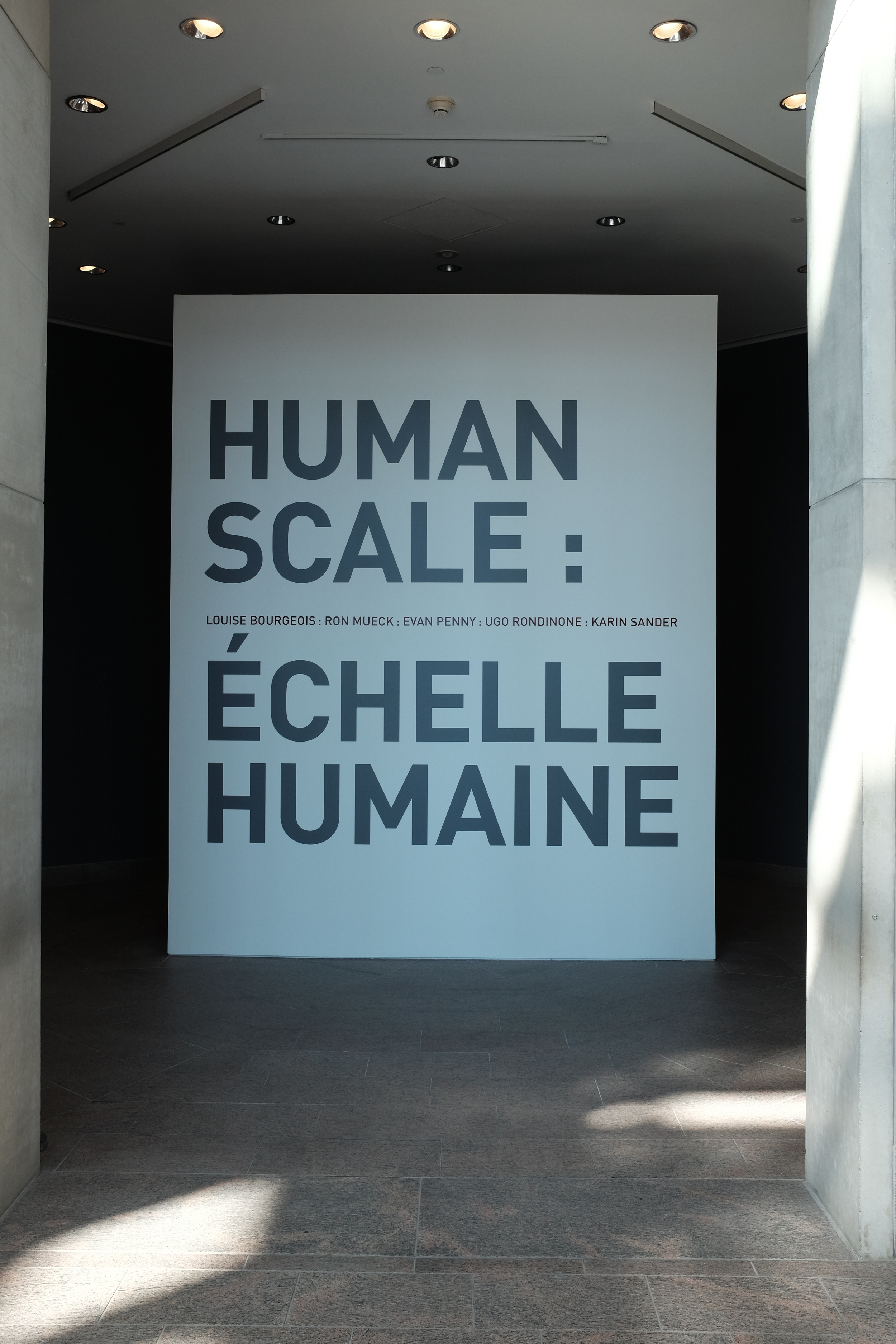
A case study of A Place Beyond Belief by Glaswegian artist Nathan Coley.

• What’s your first response to this piece?

I find the contrast between the deep shades of blue in the sky and the yellow of the lighting attractive. I like that there is a range of blues in the sky and I like the silhouettes of the framework and the building behind the sign. I also like the angle of view from which this image was shot—it seems more dynamic than a straight-on shot. I don't yet have a firm understanding of the piece, though.

• What questions are you going to ask in order to make sense of the piece?

Where is the piece set? Is the text a reference to something specific? How was the piece constructed? Is it a permanent installation or temporary? Or was the image just found by the artist? (Doubt it.) Does the specific place matter or could the work have been installed anywhere? Do we know anything about the artist's intent? How does the work fit within Coley's body of work? Have any reflections on the piece been published?

• What type of work do you think this is? It could fit into several categories. How would
you define it?

I've been referring to it as an installation, largely because I'm assuming that this is not a "found" piece. It could be site-specific but that remains to be seen. It could be classed as a scultpure, depending on how integral the supporting structure is (or is it just hold the thing up?). Is the work just the text? The entire structure? Or does the building in the background play a part in the piece? If so, is the work the photograph of the installation or the installation itself? Not having any information yet on the role of the site, I'll have to define this as an outdoor installation featuring illuminated text. That's more of a description than a definition, but I'll be ready to adjust it once I have more/better information.

• What do you think the text is about?

It's difficult to land on a meaning. "A place beyond belief" could mean "a place where belief does not exist" or it could mean "an unbelievable place." The text could be referring to the specific location of the installation or it could have broader application. If it is site-specific, the text might refer to the church in the background and offer a commentary on religious belief in general or the Christian faith in particular. 

• What are your first thoughts after listening to the monologue?

My first thoughts are that this is a moving and powerful story and that Coley tells it well. For those of us with strong memories of 9/11, it is easy to remember the feelings of sorrow, anger, confusion and disbelief in the time during and following the event. It is also easy to imagine the tensions in the subway car, both on the part of the Sikh man and the others around him.

• What other information can you find on Coley’s website about this particular piece?

In addition to multiple images of the installation, the website contains details of its construction (illuminated text on scaffolding; dimensions variable), photo credits for the images, locations where it has been installed (Haunch of Venison, London; Art Gallery Kosovo, Pristina, Sept 2012; Kunstverein Freiburg, Germany, Jan 2013), the link to the video of Coley providing background on the piece and a link to a site related to the location in London (the link was broken when I tried to access it on May 7, 2016).

Where is it actually sited?

I am not sure where it is actually sited. The most recent location I can find for the piece was at the Triennial Bruges 2015

• Does this alter your response to it?

No, not at all. Coley has installed the piece in different locations around the world and has often juxtaposed it with buildings connected with religious, political or commercial activity. His message of the need to find a "place beyond faith" is probably a broad concept in his mind and can lend itself to a sort of universal social criticism in many settings.

• Have your views on this piece changed after listening to Coley speak about it? If so,
why?

They have changed somewhat. I've come to a better understanding of the meaning of the piece and how Coley, and his hosts, have used it as a social critique that can lend itself to a number of sites. In a sense, then it both is and isn't site-specific. Given the general nature of the message, the text will also be understood in different ways over time just as it has already moved on from its initial association with the 9/11 attacks. I, like most people, want to live in a world that is free from violence and injustice and on a simple level "a place beyond faith" seems to provide an answer. I am not confident that we can all move to that place, though, as our lives and societies all depend on some form of faith, whether acknowledged or not. If Coley's interviews are anything to go by, he may enjoy just that kind of irony and ambiguity.

• Do you think contextual information is essential to gaining a greater understanding
of contemporary work? Make a note in your learning log.


I think the answer to this question has to be "yes and no." Yes, contextual information is important if we are concerned with the artist's intent: context can help get us closer to intent but it cannot guarantee that we have complete understanding (and it is always possible that the artist has not completely understood his or her own work). Yes, contextual information can be helpful for the viewer in considering a broader range of meanings than a first view might provide. But no, contextual information can never exhaust the evolving range of meanings that a piece might suggest through changes of time and place.

• Do you think it should be an essential ingredient?

I think that contextual information is an enriching and important tool, particularly for those interested in art, culture and the history of interpretation. But I'd hesitate to call it "essential"—I'd be concerned with giving the impression that we can ever arrive at the "correct" reading of any work of art. Some are better informed than others, but none should pretend to be the last word.

Exercise 3: Gallery or site visit

In the last few weeks I have visited three sites that could not be more different in nature or content. Two could be classed as "galleries" while the third describes itself as a museum, but is closer to a cross between a repository and a site-specific installation.

The first visit was to the National Gallery of Canada in Ottawa to see, among other things, an exhibit called "Human Scale." The exhibition is designed

to explore the evolving relationship between the body and sculpture through the work of [...] internationally renowned artists. It reflects upon the persistent question of scale in sculpture, as contemporary artists adapt to new materials, means and technologies for figurative representation. The works on view each vary dramatically in size and proportion, making for a provocative exploration of the physical, psychological and expressive character shaping what it means to be human. (source: Human Scale exhibit web page)

The artists in question are Ron Mueck, Evan Penny, Ugo Rondinone, Karin Sander and the late Louise Bourgeois. Mueck's large-format wood, wire and latex constructions are startlingly realistic—they are often referred to as "hyperrealistic"—and the impression they leave on the viewer is striking. Their scale and accuracy invite us to step up close and examine tiny details in a way that we might not observe a real person. And yet we would not be surprised to feel warmth radiating from the skin, see blood pulsing through the veins and hear breath coming from the nostrils of the oversized newborn portrayed by A Girl. (In fact, a toddler at the exhibit wandered up to the gigantic creature many times her size, pointed and said "baby!"). The sculptures by Evan Penny are also slightly larger than life but it is not their size and accuracy that capture attention, but the way that they have been scaled so that their perspective is slightly "off." When viewed from one angle all seems well; when viewed from a slightly different standpoint the human form has clearly been distorted. The effect is unsettling and shows how much we take for granted in the way we usually view the human figure. And that might be the real benefit of such works: although Mueck's work has been criticized as a "parody" of the body, he and the other artists at this exhibit succeed in making us reconsider the wonder of our own ordinary embodiment.


The second visit was to the Bellago Gallery of Fine Art in the Bellagio Hotel, Las Vegas. Gambling is of no real interest to me so I was looking for something else to do during my down time on a recent business trip to the city. I was very pleased to hear that not only was there an art gallery on the Vegas Strip, but that there would be an exhibit of photographs by Yousuf Karsh, the Canadian portrait photographer.  Like most people with an interest in photography, I am very familiar with reproductions of his work in books, but I have not had many opportunities to see his large-format prints in person. The fact that Karsh plied his trade in Ottawa also made for a nice local tie-in for me, so I ordered a ticket to see "Icons of the Twentieth Century."

The gallery is a very small facility comprising just two rooms, well back from the street on the ground floor of the hotel. It's not an easy place to find in a complex the size of The Bellagio. But the size of the gallery is not at all the problem: it's the lighting. It is impossible to view the Karsh photographs properly. There is so much glare from the harsh overhead lights that is impossible to view any of the beautifully-printed images without seeing light flares or the reflections of visitors in the glass covering the images. The images themselves are large, with the very smallest being 11x14" and the more common size being 16x20" or larger. Each contains a character study designed to reveal something of the personality of the sitter and, although the style belongs to another era, the work stands among the best of its kind for its time. On close inspection it is possible to see that they have been printed with great care, with clean highlights, wonderful tonal range and deep, rich blacks. This is what viewers have come to expect of a Karsh image (and pay to see!), but the experience is marred by the distracting lighting and presentation of the work.


The third visit was also in Las Vegas: a night-time tour of the Museum of Neon, more colloquially known as the "Neon Boneyard." The site is the last resting place for many of the famous illuminated signs that lit up the Vegas Strip in the 50s and 60s. Rather than sending the signs to a scrapyard or recycling facility, they are being preserved in the dry Nevada air by a non-profit group keen to celebrate local history and... art.  Although perhaps not site-specific in the strictest sense of the term, the signs flourished in the desert city and have a credible claim to being a distinct local art form. Part of what made (and makes) The Strip the experience that it is, neon was employed in Las Vegas on a scale and with imagination seen in only a handful of places. It is now yesterday's technology, having been largely replaced by cheaper, more reliable and ultimately more flexible video screens.


The site itself is a two-acre fenced lot containing a large number of signs that appear to have little order in the way that they have been displayed. Nevertheless, a certain number have been illuminated and turned toward the walkway in a fashion that shows the placement is not entirely random. The signs are constructed of sheet metal and painted in bright colours that supplement or contrast with the neon or incandescent bulbs they hold. Some of the neon signs are "animated," but most contain static lighting displays. All of the signs are intended for commercial advertising, with some simply announcing a service or business and others being more complicated and imaginative in design. The more interesting signs are those that try to convey a sense of style or excitement about the establishment they announce. This is the era of "Mad Men" at its colourful, gaudy best. The museum members had originally planned to restore the signs to their original state wherever possible, but it became clear that this was neither possible (because of costs and availability of materials) nor desirable (visitors to the museum repeatedly said that they liked the patina of age and exposure on the objects). It would be nice for visitors to be left to their own for a few minutes to linger over the design and craftsmanship of the signs, but all visits are guided and kept on a tight schedule. Because the visits are guided, there is also non-stop commentary from the guide.

Exercise 2: Developing your research skills

Katie Paterson Vatnajökull (the sound of) 

This piece is a site-specific installation in Iceland. It makes available a continuous feed of amplified sound from the Vatnajökull glacier via telephone. An audio loop is available as a sample on the artist's website and appears to consist mainly of ice cracking and the running of meltwater.

Unlike Longplayer, another audio installation, there is a greater sense of distance between the source of the sound and the listener. This is not just because of the physical distancye between Iceland and wherever the listener might be in the world, but because the source of the sound does not seem as obvious. In the case of Longplayer the video gives the listener something to look at and a sense of being "present" at something recognizable as a performance, even if the musical notes may someday be sounded by computer rather than musicians. With Vatnajökull, on the other hand, we do not have the same sense of immediacy or agency: what does the installation look like and how was it done? Is there really a continuous feed of sound from the glacier 24/7, or are we listening to a very long audio loop that repeats? Is there really an installation at all? Put another way, is there really a "there" there or are we being tricked?

Nevertheless, we can be fairly confident that Katie Paterson is playing fair with her audience because she has shown such great care in researching and producing her other pieces. Whether it is Future Library or Fossil Necklace, Paterson has painstakingly worked to create objects and happenings that are rooted in specific places and times. If anything, her work is often preoccupied with an interest in very long stretches of time and cosmic dimensions, such as can be seen in Ancient Darkness TV and All the Dead Stars.

On the face of it, Vatnajökull is largely about place, being named for a large, well-known ice cap. It is the source for Iceland's famous glacier lagoon visited by many thousands of tourists each year and, even without having visited the site, most people could conjure up something like it in their imaginations supported by the sound of moving ice and water droplets alone.

On reflection, however, Vatnajökull is also very much about the passage of time. Even though Katie Paterson's use of text in the piece is very limited and provides few interpretive clues, glaciers are all about time. The formation of an ice sheet takes many hundreds of years and I remember the tour guide at Jökulsárlón telling me that the pure glacial ice she handed me to taste was over 1,000 years old. While it was still in my mouth, it dawned on me that Vikings were roaming Iceland when the snow fell that created the icy diamond! But the constant dripping and cracking we hear in Paterson's piece reminds us that the ancient ice sheet is melting at an ever-increasing pace because of global warming. And, as we look forward, we can imagine a time when there may be no Vatnajökull at all -- along with the related climactic, economic and social impacts that we really don't understand yet.

In this way, there is both a strong, ancient character to the work blended with a warning about the fragility of all natural things that are subject to the passing of time and the effects of human activity.  

Jökulsárlón at the foot of Vatnajökull (taken Septermber 23, 2015)

Jökulsárlón at the foot of Vatnajökull (taken Septermber 23, 2015)

Research point: artists whose work incorporates text

  • Ian Hamilton Finlay (1925-2006; sculpture, writing, graphic art, poetry)—Many of Finlay's works incorporate text and he had a fondness for inscribing words and entire poems on stone although he worked in many media. Perhaps his most famous work, Little Sparta, is the garden he created southwest of Edinburgh. Little Sparta brings together sculpture, poetry and gardening to create an environment that both fits into, and stands apart from, the local landscape. As one of Finlay's own lines asserts, "It is the case with some gardens as with societies; some things require to be fixed so that others can be placed."
     
  • Alec Finlay (1966-; poetry, sculpture, collage, technology, publishing)—An interesting work, The Road North, consists of poems written on a blog during a year-long trip around Scotland with a friend. It is described as a "collaborative audio and visual word-map" and is loosely inspired by a journey taken by the Japanese poet Basho. The blog entries contain photographs, snatches of conversation, reflections on places visited and poetry, along with pictures of sights along the way.
     
  • Doug Aitken (1968-; photography, video, sculpture, illustration, installation)—A series of creations consisting of a single word in large type that provides the outline of an image or images: examples include "Star," "Party," "Free," "Riot," "One," "Sunset." The images contained within the words sometimes work against the word ("Party" contains an image of many discarded tin cans) and sometimes appear to support it ("Sex" suggests a lush garden and fruitful nature and "Vulnerable" contains an image of a lone aircraft sitting on a tarmac apron).
     
  • Graham Gussin (1960-; neon, video, installation, sound)—"Someplace Sometime" is a blue neon sign that undermines the typical use of a large, bright, coloured sign: to signal something or somewhere worth noticing. Instead, the work catches the user's attention to underline no particular place or time. Is this humour, something deeper or a bit of both? Possibly a regular theme of Gussin's, given that we see it present in other of his works, such as "Untitled" and "Zone Out Plinth" where words again signify less than they promise.
     
  • Marine Hugonnier (1969-; film, photography, sculpture)—Series "Art for Modern Architecture" systematically replaces pictures from newspaper front pages with colourful geometric shapes. Replacing the images detracts from the stories by removing helpful visual references, but it also has the effect of relativizing the text as well: the columns and paragraphs of words now take their place as graphic elements alongside the brightly coloured blocks. It's a strange effect: if there had only been text on the page we might not miss the images but, once the image content is present only as pure colour and form, the words carrying meaning are also lessened in impact.

Many of the pieces produced by these artists are relevant to theme of "place," albeit in significantly different ways. Ian Hamilton Finlay has shaped the landscape around himself and incorporated his work directly into it. Alec Finlay's work is not so much tied to one place but involves travel, reflection and response to a series of places around Scotland. Dou Aitken's installations constitute one-word comments involving places, but it is not always clear whether the place comments on the text or the text is a comment on the place. Graham Gussin's neon sign seems to invoke place through its absence by telling the viewer that there is nothing particularly special about the location of his installation. Even Marine Hugonnier's graphic constructions with newspaper might be seen—at a stretch?—as a comment on place: how do we understand the architecture of a place or the use of space when what we think we need to create meaning is replaced by something completely different?

Exercise 1: Exploring 'place'

‘Place – The First of All Things’, an essay by Tacita Dean and Jeremy Millar (pp.11–26)

The essay provides a conceptual and theoretical introduction to understandings of "place" and begins by walking through some basic definitions before moving looking at how the concept has evolved over the centuries.

Dean and Millar use "place" in a technical sense that goes beyond a simple understanding of location of an object or place in space. In fact, much of their discussion has to do with distinguishing "place" from "space." In their use, "space" has more to do with attributes of physical location or presence, while "place" has overlays of meaning, value and interpretation. Along this line, they go so far as to suggest that "[o]ne might even argue that a landscape ceases to exist if there is no one to look upon it" (p.13). Space might just be there, but place has to have relationship and meaning or order.

The relationship to a viewer or interpreter means that "place" is also touched by time, whether by simply becoming familiar (one way that "space" becomes "place," p.14) or by association with particular events.

There then follows a discussion of how developments in theology, philosophy and science gradually inflated the understanding of "space" and downgraded appreciation of "place." God could not be less than the space He created, so it was posited that a limitless God implied an infinite space. Space, then, became the stage for expanding imaginations and exploration, while place seemed diminished by comparison.

The notion of "place" was never completely eclipsed, however, and came back into its own at least partially because of romanticism. More importantly, "place" still had interpretive power to help people think about human experience and meaning: 

As such, we must recognize not only that there are fundamental differences between place and space, and place and site, its modern replacement, but also that there are many places within place, many regions, each with their own identities, dialects and dialectics.
— Dean and Millar, p.15

And those places have interesting qualities—they can change in meaning over time and can relate to one another through overlap and interpenetration.


Overall, I found this to be a very useful article that helped me to think differently about the importance of "place" in art (and in other ways, too). I have to admit to rolling my eyes in the past when I would read yet another artist statement about "exploring space," but I've gained a new appreciation for the concept.

My only real quibble is that I think Dean and Millar are a little hard on the Enlightenment philosophers who gave greater weight to "space" than to "place"—this was an age of exploding knowledge and exploration in all the sciences, after all.

I will want to think more about a number of the ideas they present. For example:

  • the role of time, meaning and value in defining "place" helps to underline how two or more people can inhabit the same "space" but not necessarily the same "place."
  • a single space could constitute multiple "places" even for the same person, depending upon the interpretative lenses he or she chose to wear.
  • the idea of "thresholds" is very helpful in suggesting how different places can relate to one another without marking hard boundaries between them. There is not necessarily one "place" beyond which is limitless and unknowable space: there can be limitless "places" beyond, all shifting and changing in size and meaning, like soap bubbles running over one another.

All told, a good piece for generating some fresh ideas for me!

Exercise 2: Interpreting video art

I found Sam Taylor-Wood's Still Life unappealing when I first started watching the time lapse video of rotting fruit. The fruit sits on a plate on a table against a dull, neutral background and gradually does what any living thing does when it dies: it decays. The camera stays in a fixed position during the shoot, meaning that the only movement to register in the frame is that of the subject itself.

Surprisingly, it does move. And this is what sets it apart from the "still life" tradition of painting that Taylor-Wood references both in the way she presents the fruit and in the title she gives the work. While still life paintings often hint symbolically and statically at decay, the artist uses time and technology to show the process at work. A plastic pen lying on the table belongs to the contemporary world and does not change during the video: its material has no life in it, or on it (as far as we can see). 

The movement in the video also suggests that even in the face of death there is "still life" present: spores and insects live on the host and change its shape while consuming it. There are ebbs and flows of mini "circles of life" taking place on and within the dead fruit. 

The key to seeing all this is the ability to play with time photographically, which allows us to remain attentive through a process for which we wouldn't usually have the patience or interest. Taylor-Wood might be saying to us, "Slow down: you're missing a lot of life." 

The same attentiveness to the passing of time and uncomfortable detail is present in a number of Taylor-Wood's other video works, such as A Little Death (2002; a time-lapse of a rotting rabbit's corpse), Pieta (2001; a real-time observation of a couple mirroring the pose of Michelangelo's sculpture), and Hysteria (1997; a video of a woman who seems to move gradually from joyous laughter to hysterics... and back again?).

The subject matter of Taylor-Wood's Still Life (and other works) does not always appeal to me but I can appreciate the way she uses time in her pieces. 

Case study: interpreting sound—Longplayer

The performance of Longplayer at the Roundhouse in 2009 was an invitation to step out of regular time. The piece represents a break from music most of us are familiar with in terms of pace, rhythm and lack of discernible repetition.

The sounds are rich and varied with a purity of tone created by Tibetan singing bowls that have likely been made of materials built to last. A team of musicians travels from bowl to bowl, striking them at intervals that might be scripted.
The music produced is reminiscent of long, interplanetary voyages in sci-fi films. It is contemplative and in no great hurry: the notes reverberate, have a slow decay, combine and overlap. There is no sense of the “progress” that we usually expect in a piece of music—we’re not building toward the resolution of a melody or theme.

We play no part in the performance but observe it from above. And in this position we can see that the bowls are arranged in a series of concentric circles that do remind us of the planets in their orbits. Or perhaps we are looking at the inner workings of a vast lock, with the bowls spaced at irregular intervals in their courses. Designed to run without repetition for a millennium, Longplayer’s orbits are independent of one another and, like any circle, have neither beginning nor end.

The music lulls the listener for a time but leaves us with more questions than answers. Where does the movement come from? Are musicians or listeners necessary? And how long can we listen without a sense of direction, achievement or satisfaction?

Exercise 1: The fourth dimension

This exercise marks the beginning of Project 2: Time and time-based media.

Make notes on your own thoughts about time

As someone who has done graduate work in theology and learned to read a couple of ancient languages I have certainly thought about time. I learned through those studies to pay close attention to issues of history, culture and language, all of which are directly affected by time. The understanding of ancient texts is aided by giving care to the history of interpretation and the realization of the distance that exists between our time and that of the first writers and readers or hearers. We have to be conscious of the temptation to project our own views onto the past and the future and resist making our own period normative. To interpret an ancient document faithfully is to try to inhabit—however imperfectly—the world of the text.

Even without formal study, the process of aging must encourage most people to think about time and its passing. It happens to us all (birth, growth, maturity, decline and death) and comes close to home as we see our children gain strength and our parents gradually lose theirs. And talking with family members has made me conscious of the malleability of memory as we realise from each other that the accuracy of the things we remember can change with the years. And that our frame of reference may not be theirs. Or completely reliable.

Have you thought about time in relation to artwork before?

Much of what I wrote above applies to artworks as well as to ancient texts: the role of time in shaping culture and interpretation, and even the decaying effect that it can have on physical materials. The further in time we are from the moment a piece was created, the more our world is not the world of the artist.

I also have a particular interest in photography which owes much of its power and interest to the way that the camera can play with time: 1/1000 of a second for this frame; four hours for this one. Photography allows us to experience and abstract time beyond the way our senses usually allow. A camera is a time machine.

Have you already come across pieces that explore what time is?

Again, photography is the obvious answer, whether it is Eadweard Muybridge's pictures of human and animal movement or Harold Edgerton's images of bullets frozen mid-way through fruit and playing cards. Time-lapse shots of passing clouds, waves and even passing seasons demonstrate how the camera can capture much longer periods. Painters also play with time for effect, whether subtly in the  memento mori pieces mentioned earlier in this course or more obviously in Salvador Dali's melting clocks.

In the last segment, the videos and articles on Damien Hirst's works also mentioned the effect that time can have on artistic materials themselves: sharks can rot even when swimming in formaldehyde.

Exercise 5: Finding out more

We are asked to find two examples of still life work that include pictures of fish, so I chose two pieces from the Bridgeman site and sketched them in my notebook (there is a reason why I am interested in writing and photography, rather than in painting or drawing!).

Sketches of two still lifes with fish, 05/03/2016

The two images and notes are as follows:

  1. Sandra Lawrence, Starfruit and Fish, 1999 (acrylic of canvas)
    I liked the symmetry of the fish in this image and the way their curves contrast with the angles of the starfruit. There is also a hint of realism about the painting.
     
  2. Reuven Rubin, Still Life with Anemones, (oil on canvas)
    This image appealed to me for quite different reasons—I liked the stylized flowers and fish lying on a copy of the Haaretz newspaper. The painting is evocative rather than realistic and I think a boat and a tree are to be seen through the curtains. To be honest, I didn't even notice the boat-like shape until I started to make this rough sketch of the painting. Perhaps one value of sketching is that it forces us to slow down and be more attentive to what is in front of us.

The other part of this exercise involved watching a Khan Academy video on Damien Hirst's The Physical Impossibility of Death in the Mind of Someone Living. The speakers on the video discussed possible interpretations of Hirst's piece as well as meaning in contemporary art. Like me, one of the participants wondered if the title of the work was a piece of wordplay and mentioned that he could interpret, but felt "like I would be making stuff up."

One of the participants gave a useful quotation from Marcel Duchamp to the effect that "a work of art is completed by the viewer." I think that is a helpful insight: the artist makes some choices for the audience (one participant says Hirst "has framed the shark for us") but it lies with the audience to bring something to the exchange. Once we get away from the older still life that we saw in the previous exercise, where there is a familiar frame of reference, the artist can suggest possibilities to an audience that may reply with a range of interpretations, expected or unexpected. I think this can be both exciting and unsettling all at once.

The other line of discussion had to do with the fact that we all face death and don't like it. Hirst's shark is a physical demonstration that in spite of extreme measures—up to and including formaldehyde tanks—we cannot escape the effects of time and, ultimately, death. One speaker mentions how mummified Egyptian kings are an example of how constant the fight against impermanence has been in human history. This brought the discussion back to the issue of meaning and how much of contemporary art turns around issues of philosophy, aesthetics and the limits of interpretation: "is this a grand joke if nothing is off-limits?" Well, if the viewer is responsible for helping to bring meaning to art, then there is likely no final and satisfying answer to that question.

The additional contextual information about The Physical Impossibility of Death in the Mind of Someone Living was helpful in reassuring me that there is probably no final "meaning" for a given work of art and that we are instead drawn into a discussion. Some points of view may be more informed, richer and more suggestive than others, but none is likely to be "correct."

Grayson Perry — "Beating the Bounds"

The second of Grayson Perry's Reith Lectures explores the boundaries of art: what sort of things do and do not qualify as contemporary art? 

Perry acknowledges that establishing the limits of art is not easy and that "art" itself has only existed as a self-conscious category for the last few centuries. And although anything can be art (for example, Duchamp's Fountain), art can stop being "art." If this is the case,  there must be boundaries even if these are sometimes emotional in nature rather than intellectual. And we want to know where the bounds lie. As Perry says, "I want to know when to put on my art goggles."

To help us do that, Perry proposes eight tests for art: 

  1. Is it in a gallery or art context?
  2. Is it a boring version of something else? 
  3. Is it made by an artist? 
  4. Photography is problematic: is the subject smiling? Is there any staginess?
  5. The Limited Edition Test: "if something is endless it gives away some of its art quality." 
  6. The Handbag and Hipster Test: who is looking at it? Is there a queue? 
  7. The Rubbish Dump Test: would anyone notice it and pick it up? 
  8. The Computer Art Test: would it cause anyone to pause and think rather than click through? 

No one test is sufficient to establish the "art"label, but Perry sees them forming a Venn diagram "and the bit in the middle is art."

I think that, while we might quibble about one test or another, this is a helpful approach to identifying art. It combines a cluster of judgements that take in the creator, the created object/event, the venue and the audience(s). And although Perry doesn't mention it, it also acknowledges implicitly the role of time: if a piece is "a boring version of something else," enough time must have elapsed for multiple versions to have been created and become boring. The audience/response tests (numbers 6, 7 and 8) also presuppose that an audience has had time to gather and make judgements. Some of those judgements will stand the test of time; others will pass quickly.

As someone with an interest in photography, I'll need to chew on number 4 a bit more. I think this is the weakest of Perry's tests, but it reflects some of the lengthy discussion about the art status of photographic work. Perhaps part of the answer is that a photograph is just as susceptible to Perry's other seven questions as any other piece of work. It would then be up to him to demonstrate why photography doesn't fit his Venn diagram. If a urinal can meet the tests, why not a photograph?

Exercise 4: Looking at context

Looking at Damien Hirst's The Physical Impossibility of Death in the Mind of Someone Living, 1991

Write down a few words giving your first reaction to the piece.  

Puzzlement; uncertainty; grasping at meaning

Do you have an emotional response to it? 

No, no particular emotional response. It leaves me unmoved. 

What do you think it's about? 

It's static, frozen artificially in time (won't rot like any natural dead thing would). The shark looks like it's alive and swimming, but it's not. It looks as though it is threatening, but it is not.  Is it a caricature of a shark or of life? Is it about the appearance of life in death? The persistence of memory? It's hard to say with any certainty. 

 What do you think about the title? 

The title is ambiguous: the impossibility of whose death -- the thinker's or someone being thought of? Is the title even related to the piece or is it a joke on the viewer?


Looking at Edwaert Collier's Still Life with a Volume of Wither's 'Emblemes,' 1696

 Write down a few words giving your first reaction to the piece.  

Visually rich; lots to explore; engages the mind

 Do you have an emotional response to it? 

There is some immediate comfort in the familiarity, but the piece feels old-fashioned and tired.

 What do you think it's about?

This was a fairly common type of painting, generally a lesson about the certainty of death and how that knowledge should inspire us to sober reflection and living.

 What do you think about the title?

The title is bluntly descriptive of the image, but doesn't allude to any deeper meaning. It does make me wonder what Wither's Emblemes was about, though.


Of the two works, Hirst's definitely makes me work harder. With Collier I'm on more familiar ground and have a frame of reference that helps me to interpret it, even if not completely or perfectly. With Hirst, I'm quite lost without a guide to help me understand. 

Exercise 3: Reading about art

This was a relatively straightforward exercise. The passage to be read from Art History: The Basics was quite short, but the discussion on the definition of "art" was engaging and the examples were helpful. Although I'm sure the writers won't leave the issue unresolved, they ask a question that probably goes through the minds of many people: has the definition of "art" been stretched to the point where it is meaningless? And their brief comments about the roles of culture, history and language point out that the understanding of art has evolved and will continue to do so.

I had never heard of the material "jesmonite" before, so I had to look it up. I now know that it is "a composite material used in fine arts, crafts, and construction. It consists of a gypsum-based material in an acrylic resin" (Wikipedia).

The short excerpt was enough to convince me that the book is probably one I should order for reading and reference. 

Exercise 2: What is art?

What is art?

This is obviously a tough one, but I think that almost anything that is a human creation or the result of a creative effort could be called art. But perhaps it takes more than that: perhaps there has to be some kind of intent on the part of the creator. I'm not sure about this, though—if enough people judge the result to be "art," does the one who performed or created it have to have intended it to be seen that way? How self-conscious do you have to be?

How do we know it is art?

I'm not sure about this, either. As I mentioned above, perhaps all creative work has the potential to be art. Grayson Perry's lecture ("Democracy has bad taste") suggests that quality in art is arrived at by a tribe. Could the same hold true for judging whether or not something is art at all?

Who decides what is art?

I'm not sure there can be an ultimate answer to this, but the judgement of the tribe or guild might be one place to start. The challenge with any guild, though, is that can become a closed shop—once it decides who is worthy it can then close the door to new people, ideas or approaches.

Does intent matter when judging what is art? Is reception the key? Is it enough if I decide that my work is art, regardless of what everyone else thinks?

If the simple fact that an item appears in a gallery makes it art, all we have done is hand over judgement to the gallery owner. Perhaps that is a good place to begin, but he or she is just one possible source of validation. Would others then be swayed by the gallery, rather than thinking about the value of the work itself?

Duchamp's statement about wanting "to put art back in the service of the mind" makes me wonder what he is opposing. Does he think that art has been in the service of the emotions? of sentiment? of fashion? of settled opinion? Perhaps he viewed his art as an opportunity to provoke thought. If that's the case, he must have seen Fountain as a success: it is not immediately clear why the artist views this piece as art, how he can offer it as his own work, and what the viewer is supposed to take away from it. The viewer can either reject the piece outright or be forced to think about questions of meaning.