Back to the Met

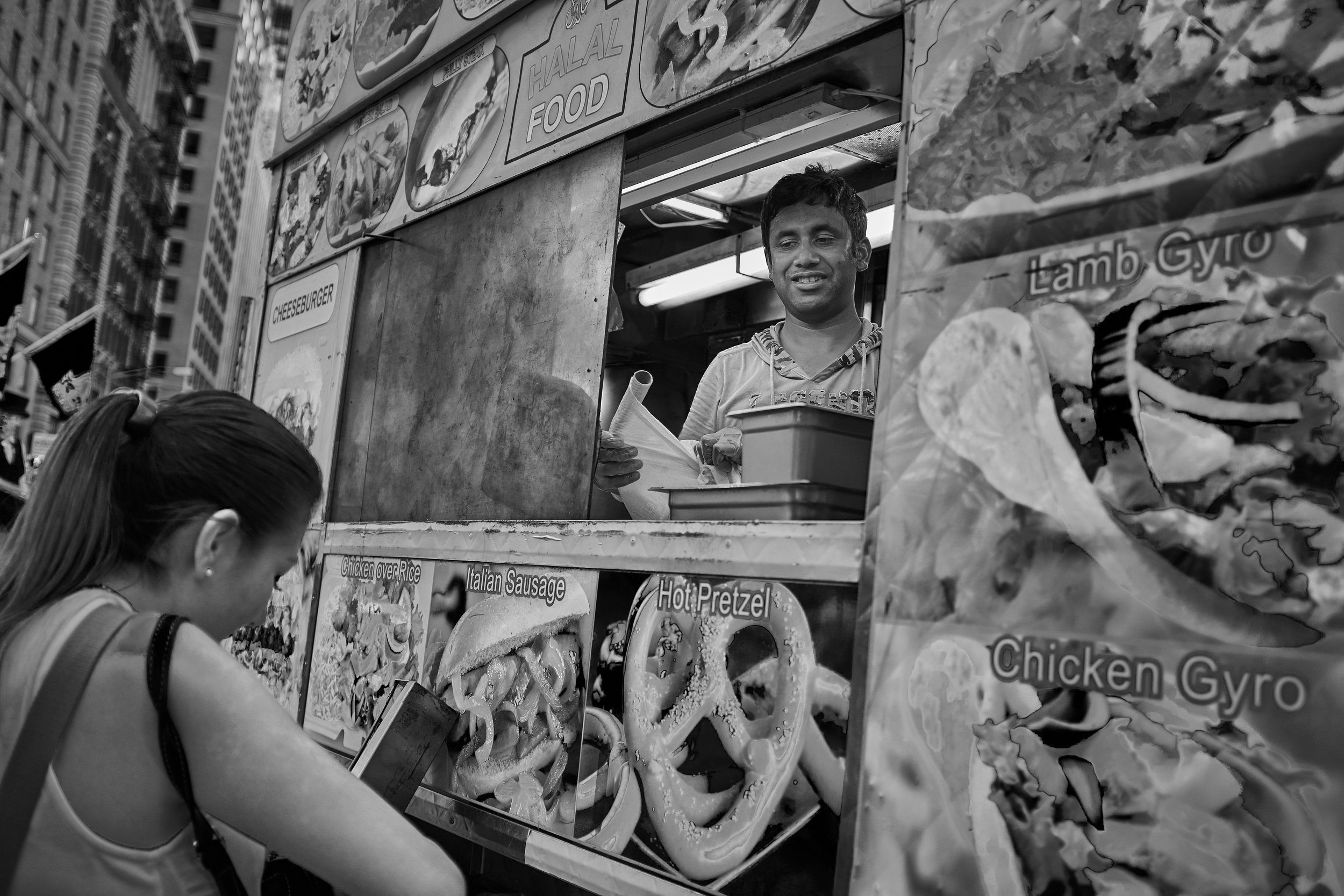
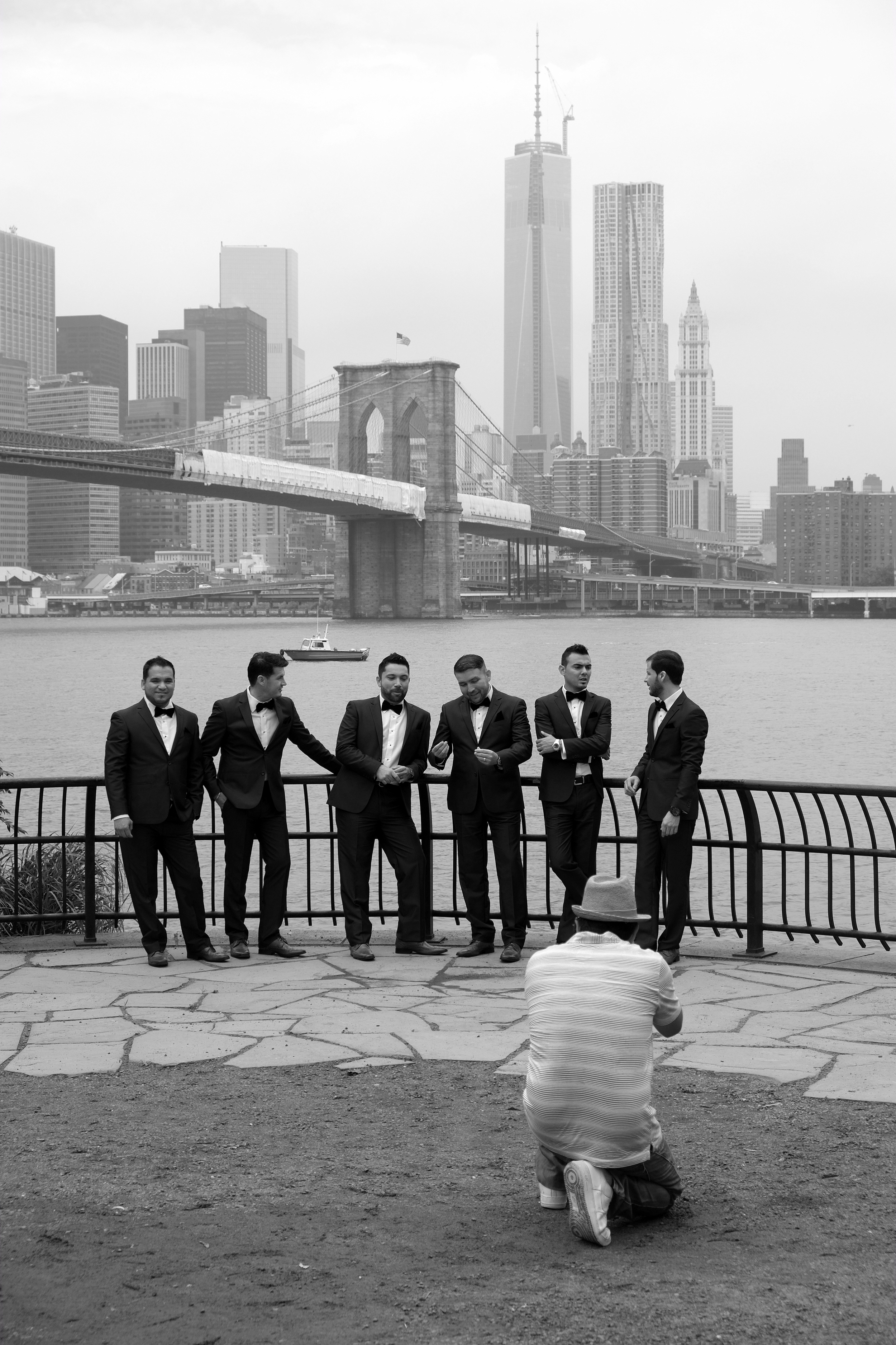
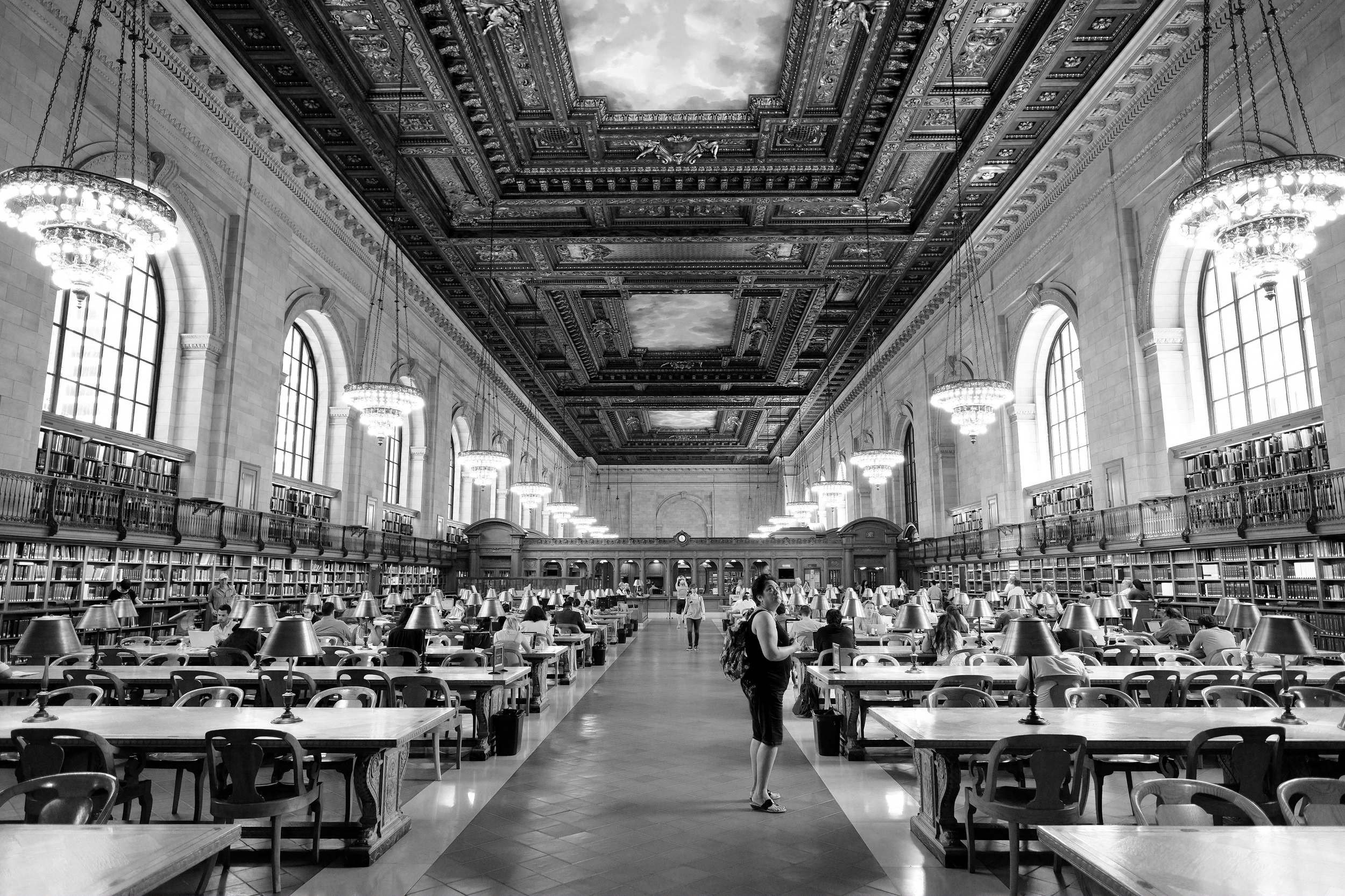
Like many of the world’s great art galleries, NYC’s Metropolitan Museum of Art has such a massive collection that it is impossible to do it justice in a single visit. And then there are the temporary exhibitions and the fact that the public collection is spread across three locations Manhattan locations …

During our early January 2018 trip, we had the opportunity to take in “Michelangelo: Divine Draftsman and Designer,” sculptures by Rodin, a David Hockney retrospective a survey entitled “Delirious: Art at the Limits of Reason, 1950–1980,” and a curation of items from The Met’s permanent collection called “Reimagining Modernism: 1900–1950.”

The Michelangelo exhibit was impressive not only for the sheer scope of the art works and periods covered, but also for the amount of technical detail on how he went about conceptualizing and creating. As was (and is, I suppose) common with other major artistic figures with a prolific output, Michelangelo (1475–1564) became most active as a draftsman and designer overseeing the work of craftsmen who made his ideas a reality. He was the CEO of a design shop and factory. I have known for a long time that this was the case, but to see the evidence up close—annotations to workers, evidence of the use of tools and drawings to create templates that could be used over and over—was fascinating.

Many of Rodin’s (1840–1917) best-known sculptures were on display—Le Penseur attracted a lot of attention in a crowded hallwaybut what was most interesting to me was the opportunity to see how he evolved as a draftsman over the course of his career. And the rough-hewn bases of his statues made me wonder whether his creations were emerging from the stone or sinking into it.

Le Penseur, Auguste Rodin

Le Penseur, Auguste Rodin

The David Hockney retrospective spanned the years between 1960 and the present day, with many works on display. It was a rich exhibit as much in quantity as in the quality of the colours of a consistent palette that Hockney has favoured throughout his career. The canvases are lush and pastel, and seem to illustrate an idealized world that is close to, but just beyond this one. Throughout, you can sense an almost sub-tropical warmth in the paintings, whether in Californian swimming pools (where you’d expect it) or in Yorkshire landscapes (where you wouldn’t!). Hockney’s persistent vision of the attractive world he inhabits artistically colours even his portrayal of his homeland.

“Delirious: Art at the Limits of Reason, 1950–1980” starts with the question, “Can postwar art be understood as an exercise in calculated insanity?” The exhibit looks at irrationality in art following WWII in so many categories that is doubtful that the works of the 60+ artists would have been displayed together before now. The principal idea is that each of the artists represented responded to a modern world that seemed to them absurd and lacking in coherent meaning. “Delirious” is reactive rather than proactive—it is a response or witness to absurdity (or an accusation?) but none of the selected artists offers a prescription to a confused and hurt world. The works on display span 30 years in the previous century, but are we any better able to make sense of the world we live in today, apart from totalizing narratives of power and commercialism?

According to The Met’s write-up, the curated display of modernist works we saw “reinterprets and presents afresh the Metropolitan’s holdings of modernist paintings, sculpture, design, photography, and works on paper.” The pieces were arranged according to seven themes—Avant-Garde, Direct Expression, Abstraction, Bodies, Work and Industry, the Metropolis, and Retreat—and I found the grouping helpful in putting together an interpretive frame. The museum is proud of how much “vistas and sight lines owe to the building of new walls and the reconfiguration of existing walls, which inject new life into these spaces” and I agree with this completely. More than once, I rounded a corner only to be stopped in my tracks by the power of art works arrayed beautifully—it was a kind of visual treat. It made me think of the power that museum and gallery curators have: to show a work in a flattering or unfavourable light and to influence the viewer’s interpretation of a piece by controlling the context around it.

Constantin Brancusi, Bird in Space, in front of Pablo Picasso’s Nude Standing by the Sea and Burgoyne Diller’s Second Theme

Constantin Brancusi, Bird in Space, in front of Pablo Picasso’s Nude Standing by the Sea and Burgoyne Diller’s Second Theme

Of all the shows we visited in the gallery, “Reimagining Modernism” engaged me the most and I am not sure what to make of that. Perhaps I am responding to a romanticised idea of the modernist period, or perhaps it is the combination of bold, coherent ideas, beauty and function coupled with confidence in progress—a narrative that we now know can lead just as easily to advancement for humanity as it can to totalitarianism.

Coffee Service 1934, by Helen Hughes Delany (1885–1968), stainless steel and bakelite.

Coffee Service 1934, by Helen Hughes Delany (1885–1968), stainless steel and bakelite.

A week in Manhattan with the X100T

From one extreme to the other.

From the empty stretches of red PEI sand and seawater so cold it burned my legs to the hot smells and constant press of NYC's streets, a two-day drive took us to another world. And it was time to break out my new X100T again.

B&H Photo was the first port of call, where Douglas Kirkland was giving a fascinating overview of a photographic career that has spanned almost six decades. For those of us who do not live in a major centre, it's hard to pass up the chance to listen to a figure like Kirkland live when the opportunity arises. And, since no stop at that photographer's playground would be complete without touring the store and buying something, I picked up a wrist strap and lens hood for the Fuji. The wrist strap would let me keep the small X100T out of sight but close to hand and the hood would provide a measure of protection for the lens without having to fiddle around with a cap while out for the day. Which leads me to...

Three Questions for the Good People at Fujifilm: 1) Why are you still using the slip-over style of lens cap on the X100 series after all this time? It's a pain to use and too easy to lose. Please consider other options. 2) Why have you persisted with that strange arrangement for the thread on the front of the lens? It needlessly complicates changes between the lens cap, filters and lens hood. 3) And speaking of the lens hood, how do you justify US$70 MSRP for a piece of moulded plastic and a threaded ring? I suspect that most people will do what I did and buy Vello's US$20 version. Other than missing the "Fujifilm" label on the plastic, I haven't noticed that the cheaper product provides US$50 less protection.

But let's return to the camera.

So, what is it like to use the X100T in Manhattan? A dream. It is small, light, responsive and discreet. I wore it strapped to my wrist all day with no fatigue and it was ready to go at every opportunity. It was small enough that it attracted no attention from passers-by although, to be fair, there are so many tourists and cameras in New York that you start to look strange if you don't have a device in front of your face.

And I was thoroughly pleased with the pictures I made. I generally shot in RAW+JPEG Fine using the "BR" setting because I like the contrasty images it produces, particularly with blue skies. The "Classic Chrome" palate is fun to play with, but I suspect that we'll all be getting tired of seeing images rendered that way before too much longer. I've always appreciated the way Fuji has with JPEGs and I got hooked on being able to use the camera's WiFi to transfer pictures to my iPad for immediate sharing. Once home, though, I spent some time with the RAW files because of the extra latitude for adjustments.

Results from the trip? Buyer's remorse, 0. Fujifilm X100T, 1.

Cliché roundup—the Brooklyn Bridge with my X-E1

I understand that more than 8 million people live in New York City. I understand that NYC is a popular destination for millions more business people and tourists each year. And I also understand that the Brooklyn Bridge has been photographed by every single one of those people, multiple times.

I don't care. 

These are the pictures I took of the Brooklyn Bridge with my Fujifilm X-E1 and I like them. 

So there. Now it's millions and millions plus one.


Temple of learning—New York City Public Library

Now that I've transferred this site over to Squarespace 6, it's time to get cracking on the blog again. I'm pleased with the way things are displaying so far and I'm looking forward to using the increased flexibility for the galleries and for the blog itself.

The pictures in this entry were all taken with my Fujifilm X-E1 while in New York City for a week in July. It was great to get a block of time where I could concentrate on photography, so I tried to make good use of it. The X-E2 has just been released, but I think it'll be a little while before I can justify stepping up to a new body when I bought this one just a year ago. Still, the improved speed and image quality of the new X-Trans CMOS II sensor does sound pretty tempting. On the other hand, the "Lens Modulation Optimizer" sounds like something Marvin the Martian might use as a weapon.

But back to the pictures. The Main Branch of the New York Public Library (also known as the Stephen A. Schwarzman Building) was built on top of a former reservoir in Manhattan between 1897 and 1911. Every corner of the building speaks of a high regard for literacy and written culture as foundations of the world we know.

Public libraries are having to reinvent themselves and many are scrambling for funding to avoid becoming "book museums" in the face of the digital revolution. For the last several centuries, though, they were centres of entertainment, socializing, self-improvement and democratic education of citizens. Today we have instant access to a staggering range of "content" day and night on portable devices and I like the new access. I'm just not always sure that we are better people or better citizens for it.

Guggenheim in monochrome


Guggenheim 3 -- Fujifilm XE-1 - 14mm - f/11 - 1/350 sec - ISO 200The term is overused, but the Solomon R. Guggenheim Museum truly is an iconic piece of architecture and instantly recognizable. Designed by Frank Lloyd Wright, it is as much a work of art as any of the pieces displayed within its walls.

I've admired the building on previous trips to New York City but this is the first time I've had the opportunity to visit the gallery. Unfortunately, the current installation by artist James Turrell means that the famous interior spiral ramp is completely covered by projection screens. Great for lovers of Turrell's work with light; not so great for anyone who wants to experience the unique design of the gallery.

I may have spent as long photographing the building as I did visiting the exhibits inside. The curves and lines cry out for abstract treatment and it gave me the opportunity to try out the black and white mode of the Fujifilm X-E1, using the simulated red filter to darken skies.

I wasn't disappointed. The resulting JPEGs, while not completely straight-out-of-the-camera (I did make some contrast adjustments), showed a pleasing tonal range and held highlights well. I'm becoming increasingly confident that the JPEGs the X-E1 produces stand up with little or no post-processing.

I think I'll be doing a lot more black and white work with this camera.

Geggenheim 6 -- Fujifilm X-E1 - 14mm - f/11 - 1/220 sec - ISO 200Guggenheim 12 -- Fujifilm X-E1 - 18-55mm @ 55mm - f/8 - 1/1800 sec - ISO 200Guggenheim 4 -- Fujifilm X-E1 - 14mm - f/11 - 1/240 sec - ISO 200Guggenheim 2 -- Fujifilm X-E1 - 18-55mm @ 55mm - f/8 - 1/320 sec - ISO 200

New York grain

We spent three glorious days in NYC a week ago. If you're not caught in a late-winter blizzard, March break in Quebec often means grey skies, grey streets and grey scenery, so somewhere with a little more warmth and activity is always a welcome break.

New York is only a day's drive from here, but it could just as well be a world away. Not only is it warmer, but there's something to see and do on every street corner. A break for the soul, as well as for the body!

And it's a photographer's paradise. If you aren't moved visually by this city at any hour of the day or night, well, you need to put your camera away and take up Sudoku as a means of personal expression.

This shot was taken from the "Top of the Rock" at Rockefeller Center. The observation deck allows for fantastic views of the city in most directions and is a great vantage point for including the Empire State Building in panoramas. We went up just before sunset to get the best balance between the building lights and the glow of the sky. We weren't disappointed. I messed around a bit with the image in the desktop version of Snapseed, an inexpensive little image editor with fast and powerful tools. For about $20, it's a real deal, and it lets me experiment with RAW, JPEG and TIFF files non-destructively.

Still in the photographic line, we also visited B&H Photo and Video so I could pick up a new lens and make the pilgrimage to the superstore. I have never seen anything like it: a photographer's most vivid dream and combined with a descent into the ninth circle of retail hell. It's madness -- but what glorious and orderly madness!

Needless to say, we'll be going back to New York and more shots will follow on the blog.