Denotation: Richard Babcock's wartime recruitment poster features a male sailor riding a moving torpedo. Aside from the splashing of the torpedo's wake, there is very little other detail in the image. The legend under the image appears to be hand-painted in bold capitals, in red and blue lettering. There are two wavy lines under the word "the" and the text is underlined by a solid gold or yellow line, roughly the same colour as the torpedo.

Richard Fayerweather Babcock, Join the Navy, c. 1917
Blue, gold and watery green are the most common colours in the painting, so the red text reading "Join the Navy" stands out. The simple graphic and bold capitals of the message mean that the poster would likely be easily read and from some distance.
Connotation: The sailor's position and the placement of his hands and legs suggest that he is riding a bucking horse in a rodeo, a scene that would be played out many years later by a character in the movie Dr. Strangelove.

Actor Slim Pickens in a still from Dr. Strangelove. Columbia Pictures, 1964.
The message of the poster seems to be that life in the navy is a great adventure for "fighting men." Unlike some other recruitment posters, there is no mention of duty to king, country or family—the only motivation appealed to is a desire for action. There is no reference to the flag, although the red and blue primary colours might help to recall the Stars and Stripes. Overall, the poster played to ideals of masculinity and the sporting life at the time.
It's possible that the torpedo served as a phallic symbol, but other examples of Babcock's posters that I have been able to find do not seem to draw on sexual overtones. At the same time, sexual symbolism and innuendo are not recent arrivals in the visual arts and there is no way to know what connotations the artist may have had in his mind.
What is more striking to me is that the poster represents a naive—and blatantly misleading—American outlook. By 1917, European armies had been in the trenches of WWI for three years and would no longer see enlistment as a call to action and adventure. While British posters insisted on duty, a cowboy riding live ordnance was designed for young men who did not know what was waiting for them.
Another example: The Big Whopper
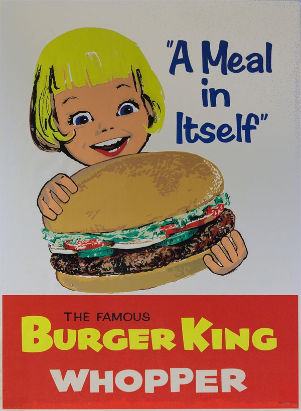
Burger King advertisement, 1960s.
I chose this second example because of the simplicity of its design.
Denotation: The poster is a painting with a relatively limited colour palette, bearing the image on a white background of a young girl holding a hamburger and looking at it with excitement (mouth open and eyes wide). The image contains the legend "A Meal in Itself" and the lower quarter of the poster is a red rectangle with the words "The Famous Burger King Whopper" in all-caps. The painting looks as though it has been executed quickly (the fingers on the hamburger bun look somewhat clumsy) and there is more attention to detail in the hamburger ingredients than there is in the girl's face.
Connotation: The style of the poster might have been meant to appear unsophisticated and winsome. Although it evokes the excitement of a child, the image's tagline "A Meal in Itself" was probably aimed at parents and perhaps, more specifically, mothers. Children don't normally think of fast food in those terms, and the attention given to the hamburger ingredients (a fresh bun, well-cooked meat, tomatoes, lettuce and cucumbers) is designed to show that the little girl is indeed about to eat a complete and nutritious meal. The poster is presented in a deceptively simple style (reduced palette, unsophisticated art and limited text), but it is communicating visual messages that show the food both as desirable or exciting for children and reassuring for parents.
As a parent and now grandparent, I understand wanting to make sure that one's family has nutritious meals and I also understand that busy families sometimes opt for fast food. It is natural to want to be reassured that a "fast" option doesn't mean that I am feeding children something unhealthy. The poster might have been effective in its day, but its artwork is now dated, the figure of the little girl unappealing and we know much more about what goes into the meals prepared in fast food restaurants. The hamburger might be "a meal in itself," but I would be less confident that it is a good meal. To suggest that this was a nutritious choice for a child might have been the biggest "whopper" in the poster.
Another person I showed this image to remarked immediately on the size of the hamburger relative to the girl's head: she is dominated by the product in front of her. The portrayal of the product is more important than that of the child; the hamburger is truly the subject of the art. The same individual also mentioned that the apparent era of the poster reminded her of a particular episode of Mad Men (a television series centred on the advertising industry of the 1960s) when fast food was taking on a larger role in the lives of families. The fast food restaurant was supplanting the family table and began to market itself in this way to draw customers by easing their guilt over not cooking at home.