Project 4, Exercise 2: Knitting patterns

An initial mind map on knitting

Examples of knitting and knitwear

Many of the historical images I found online (and this is only a representative sample) followed a fairly stereotypical pattern: while both women and men wore knitwear, it was largely made by women, often in groups or in cozy domestic settings. I did manage to find some historical images of men knitting, but there are far fewer of them and they often go out of their way to show men knitting in ways that underline their masculinity (as in the group of men in uniform, above).

It is easier to find contemporary images of men knitting, but a significant number still show the men in ways that otherwise confirm their masculinity (men in uniform, sports figures or actors with a rough edge). It is sometimes hard to tell if these men really knit, or if the image is meant to be ironic.

Another important difference between historical and contemporary images of knitting is the move from a concentration on utility to artistic pursuits. Earlier images of knitted products show almost exclusive interest in items of clothing. More current images show greater imagination in pattern and use of colour in knitwear, and are also much more likely to feature knit items that are solely decorative or clearly intended to be art. Much of this can probably be attributed to a wider variety of knitting tools and materials available, as well as to greater affluence and/or time for leisure activities. 

Gallery visit: Musée du Louvre

During a recent visit to Paris I made a point of visiting a number of galleries and museums and will write them up as I have time over the days to come. It would probably have been better to document my thinking at the time, but I was in "holiday mode" and not ready to spend hours writing. Nevertheless, I did reflect on my experiences and made notes that I will draw from.

The first gallery I visited was the Musée du Louvre, something I have wanted to do for years. I was overwhelmed by the sheer scale of the museum and it is difficult to know where to start describing the visit. From outside it is easy to think that the collection is housed only in the older building that surround the central square, not realizing how extensive the complex is and how much of it lies underground. It is massive and would take several visits to even pretend to have covered all the exhibition space at a rapid pace. I tried to see as much as I could but I became aware that I wasn’t giving many of the works their due because of a desire to keep moving. I was also surprised at the number of visitors in February: if this is what the crowds are like during the off season, I can not imagine what it must be like when all the tourists arrive in the spring and summer. I quickly realized that I was “consuming” art rather than viewing a collection properly. After four hours, my feet decided that I had seen enough for this trip.

I was particularly taken with the portraits painted by Jacques-Louis David. I have seen a number of David’s paintings before, both on TV/video and in person at the Palais de Versailles. Many have qualities that appeal to me: technical skill, a clear story and sometimes a hint of humour or pathos. It seems to me that there is something very human about his paintings, although I know that sounds silly: all paintings are produced by humans. Somehow, though, there is a connection with the viewer that I don't necessarily sense in other painters of the period. I’ll need to think more about this, because I’m aware that I'm not expressing myself well.

I was also fascinated by the Fayum funeral masks in the Louvre's collection: these were striking because of the quality of the work and its state of repair. How much restoration has been performed on these pieces? The portraits and masks seemed representative enough that one could believe they were good likenesses of the deceased. But were they or were they idealized representations, perhaps built on some notion of the ideal or divine man or woman? Whatever the case, these were clearly meant for people of some means and it seems apparent that people millennia ago were as interested in honouring memory and leaving a good visual representation of themselves and their loved ones.

The Mona Lisa and the selfie: from contemplating the other to fixating on one’s self. By the time I had followed the signs to the gallery where this piece is hung behind a protective glass, it was obvious that I was going to visit a celebrity. Few works in the museum have their own signposts so that you can find them from several galleries away. I could have waited my turn in the long line to see the painting from a couple of metres away, but it seemed to me that the crowd itself had become the story. Many visitors, having queued up to see the painting, turned their backs on it as soon as they were in front of it so that they could take a selfie. I understand that people want to document their experiences, but many of them spent no time at all contemplating one of the world’s most famous pieces of art. They were oblivious to the object in front of them, which had little or no significance of its own. Instead it was there to validate their importance or experience. It didn't point to anything grander, more beautiful, nobler, more challenging or universal than… me.

Can a large museum be too much of a good thing, or does it require a different kind of strategy to be useful?

Project 4, Exercise 1: The next big thing

For this particular piece of contemporary visual communication, I have chosen the logo that was designed to represent the 150th anniversary of the Confederation of Canada (1867–2017). The logo was created by Ariana Cuvin, who won a design competition held by the Government of Canada.

According to the Department of Canadian Heritage,

The logo is composed of a series of diamonds, or “celebratory gems”, arranged in the shape of the iconic maple leaf. The four diamonds at the base represent the four original provinces that formed Confederation in 1867: Ontario, Quebec, New Brunswick and Nova Scotia. Additional diamonds extend out from the base to create nine more points—in total representing the 13 provinces and territories.

The logo has been made available in a number of visual treatments that can be used to complement the particular use to which it is put. For illustrative purposes, here are just four of the available visual treatments:

What characterises it as ‘new’? How does it fit within wider contemporary trends?

The logo appears 'new' in at least two senses. First, graphical representations used by the Government of Canada are relatively limited, closely guarded and are well-known by the Canadian public from communications materials, federal buildings and government correspondence. Best known among these are the 'Canada Wordmark' and the graphic representations of Canada's government departments whose uses are governed by the Federal Identity Program. The 'Canada 150' logo is a clear visual departure from these very familiar symbols and graphical representations.

The Canada Wordmark

The Canada Wordmark

A second reason that the 'Canada 150' appears new is that it has been designed with a contemporary aesthetic. Although government communications are rarely known for their daring, this logo is not out of place with other current corporate logos and images.

Are there any direct lines of influence from other contemporary artefacts – or historical ones?

There is indeed an obvious point of comparison or line of influence from an historical artefact: the official logo of Canada's Centennial year in 1967, as seen below:

Canada's Centennial logo, designed by Stuart Ash

Canada's Centennial logo, designed by Stuart Ash

Although not identical, the two logos clearly share a heritage in that their respective creators have chosen to represent Canada's provinces in territories through the elements of a stylized maple leaf.

What factors may lead to your example becoming ‘last year’s thing’? What aspect of the design will age first? What do you think will replace it?

The 'Canada 150' design will become 'last year's thing' very quickly, because it has built-in obsolescence. The logo is explicitly tied to the sesquicentennial year—2017—and will be out of date by 2018. It will live on in some of the promotional items that people will buy to commemorate the anniversary and will eventually become a nostalgia piece for those who are young now, just as the Centennial logo stirs up memories for those who were schoolchildren in 1967.

The 'Canada 150' text will age first. Without it, the graphic could probably have had a longer shelf-life even though it is so clearly tied to the sesquicentennial. And because these events by definition only happen every fifty years or on other significant anniversaries, nothing will be created to replace it. The logo is a one-off and will fade as quickly as the t-shirts on which it is printed.

Project 3, Exercise 2: Join the Navy

Denotation: Richard Babcock's wartime recruitment poster features a male sailor riding a moving torpedo. Aside from the splashing of the torpedo's wake, there is very little other detail in the image. The legend under the image appears to be hand-painted in bold capitals, in red and blue lettering. There are two wavy lines under the word "the" and the text is underlined by a solid gold or yellow line, roughly the same colour as the torpedo. 

Richard Fayerweather Babcock, Join the Navy, c. 1917

Richard Fayerweather Babcock, Join the Navy, c. 1917

Blue, gold and watery green are the most common colours in the painting, so the red text reading "Join the Navy" stands out. The simple graphic and bold capitals of the message mean that the poster would likely be easily read and from some distance.

Connotation: The sailor's position and the placement of his hands and legs suggest that he is riding a bucking horse in a rodeo, a scene that would be played out many years later by a character in the movie Dr. Strangelove.

Actor Slim Pickens in a still from Dr. Strangelove. Columbia Pictures, 1964.

Actor Slim Pickens in a still from Dr. Strangelove. Columbia Pictures, 1964.

The message of the poster seems to be that life in the navy is a great adventure for "fighting men." Unlike some other recruitment posters, there is no mention of duty to king, country or family—the only motivation appealed to is a desire for action. There is no reference to the flag, although the red and blue primary colours might help to recall the Stars and Stripes. Overall, the poster played to ideals of masculinity and the sporting life at the time.

It's possible that the torpedo served as a phallic symbol, but other examples of Babcock's posters that I have been able to find do not seem to draw on sexual overtones. At the same time, sexual symbolism and innuendo are not recent arrivals in the visual arts and there is no way to know what connotations the artist may have had in his mind.

What is more striking to me is that the poster represents a naive—and blatantly misleading—American outlook. By 1917, European armies had been in the trenches of WWI for three years and would no longer see enlistment as a call to action and adventure. While British posters insisted on duty, a cowboy riding live ordnance was designed for young men who did not know what was waiting for them.

Another example: The Big Whopper

Burger King advertisement, 1960s.

Burger King advertisement, 1960s.

I chose this second example because of the simplicity of its design. 

Denotation: The poster is a painting with a relatively limited colour palette, bearing the image on a white background of a young girl holding a hamburger and looking at it with excitement (mouth open and eyes wide). The image contains the legend "A Meal in Itself" and the lower quarter of the poster is a red rectangle with the words "The Famous Burger King Whopper" in all-caps. The painting looks as though it has been executed quickly (the fingers on the hamburger bun look somewhat clumsy) and there is more attention to detail in the hamburger ingredients than there is in the girl's face.

Connotation: The style of the poster might have been meant to appear unsophisticated and winsome. Although it evokes the excitement of a child, the image's tagline "A Meal in Itself" was probably aimed at parents and perhaps, more specifically, mothers. Children don't normally think of fast food in those terms, and the attention given to the hamburger ingredients (a fresh bun, well-cooked meat, tomatoes, lettuce and cucumbers) is designed to show that the little girl is indeed about to eat a complete and nutritious meal. The poster is presented in a deceptively simple style (reduced palette, unsophisticated art and limited text), but it is communicating visual messages that show the food both as desirable or exciting for children and reassuring for parents.

As a parent and now grandparent, I understand wanting to make sure that one's family has nutritious meals and I also understand that busy families sometimes opt for fast food. It is natural to want to be reassured that a "fast" option doesn't mean that I am feeding children something unhealthy. The poster might have been effective in its day, but its artwork is now dated, the figure of the little girl unappealing and we know much more about what goes into the meals prepared in fast food restaurants. The hamburger might be "a meal in itself," but I would be less confident that it is a good meal. To suggest that this was a nutritious choice for a child might have been the biggest "whopper" in the poster.

Another person I showed this image to remarked immediately on the size of the hamburger relative to the girl's head: she is dominated by the product in front of her. The portrayal of the product is more important than that of the child; the hamburger is truly the subject of the art. The same individual also mentioned that the apparent era of the poster reminded her of a particular episode of Mad Men (a television series centred on the advertising industry of the 1960s) when fast food was taking on a larger role in the lives of families. The fast food restaurant was supplanting the family table and began to market itself in this way to draw customers by easing their guilt over not cooking at home.

Project 3, Exercise 1: What does this apple mean?

The story of the fall in the Garden of Eden as told in the Book of Genesis has been painted by many artists. Although the biblical text speaks only of Eve eating and subsequently offering Adam "fruit," Hendrick Goltzius—like every other artist—has represented the fruit in question as an apple. Because of this portrayal, the apple has come to represent a pleasing temptation that leads to sin and dire consequences.

Hendrick Goltzius, The Fall of Man. Oil on canvas, 1616.

Hendrick Goltzius, The Fall of Man. Oil on canvas, 1616.

Centuries later, Disney Studios used the offer of an apple again as a signifier of a tempting threat with terrible consequences, as the evil Queen in disguise holds up shining, red fruit that Snow White is unable to resist.

Still from Snow White. Disney Studios, 1937.

Still from Snow White. Disney Studios, 1937.

For all the association of the apple as a signifier of temptation and evil since biblical times, it has also been used in the Christian tradition to different effect. Lucas Cranach the Elder, for example, uses the apple theologically to make the point that Christ has overcome the effects of the Fall. Seen this way, the apple signifies new life and fruitfulness through salvation rather than death and despair through disobedience.

Lucas Cranach the Elder, The Virgin and Child under an Apple Tree. 1525–1530.

Lucas Cranach the Elder, The Virgin and Child under an Apple Tree. 1525–1530.

The Belgian surrealist painter, René Magritte, takes a different direction altogether with the apple. In his painting, The Son of Man, an unidentified male figure in business attire has his features concealed by a large green apple with leaves still attached. Only the very edges of the man's eyes may be seen. The scene might be mundane except for the fact that one of the man's elbows appears to bend the wrong way and the apple floats in mid-air. The apple is full of life but serves only to conceal. It is one of the smallest visual elements in the picture but it covers exactly what we want to see: the man's face. It is a frustrating painting, then, because it conceals information rather than furnishing it. If the apple is a signifier, it is one that points to less meaning, rather than more. We think we know what we are looking at, but we understand less than we should. (Magritte would take a similar approach with the figure of a dove—another rich symbol—in Man in a Bowler Hat, also painted in 1964.)

René Magritte, The Son of Man. 1964.

René Magritte, The Son of Man. 1964.

More recently, a stylized apple has become instantly recognizable as the corporate logo for Apple Inc. Although it was originally multi-coloured, the apple is now most often seen in monochrome but is just as easily recognized because of its distinctive outline. The outline is said to be missing a bite in order to give the apple scale (relative to the size of a human bite) to ensure that the figure would not be mistaken for a cherry. In this case the signifier points simply to the name of the company—chosen because of Steve Jobs' work in an apple orchard—rather than having symbolic weight.

First official Apple corporate logo, used from 1977 until 1998

First official Apple corporate logo, used from 1977 until 1998

Even in this small collection of examples, the range of things signified by the figure of an apple is wide. Most of the potential meanings depend on relationship to other systems of signs (myth and story; other artistic works; knowledge of corporate names) and the apple can be used to designate the extremes of risk or health. A thread running through a number of the uses point to the apple's ability to conceal: what it appears to be may not be what it contains. Or the figure of the apple itself may conceal the face that lies behind it. Or the outline of a natural fruit may give a friendlier face to the reality of the high-tech corporation that lies behind it.

Project 2, Exercise 3: Film posters

Sing Street poster, 2016.

I have chosen to discuss the poster for the 2016 film Sing Street because it is a relatively recent movie and because of the stylized artwork.

The film is a coming-of-age story set in Dublin of the 1980s. The protagonist has a crush on a young woman and decides that being in a band is the best way to get her attention. As a result, a lot of the movie is taken up with those two themes: the development of the relationship and the influence of the popular music of the time.

The poster captures both themes well. The two main characters dominate the artwork and their fashion sense and hairstyles recall the 1980s. They are clearly young—both from the way they are dressed and the pinkness of their skin and lips. The lead is playing a guitar and singing, although the young woman is looking off somewhere else—the future? perhaps she has ambitions—and is dressed much like Madonna in the 1985 film, Desperately Seeking Susan.

Madonna in a production still image from Desperately Seeking Susan, 1985. Orion Pictures.

Madonna in a production still image from Desperately Seeking Susan, 1985. Orion Pictures.

The image is not straight photography but has been posterized, with reduced tones, heightened contrast and saturated colours. In this way it references the look, colour palette and blocks of colour of the music imagery of the same period, as can be seen in the picture of The Cure, below. The type and typefaces are simple and bold, and are also in keeping with poster art from the 1980s.

The Cure

The Cure

Taken as a whole, the different elements of this poster for Sing Street combine to make an effective visual communication. They telegraph the major themes of the movie while evoking the spirit of the period in which it is set.


Project 2, Exercise 2: Re-contextualising images

John Heartfield

  • http://www.johnheartfield.com/John-Heartfield-Exhibition/
  • Born Berlin 1891 as Helmut Herzfeld but anglicized his name during WWI in response to anti-British sentiment in Germany.
  • Politically active, a proponent of Dada and an originator of photomontage as a means of artistic and political expression. Also built theatre sets for Bertolt Brecht.
  • Fled Berlin for Prague in 1933 to avoid arrest by the SS after sustained criticism of the Nazi movement. Fled Czechoslovakia in 1938 when the country was invaded by Germany.
  • Lived during WWII in Britain and returned to Berlin in 1950 where he was viewed with suspicion by the East German government. Died 1968.
© 2016 Heartfield Community of Heirs. All Rights Reserved.

© 2016 Heartfield Community of Heirs. All Rights Reserved.

Peter Kennard

  • http://www.peterkennard.com/
  • Born London 1949 and based there. Artist and academic at the Royal College of Art.
  • Politically-active in left-leaning causes, turned to photomontage as a means of expression. Produced work in support of the Committee for Nuclear Disarmament.
  • Uses more modern photomontage tools (Photoshop) than were available to Heartfield (scissors and glue). As a result, some of his pieces are mistaken for "real" images and the potential for the image to affect perception of a mass audience can be heightened. A more deliberate effort to affect not only public discourse but perceptions: "We were trying to portray Iraq as it happened and not wait until afterwards and make a history painting" [The Guardian].
"Photo Op" by kennardphillipps/Reuters. 2005.

"Photo Op" by kennardphillipps/Reuters. 2005.

Hannah Höch

  • http://www.theartstory.org/artist-hoch-hannah.htm
  • Born 1889 Gotha, Germany. Died 1978 Berlin.
  • Became friends with Raoul Hausmann, a fellow-participant in the Berlin Dada group and with him became a pioneer of photomontage.
  • A strong advocate for contemporary women artists, she seems to have been undervalued by many of her male colleagues in the artistic community. Her photomontages often criticized the fashion and beauty industries, as well as the ideal of the Weimar New Woman, and frequently challenged gender roles by fusing images of male and female bodies.
  • Her work appears to be just as political as Heartfield's, although small "p" political rather than partisan. Her technique is also rougher, in that the components of her images are often torn from papers or magazines rather than being neatly cut with scissors. Her images are very abstract and distinct from Heartfield's—often bizarre—"realism".
  • Höch's works were seen as "degenerate" during the Nazi period and seldom shown. Although she was freer to exhibit after the war it seems that she never achieved the same degree of attention.
Hannah Höch, Self portrait.

Hannah Höch, Self portrait.

Martha Rosler

  • http://www.martharosler.net/
  • Born Brooklyn, 1943.
  • Works in video, photo-text, installation, and performance, as well as writing about art and culture. Rosler’s work is centered on everyday life and the public sphere, often with an eye to women's experience. Recurrent concerns are the media and war, as well as architecture and the built environment, from housing and homelessness to systems of transport. [Wikipedia].
  • Influential artist, lecturer, professor and writer.
  • “My art is a communicative act,” Martha Rosler says, “a form of an utterance, a way to open a conversation.” [www.artsy.net]
  • Her work is reminiscent of Kennard's and the two share an interest in protesting warfare. Whether it is coincidence or whether Kennard's 2005 image was influenced by Rosler's piece from the year before, each has produced a photomontage named "Photo Op" (above and below) depicting an individual taking a cellphone selfie, oblivious to the scene of fiery destruction behind them. Kennard indicts Tony Blair for the UK's role in Iraq, while Rosler broadens the critique to include a non-politician too caught up in her comfortable surroundings to notice the bodies behind her and the armoured tank outside in the garden.
Martha Rosler. Photo Op, 2004

Martha Rosler. Photo Op, 2004

II. A recontextualised image of my own: Discover unspoiled Iceland!

I'm happy with the results of this collage because I was able to create what I had in mind and I believe it expresses my idea well. I have created meaning through the use of exaggeration of a real situation, which is the impact of ballooning tourism on Iceland's small and fragile ecosystem. Although the text in the collage may not be strictly necessary, I wanted to be sure that the ironic line made the point difficult to miss. Iceland—and especially its international airlines—are marketing the country heavily as an unspoiled place of wild beauty. The more successful these efforts are, although they are crucial to the country's economy at the moment, the less likely Iceland will be to remain beautiful.

Although all of this is a bit heavy-handed, I think it is in keeping with the approach of artists who work in collage or photomontage. What seems to vary, however, is the extent to which the artist attempts to create work that is "realistic." Kennard's Photo Op comes close to photorealism—close enough that some viewers were inclined to believe it was a real photograph (although this may have happened because they were predisposed to think the worst of Tony Blair). Rosler's Photo Op, on the other hand, is unlikely to be mistaken for a real image for a number of reasons: the repetition of the female figure, the positions of the bodies behind her, and the strange mixed lighting throughout the scene. It looks artificial and this is clearly Rosler's intent—perhaps the artificiality of the image underlines the artificiality of a lifestyle that encourages preoccupation with appearance and self, while ignoring the damage around us.

Collage is a powerful tool for creating images and lends itself to communicating a political message ("political" in the broadest sense of the term). It takes existing graphic elements and rearranges them in a way which can be deceptive or plainly incongruous—almost as if holding up fragments of the given world and showing their brokenness or contradiction. They can take what is "real" and show it to us in all its reality or unreality. It is a tool that was born in modernity, with the photograph and high-speed printing, and perhaps for this reason it is ideally suited for protest and criticism in the era of mass communication. The Dadaists were onto something.

Project 2, Exercise 1: Mixed messages

Messages communicated by the writing

  • Enjoy your stay: the message of the words is inviting, but the formal (Gothic?) script seems to work against the message. Perhaps, though, this is meant to be an appeal to a sense of the traditional or old-fashioned. If that is the case the message and typeface might work together. Context and audience would play important parts in how such a message would be read.
  • DO NOT FEED THE ANIMALS / THEY ARE DANGEROUS: the use of all capital letters communicates a sense of the urgency of the message, which is an important one for anyone concerned about their safety. The typeface, however, might be seen as less than serious. Why not choose a simple, sans serif typeface that communicates less ambiguously?
  • We are professionals: the typewriter script is something we no longer see very often, except perhaps in advertising or on book covers. Perhaps the use of such an "old school" typeface is meant to be ironic, to evoke a particular kind of office work, or to give the reader confidence that the writer has older (and reliable?) values.
  • LUXURY: the typeface aims to be exotic and might be successful in advertising a luxury good (perfume, perhaps?). At the same time, the type is probably a little less legible than it could be—although this could have the beneficial effect of encouraging a potential buyer to slow down and read more carefully.
  • hand made: the text in lowercase, sans serif type is very legible and gives a sense of lack of pretension. It could be an effective way of presenting a hand made product with an air of honesty. In that way, text and type would work together very well.

In each of these examples, context and audience would be important factors in judging the effectiveness of the visual communication. Any one of the examples could be effective or ineffective, depending up the use to which it is put.

Additional examples where text and typeface do not complement each other:

font-choices-op4.jpg

Additional examples where text and typeface do complement each other:

bnd-trebuchet-ms.png

Research point—visual communications

[Note: the Oxford Art Online website has not been accessible to OCA students for some weeks while the contract is being renegotiated. The notes below were made before access to the website was closed.]

Whitney Davis, ‘Communication theory’

http://www.oxfordartonline.com/subscriber/article/grove/art/T018901

Davis provides a broad outline of communication theory’s major concepts and elements. Important distinction to be made between “information” (understanding that can be derived from perception) and “communication” (the intentional delivery of a message). It is interesting to see how authorial intent can pop in and out of discussions in the art world, depending upon which theorist happens to be invoked.

Communication, according to Roman Jakobson’s scheme, has six major factors: ‘addresser’, ‘addressee’, ‘message’, ‘code’, ‘context’ and ‘contact’. Code and context are particularly important, for they describe the interpretive framework within which communication can occur. Too great a gap in code or context between addresser and addressee, and communication will be ineffective or impossible.

Stephen Bann, ‘Semiotics’

http://www.oxfordartonline.com/subscriber/article/grove/art/T077528

Term referring to the analysis of signs and their use. Major theorists are Charles Sanders Peirce (1839–1914), Ferdinand de Saussure (1857–1913) and Roland Barthes.

“Saussure has been called ‘the father of modern linguistics’. He drew a crucial distinction between the linguistic system and its actual manifestations in speech (between ‘langue’ and ‘parole’). He further distinguished between the referential dimension of language, the ‘signified’ (‘signifié’), and the phonic substance of speech, or visible traces on the page, the ‘signifier’ (‘signifiant’).”

Jan Mukarovsky later translated Saussure’s linguistic insights into the esthetic realm to distinguish the ‘sensuously perceivable “work-thing”’ and the ‘aesthetic object’ existing ‘in the consciousness of the whole collectivity’.

Peirce developed a taxonomy of signs to all things and began to classify them by a tripartite division: icon, symbol and index: “the icon relates to its referent by resemblance, the symbol by convention and the index by existential connection.”

Penny Sparke, ‘Design’

http://www.oxfordartonline.com/subscriber/article/grove/art/T022395

Current sense of “design” originated with expansion of industrial revolution and the related separation of of conception from manufacture. Early on, design was largely embellishment or decoration of objects produced by mass processes, so schools of design were primarily interested in developing the drawing skills of students. The emphasis on style and decoration helped to fuel consumerism and sparked a reaction among people like John Ruskin, William Morris and what came to be known as the “Arts and Crafts” movement, “epitomized by such tenets as ‘fitness to purpose’ and ‘truth to materials’.” The movement helped give greater place to ethics and esthetics in design.

Another impact of the Arts and Crafts movement in the early 20th century was the “democratization of design” and the rise of schools and guilds dedicated to it and related principles. Significant figures and groups in this modernist period include Josef Hoffmann, Koloman Moser, the Wiener Werkstätte, C. R. Ashbee and his Guild of Handicrafts, Peter Behrens, Richard Riemerschmid, Henry Van de Velde, and the Deutscher Werkbund.

In the Americas, as industrial production expanded into assembly line mass creation of consumer goods, standardization was the rule. This was not satisfying to consumers for long, so there was a move to greater esthetic detail on the one hand (consumer demand) and the explosion of advertising on the other (consumer awareness). Although some of the same trends could be seen in other parts of the world, “designers in Europe during the inter-war years continued to be more interested in the metaphorical and aesthetic implications of contemporary life and in evolving objects that were appropriate to it” (Le Corbusier, Bauhaus).

Modern movement and later the “International Movement”: “applied to the architecture of simple geometrical forms and plain undecorated surfaces, free of historical styles, that developed mainly in Europe in the late 19th century and the early 20th prior to World War II” (Modern Movement).

Margaret M. Smith and John Newel Lewis, ‘Book illustration’

Originally, all illustration was created by hand. Later techniques included woodcuts (before 1600;  allowed both text and illustration on a single page), copper engraving (second half of 16th century) and other “intaglio” techniques (17th century; printmaking techniques in which the image is incised into a surface and the incised line or sunken area holds the ink). It was difficult to employ both intaglio and movable type on a single page, so text and image were usually on separate pages. Wood engraving was popular in the 18th century, while colour printing and lithography appeared in the 19th century.

Following up—suggested readings after Assignment 2

“Aporia” in Lodge, D. The Art of Fiction (1992), pp.219-222.

  • Used in rhetoric to suggest that the speaker is in a state of doubt or uncertainty, whether real or for effect. It can be employed to examine a genuine conundrum, or to soften the blow of dealing with a difficult topic. It can also be used by a writer to give the appearance of unguarded honesty before the reader.

  • “The discourse accretes rather than proceeds, by a kind of self-cancellation, one step forwards and one step back, contradictory statements separated only by commas, without the usual adversative but or however.” (Lodge, 221)

  • “Aporia is a favourite trope of deconstructionist critics,because it epitomizes the way in which all texts undermine their own claims to a determinate meaning; but the narrator's later admission, "that I say aporia without knowing what it means," is a trumping of aporia.” (Lodge, 222)

“Sibilance” as a literary device

  • As with alliteration, sibilance is a repetition of initial consonant sounds in a line of prose or poetry. Alliteration involves the repeated use of hard consonants (b, d, k, etc.) while sibilance uses soft consonants (“s with sh, and ch, th including three others such as z, x, f and softer c” from http://literarydevices.net/sibilance/, consulted on 11 Dec 2016).


Philip-Lorca diCorcia on the “real” in photography

https://www.youtube.com/watch?v=So_FK4qnz5Q

  • I enjoyed this brief video very much. I found diCorcia’s photographs deep and occasionally beautiful, and his discussion of the “real” in photography was very helpful. I think he is quite right: we cannot assume that the “exteriority” of a person in an image gives us an accurate window into his or her “interiority.” There is no necessary connection between the two. It is a human trait that we want to read meaning into facial expressions and to construct narratives from still images.

  • diCorcia takes pains to break the easy assumptions we might make about beautifully-lit photographs of unaware passersby or of people who have been posed by the photographer, either singly or with other people. He has done his best to ensure that there is no “story,” so any perceived meaning is almost entirely in the viewer’s imagination.

  • In this sense, diCorcia does with images what Reader Response critics do with written texts: they both draw attention to the role of the role of the audience in creating meaning and the difficulty—or impossibility, or irrelevance—of reaching behind the created work to grasp the intention of the artist.

Semiotics and Binary Oppositions

http://study.com/academy/lesson/binary-oppositions-in-literature-list-of-examples.html

http://visual-memory.co.uk/daniel/Documents/S4B/sem01.html

  • Following Ferdinand de Saussure,’semiotics’ or ‘semiology’ “studies the role of signs as part of social life. It would form part of social psychology, and hence of general psychology. We shall call it semiology (from the Greek semeîon, 'sign'). It would investigate the nature of signs and the laws governing them.”

  • Quote from “Semiotics for Beginners” -- “Structuralism is an analytical method which has been employed by many semioticians and which is based on Saussure's linguistic model. Structuralists seek to describe the overall organization of sign systems as 'languages' - as with Lévi-Strauss and myth, kinship rules and totemism, Lacan and the unconscious and Barthes and Greimas and the 'grammar' of narrative. They engage in a search for 'deep structures' underlying the 'surface features' of phenomena. However, contemporary social semiotics has moved beyond the structuralist concern with the internal relations of parts within a self-contained system, seeking to explore the use of signs in specific social situations. Modern semiotic theory is also sometimes allied with a Marxist approach which stresses the role of ideology.”

  • Semiotics is used in the interpretation of ‘texts,’ broadly understood: “[...] a message which has been recorded in some way (e.g. writing, audio- and video-recording) so that it is physically independent of its sender or receiver. A text is an assemblage of signs (such as words, images, sounds and/or gestures) constructed (and interpreted) with reference to the conventions associated with a genre and in a particular medium of communication.”

  • The belief in the independence of the ‘text’ seems to bring us close to the position taken by the Reader Response Critics who asserted that meaning is created in the interaction between the text and the reader, without reference to the conditions or intent of the author. And the attention to the medium of communication alerts us to the role it plays in establishing the possibilities and limits in sending and receiving a text. McLuhan will take this line of thinking further in his famous dictum that “the medium is the message”, in that the medium becomes more important in communicating values and possibilities than any individual medium/text that it might carry.

  • While Saussure was happy to speak of Semiology as a ‘science,’ it is less a formally-described method or discipline than it is a cluster of approaches used across many disciplines.

  • Saussure makes helpful interpretive distinctions between langue (structure and rules of a language or means of communication) and parole (a particular instance of communication) and between synchronic (reading a text as a whole, whatever its history of formation) and diachronic (paying attention to the role of time in the creation of a communication) methods of reading texts.

  • Summary of the article is a useful one for continued study in the arts, whether textual or visual: “Meaning is not 'transmitted' to us - we actively create it according to a complex interplay of codes or conventions of which we are normally unaware.” An essential part of the work of the interpreter, then, is identifying, making explicit and understanding those codes and conventions.

  • The idea of binary opposition has been described at least since Aristotle’s “principle of non-contradiction” in formal logic (‘A’ cannot be simultaneously ‘A’ and ‘non-A’) and much earlier than that, based on the experience of the world around us (dead-alive, night-day, friend-foe). It can be very useful in helping us to understand distinctions and, at times, in giving us a way to describe the new or foreign in terms of what they are not. This would be similar to the via negativa approach used in philosophy and theology.

  • Saussure and many of his followers start from the assertion that human understanding is heavily dependent upon narrative, and that the underlying structure of narrative is binary opposition or a series of such oppositions.

  • This can be a helpful tool for interpretation and understanding but, as XXX points out, binary oppositions have their limits and even dangers. Opposition makes for a narrative that is easy to tell and easy to grasp, but it can have serious consequences when applied, for example, in an ‘us-them’ way to other countries or classes of people.

Cruel and Tender at the Tate

http://www.tate.org.uk/context-comment/cruel-and-tender

  • Carter Ratcliff’s reflection on the first photographic exhibition at the Tate Modern picks up on the same theme raised by Philip-Lorca diCorcia’s work: the extent to which the viewer brings meaning to the photograph he views. Meaning is not limited or determined by the artist.

  • This is no less true in the field of documentary photography or filmmaking, although the use of the ‘language’ of documentation may lead the reader of these particular ‘texts’ to make assumptions that are not well founded. Ratcliff is quite right to say that, “[w]e are living through a protracted epidemic of confusion about the difference between artworks and documents.”

  • Because of the blurring of the lines between art and document, it should not be surprising that some photographers moved fluidly between the two: documentarians inadvertently created work that became viewed as art (Sander; the Bechers) while artists drew on documentary media and langue with and for their art (Thomas Ruff, whose work I had the chance to see last spring at the Art Gallery of Ontario).

  • I found this article particularly helpful because it helps to illuminate some of the characteristics of contemporary photography. Rather than concentrating on creating aesthetically-pleasing images, many artists now use photography either as a tool to document ephemeral works of art (as Andy Goldsworthy does with his natural creations) or as a means to directly engage the viewer about the nature of meaning, slipping back and forth between the languages of documentary and the visual arts.

Photography Theory

Notes from Bate, D. (2009) Photography: the key concepts. Oxford: Berg. pp.26-43.


  • Three key periods of photographic theory: origins (1830s); early 20th century (1920s and -30s; modernism?); and transition to postmodernism (1960s to -80s)

  • Victorian aesthetics: primary concerns are accuracy of representation and the status of photography as an art form, rather than a mere copier and a pale shadow of painting

  • Mass reproduction in the 1920s and 1930s: a technology for the masses and a tool for the avant-garde; key theorist Walter Benjamin (The Work of Art in the Age of Mechanical Reproduction, 1936) turns the page on whether photography is art and instead raises the question of how photography and mass reproduction have transformed art. John Berger (Ways of Seeing, 1972) picks up from Benjamin and explores the social impact of photographic images and how they have influenced the way we see each other. Attention to meaning and social impact opened the door to connections with semiotic theory and analysis.

  • The 1960s and 1970s: the rise and consolidation of mass media; commercialisation and social communication. Use of photography by conceptual artists to document art, rather than to create fine art. Important theorists include Barbara Rosenblum, Pierre Bourdieu, Roland Barthes and Victor Burgin.

  • Importance of being mindful of images—which we tend to consume without thinking—because they are value- and ideology-laden. Barthes’ semiotic analysis undertook to create a “theory of the ideology of photography.” (p.30)

  • Structuralism: structures / rules / system that underlie a discourse. Barthes’ last book, Camera Lucida, moves into phenomenology (“the study of structures of consciousness as experienced from the first-person point of view”) from Structuralism.

  • Semiotics: photography as a language with its own system of signs; definition created through difference; meaning formulated through relationship of signs within a system. Signifier + signified = sign and the “signified is a ‘psychological image’ in our head.” (p.33). “Here we can also see straight away how even the most fundamental signified meaning of any photograph (or other sign) is partially dependent upon the viewer’s language, as well as the various codes that it employs and their cultural knowledge. In other words, the codes with which we are familiar (the English language, four-legged animals, photographs, etc.), enable messages to be transmitted, which the spectator ‘reads’ to generate meanings.” (p.34)

  • Photographic codes: many of the ‘codes’ of photography are already built in because of technical aspects of picture-making; others are determined by the picture-maker (angle of view, focus, position, etc.). Portraits contain codes of expression that we grasp because of experience. Lighting is another rich source of codes. See Umberto Eco on photographic codes and rhetoric in ‘Critique of the Image’ in Thinking Photography, ed. Victor Burgin (Basingstoke: Macmillan, 1982).

  • Rhetoric: “In photography, codes are combined to produce a rhetorical argument. By themselves, codes are meaningless, like phonemes in language. It is only when codes are put together in specific combinations that they are effective in producing what we call a ‘good photograph’. It is from a particular configuration of such codes (whichever ones are included) that the rhetoric of the image determines the range of meanings available from the photograph.” (p.36)

  • The ‘language’ of photography: Until the 1960s and 70s, realism was most often the goal or measure of a photograph, often with more attention paid to the referent than to the photograph as a created work. Semiotics, however, pays attention to difference (for example, between referent and image) rather than similarity and allows for new possibilities of analysis and interpretation.

  • Realism and reality: “The realism of an image corresponds to a preconception of reality.” (p.41) “So it is important not to forget that there is difference involved in photographs. What the realist takes for granted as ‘reality’, semiotics argues is constructed through a photographic discourse, of codes. Contrary to the views of some sceptics, visual semiotics does not refute the existence of ‘reality’, rather it develops a way to speak about how the graphic marks on a flat piece of paper come to signify a ‘reality’.” (p.42) These points remind us that we do not have direct access to reality through a photographic image (or through any work of art), but that everything is mediated to us through created structures within which we participate whether or not we are aware of it. Without some sort of theoretical construct or approach, we will create meaning without paying attention to the codes at work or to the perspectives and presuppositions we bring to the act of interpretation.

Reflection on tutor's feedback to Assignment 2

I am very pleased with the feedback I received from Garry on Assignment 2. I put quite a bit of effort into the work and had taken time to do additional reading and incorporate it into my writing.

My tutor’s comments lead me to believe that I am on the right track and he had no major corrections to offer. Instead, his suggested additional readings are meant to help me tease out more nuances around structuralist and postmodern thinking which will be useful as tools for analysis and interpretation as I continue my work in the program. I have taken the time to read and reflect carefully on them and have written up my learning and thoughts below. I can see quite clearly how the readings help to clarify the ‘binary oppositions’ I had identified in the opening paragraphs of the novel I chose, and how the choice and presentation of the oppositions/pairs may be unequally weighted in terms of values or ideology. In addition, what appears to be straight “description,” whether in a work of written or visual documentation, is usually nothing of the kind. The technology employed (publishing or camera, for example) has its own embedded ‘codes’ that may not be explicit and many choices have been made in terms of viewpoint and ‘language.’ The able interpreter has to be aware of these influences and consider their impact on the creation and reception of the work.

I was also pleased to be able to make connections with some of the theory (particularly rhetoric and structuralism) that was familiar to me from my studies in literature and theology. I look forward to being able to pursue them further in the program, especially work done by Barthes and others in the area of visual rhetoric.

I find that I am gaining confidence in the OCA approach to education. It’s not yet completely second nature to do everything remotely—especially from Canada, rather than the UK—but the materials are good, the feedback is helpful and the chance to be more self-directed in my study is welcome. I am beginning to think about the choices for my second course in the program and, at this point, expect that I will opt to do the photography course (Photography 1: Expressing Your Vision) next rather than the one on writing (Writing 1: Writing Skills). There are a couple of reasons for this: 1) I’d like to get into something a little more visual next (although Module 4 of Creative Arts Today is on photography and will allow me to test my interest a bit); and 2) I’ve still not decided whether to follow the Creative Arts program (writing and photography) or the Photography program (photography alone). Studying CAT and then EYV in that order allows me to delay my decision about program direction until after I’ve been able to give the photography component a good shake.

All in all, I’m happy with the way things are shaping up and have begun work on Module 3. I would, nevertheless, like to pick up the pace and will look at ways to do this.

Project 4, Exercise 2: The Road

Read the extract again – as many times as you feel you need to. Think carefully about
the following and make rough notes in your writing diary:

  • ‘He’, the man, and ‘the boy’ are nameless. Why? Does their anonymity change the way we feel about the characters? Can we still care about them without names?

    There could be any number of reasons why the two are nameless: because they don't know each other; because they don't know themselves; because being named could put them at risk; because there is no one else around to name them; or because they are representative figures and their personal identities are not important (yet). Their anonymity heightens our interest in the mysterious characters and we can still care about them because of their humanity and vulnerability.
     
  • Do they still have an identity without a name?

    Yes, 'he' and the 'boy' still have identities, largely because there is no one else around at this point. If there were many men and boys with no names it would become difficult to distinguish them from anyone else but, for now, they are safe.
     
  • How can we tell they’re in danger? Are they fleeing danger or do they expect to encounter it along the way? What sort of danger? Human? Animal? Elemental?

    We know they're in danger because they are only carrying "essential" things and are prepared to abandon the cart, if necessary. The fact that it is necessary to watch their backs continually also signals their sense of danger. Whatever the risks, their forward motion suggests that whatever is behind them is worse than what might lie ahead. We have no idea what the nature of the danger might be.
     
  • The chrome motorcycle mirror tells us the time is roughly contemporary. So what’s happened to the rest of the recognisable contemporary world? Or is the story set in the future? Post-apocalypse maybe?

    We have no idea what has happened to the rest of the world, but something seems to have rendered it barren: it is characterised by "wasted country," an "empty road," "dead reeds" and a lifeless river. The fact that a mirror was the only salvageable piece of the motorcycle also suggests a risky environment: the motorcycle was damaged, and/or there is no fuel, and or the roads are not passable for motor vehicles.
     
  • They are alone: ‘The road was empty.’ Where is everyone? Why are they scared if no one is around? Because no one is around? Because someone might be around?

    Again, we don't know where anyone else is, or if there are any other humans. They are clearly scared of something that could approach them from behind, but we have no idea what the threat might except that it is mobile.
     
  • There’s been some sort of disaster: ‘wasted country... dead reeds ... shuffling through the ash ...What sort of disaster might it be?

    The disaster could be natural (fire or plague) or it could be the result of human action (war, environmental collapse, nuclear or chemical mishap) or non-human action (alien invasion, revolt of nature, malignant supernatural presence).
     
  • They’re on a journey with everything they own. Where are they going? Where have they come from?

    We don't have enough information to answer this question, but we can surmise that they are moving to a better place (food, shelter, other people) or to escape imminent danger.
     
  • The road is mentioned three times in these few lines. It is also the title of the book. What does it symbolise?

    The road may symbolise the nature of the journey they must take, possibly parallel with an interior journey or path to wisdom/self-knowledge. In this sense the road could be like some of the epic journeys of classical literature (Homer's Odyssey) or a pilgrimage, a path of enlightenment.
     
  • Can you spot any poetic devices in this short passage? What effect do they have?

    McCarthy sets up an interesting rhythm in the passage, mixing longer sentences with short staccato phrases. It gives the sense that there is no time for lengthy observations: the characters are taking in only what is essential in their environment and assessing its risk. There are also repeated references to metallic, grey objects and images: a "chrome motorcycle mirror," a "grey serpentine river," "gunmetal light," and "ash." All is lifeless and menacing.
     
  • What other stylistic language choices does McCarthy make and why? Why might he not punctuate speech?

    The author may not punctuate speech to help indicate that the regular rules have broken down or that the two characters don't have time for such niceties. The choppy rhythm and lack of punctuated speech also help to propel the reader breathlessly through the passage—just as the man and boy are being propelled forward.
     
  • What features give us a sense of where we are? How does McCarthy create a post-apocalyptic world? Would the impact be the same if he were to remove the man and the boy? Look carefully at the imagery, for example the grey ‘serpentine of the river’ and ‘the gunmetal light’. What is it about the choice of metaphor that creates a sense of danger? What does the serpentine symbolise? Think biblical perhaps. What effect will biblical and religious imagery, themes and symbols have in this genre of writing?

    We have some sense of where we are because McCarthy establishes a "place" for his characters. It is in ruins, but the descriptions leave the impression that it wasn't always like this—the boy and the man have known another reality and are aware that nature is dead. As mentioned above, the grey and metallic imagery conjures up pictures of lifelessness and mechanical—perhaps armed—threat.

    If the rest of the narrative is indeed post-apocalyptic the serpent may call up references to the symbol of the demonic. The story then takes on another dimension, as it is not just a story about a particular disaster or threat, but becomes embedded in an epic struggle between good and evil. Such interpretations are always a challenge, because it can become tempting to read too much into an author's appropriation of symbolism and myth—he or she might draw upon symbols from an earlier tradition while reinterpreting it in a new or limited way (just as William Blake does in a number of his poems, or as W.B. Yeats does in "The Second Coming").
     
  • What’s the prose style like? Are the sentences long or short? Are they rhythmic or choppy or stark? What impact does this have? Is the language complex or simple? Often the more dramatic or dark a piece is, the more simple and stripped back the prose. Why might this be? What would be the effect of more flowing, colourful and detailed prose?

    I'll repeat what I wrote above: The author may not punctuate speech to help indicate that the regular rules have broken down or that the two characters don't have time for such niceties. The choppy rhythm and lack of punctuated speech also help to propel the reader breathlessly through the passage—just as the man and boy are being propelled forward. Writing lengthier and detailed descriptions would give the reader the impression that the man and boy had all the time in the world to take in the sights and find just the right words to describe them. The sense of threat in their environment doesn't give them that luxury.
     
  • How does it all make you feel?

    This opening passage is off-putting and disorienting: nothing is as it should be in the world. We catch the characters on the run and are not allowed to ease gently into the story. There is no background or back story to orient us and the dialogue between the characters—which might tell us something about them—is as brief as it could be.

    It makes me feel like I'm on the run with them... and I want to know more.

Project 4, Exercise 1: The Road

McCarthy, C. (2006) The Road. London: Picador

  • First person narrator – from the point of view of the man (I pushed the cart...)
“I pushed the cart and both I and the boy carried knapsacks. In the knapsacks were essential things in case we had to abandon the cart and make a run for it. Clamped to the handle of the cart was a chrome motorcycle mirror that I used to watch the road behind us. I shifted the pack higher on my shoulders and looked out over the wasted country. The road was empty. Below in the little valley the still grey serpentine of a river. Motionless and precise. Along the shore a burden of dead reeds. Are you okay? I said. The boy nodded. We set out along the blacktop in the gunmetal light, shuffling through the ash, each the other’s world entire.”

Second person – as if you were the boy (You pushed the cart...) [The instructions in the course guide must be incorrect.]
 

“You pushed the cart and we both carried knapsacks. In the knapsacks were essential things in case we had to abandon the cart and make a run for it. Clamped to the handle of the cart was a chrome motorcycle mirror that you used to watch the road behind us. You shifted the pack higher on his shoulders and looked out over the wasted country. The road was empty. Below in the little valley the still grey serpentine of a river. Motionless and precise. Along the shore a burden of dead reeds. Are you okay? You said. I nodded. We set out along the blacktop in the gunmetal light, shuffling through the ash, each the other’s world entire.”
 
  • If McCarthy had chosen the third person limited point of view, think about the difference between telling this story from the boy’s POV or the man’s.

    The difference between telling this story from the boy's or the man's third-person limited POV would first of all arise from the fact that these are different people. Different people have different perspectives. More importantly, we should expect that the difference in age would play a role in the way that they relate their experiences: the man should be more experienced than the boy and have a more mature set of references with which to view, assess and describe. At the same time, the boy's lack of experience might give him a smaller frame of reference but also cause him to filter less of what he is thinking and feeling. There could also be a power differential between the two characters, based on age, size and resources. Or it could be that the boy has reserves of power that we haven't considered. All told, the story could be made to work from any of these perspectives, but each would be a distinct narrative and experience for the reader.
     
  • What impact does changing the narrative angle have on the story? Why do you think McCarthy decided to use an omniscient narrator?

    A change in narrative angle alters the immediacy of the story. First-person narration makes it easier for the reader to feel that he or she is experiencing the action along with the narrating character. It also means, however, that the reader is somewhat at the mercy of the narrator until it can be determined to what degree the narrator is reliable. Moving away from first-person narration gradually pulls the reader back from the action: second-person tells the story as narrative-in-relationship ("you and I") while third-person gives the impression of an objective accounting of facts from just outside the story.

    An omniscient narrator allows the author to tell the story from multiple perspectives in a way that first- or second-person narrative could never achieve. By using this form of narration, McCarthy is able to transcend time and place in the narrative—something that is rarely possible for human characters.

Project 3, Exercise 3: a close reading of Fern Hill

Fern Hill (1945) is a poem by Dylan Thomas, first published in the October, 1945, Horizon magazine, with its first book publication as the last poem in Deaths and Entrances. [source: Wikipedia, accessed 24 October 2016]

  • What’s the mood of the poem? How does it make you feel?

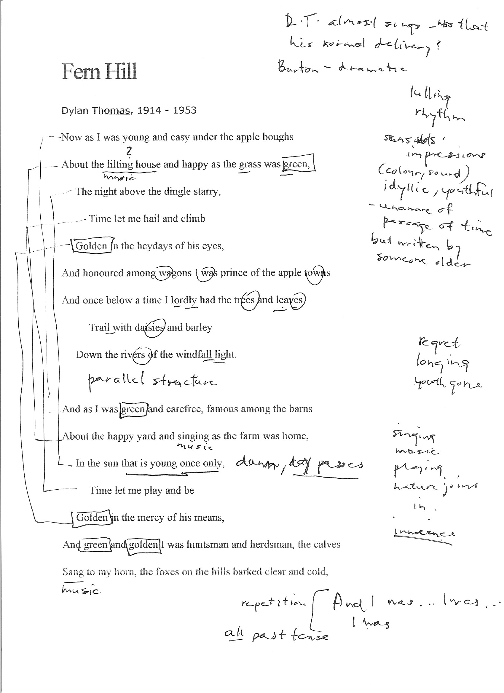
The mood of the poem seems wistful to me. Although the bulk of the text conjures up beautiful images of a blessed childhood, the way it is written in the past tense—"And I was... And as I was...I was...I was..."—leaves the clear sense that the time of youth is now gone. The piling up of sensory images, the use of colour and sound, made me feel a certain rose-coloured nostalgia. At the same time, there was a creeping awareness that although the subject has all summer to play, the poem was written by someone older who understands that childhood does not last forever ("In the sun that is young once only").

  • What poetic devices does Thomas use and what effect do they have on the poem?

Thomas makes little or no use of rhyme in this poem, but he makes powerful use of several other devices:

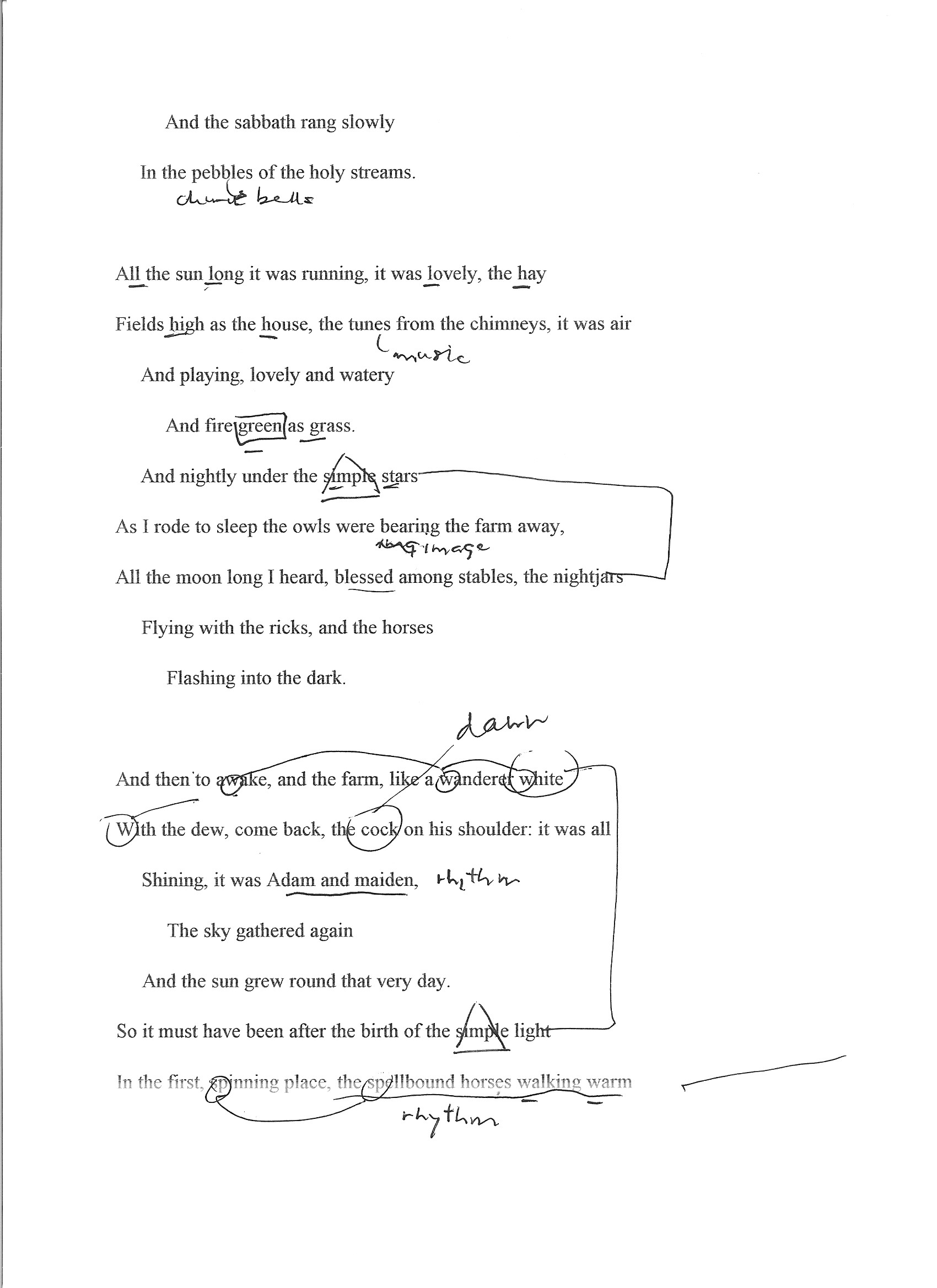
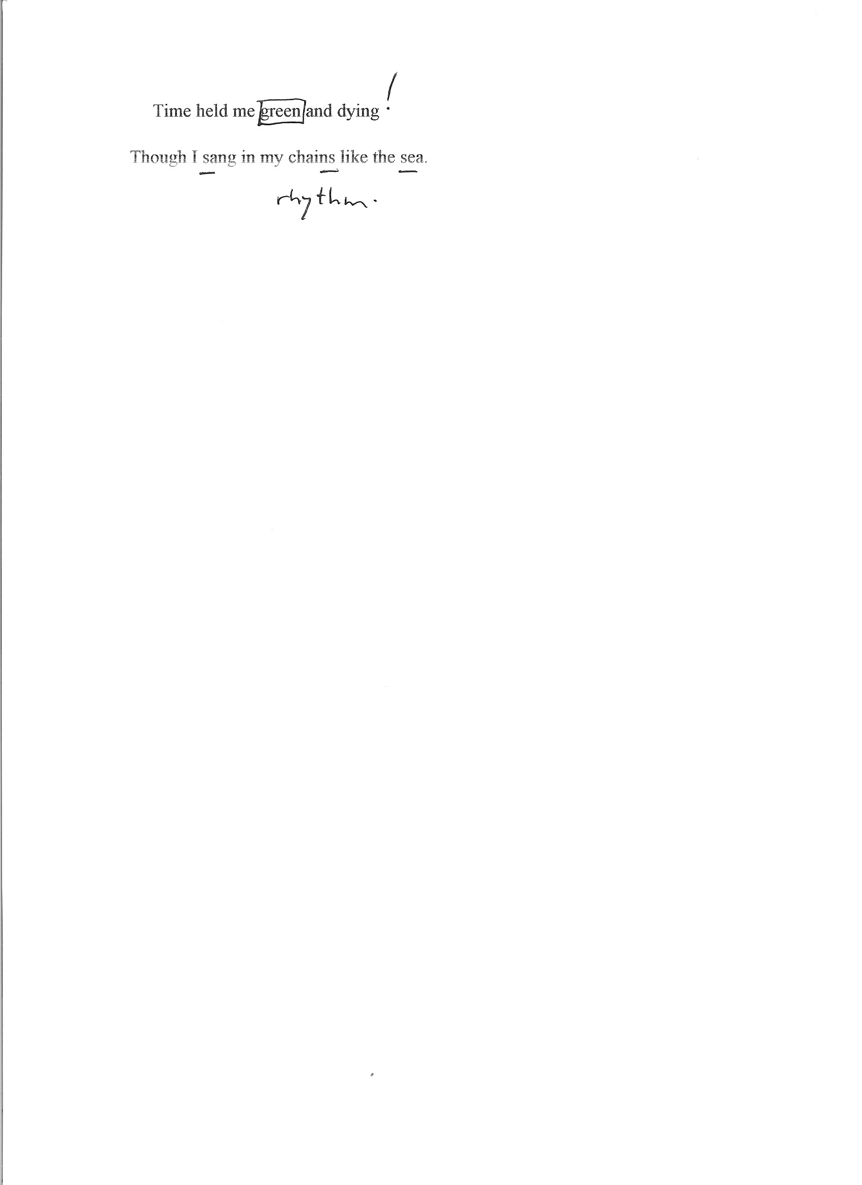
Rhythm — "the spellbound horses walking warm" — For much of the poem, the gentle rhythm carries the reader along like the boy enjoying the summer. The sharp break in rhythm in the last line is a rude awakening to the demands of time.

Repetition—"green," "golden," "And I was...I was..." — The use of repetition serves to heighten the effect of memory: particularly sharp impressions from the past that linger with us and trigger other memories.

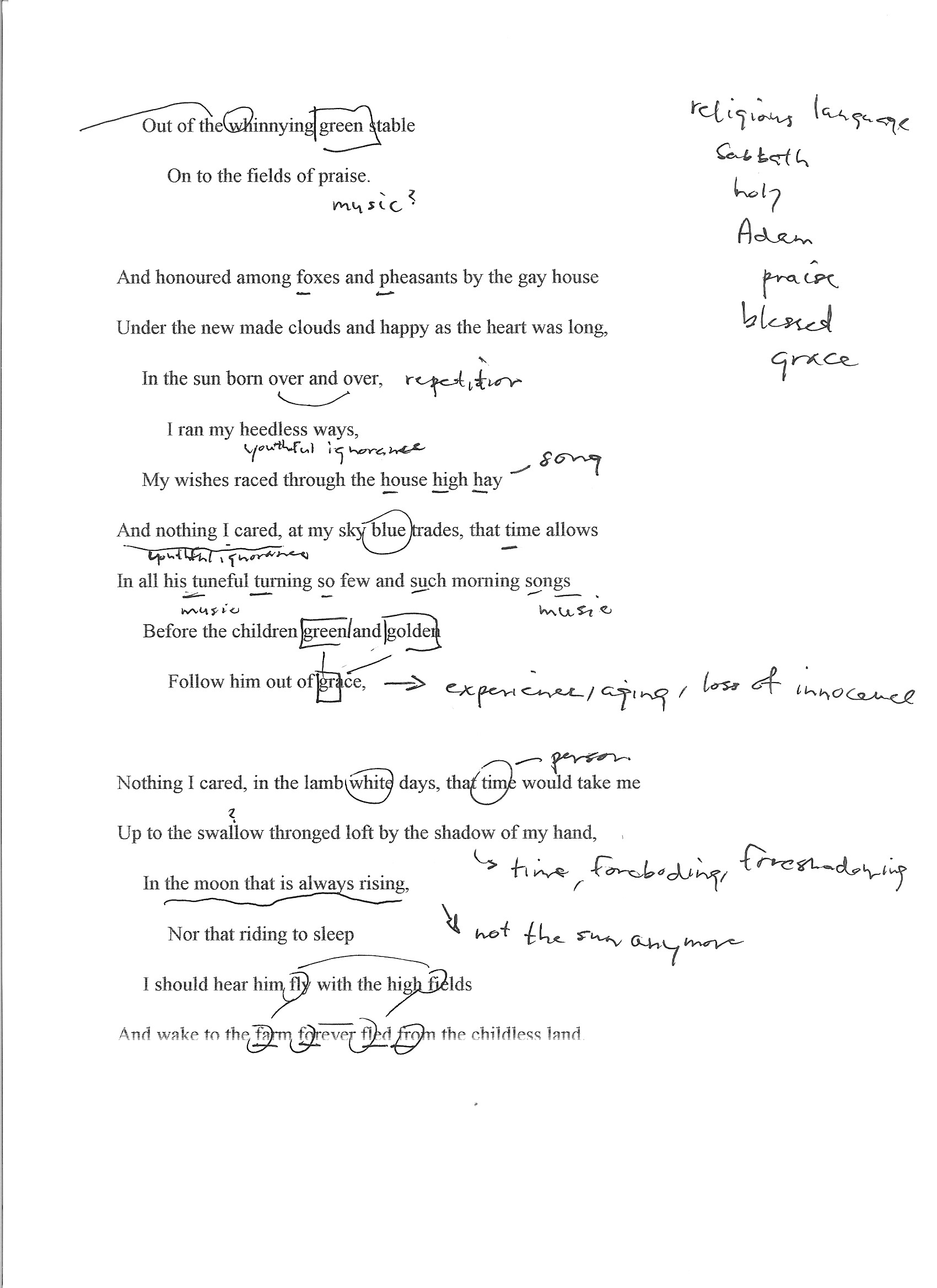
Alliteration — "And wake to the farm forever fled from the childless land," "My wishes raced through the house high hay" — The alliteration briefly speeds up the rhythm of the poem and help to make us think of play or breathless speed.

Assonance — "Trail with daisies and barley" — This line may have two examples of assonance: the long "a" linking "trail" with "daisies," and the long "e" sound shared by "daisies" and "barley." They act like a kind of internal rhyme in a single line and help to move the rhythm along.

Consonance — "Shining, it was Adam and maiden" — The repetition of the "m" and "d" sounds is pleasing and helps to make the text flow by, just as time is flowing by in a carefree way.

Onomatopoeia — "Out of the whinnying green stable" — This device helps us to hear the sound in a way that goes beyond mere description: it helps us to share the experience of the boy in the poem.

Personification — "Time let me play and be / Golden in the mercy of his means" and other examples — I think that this particular use of personification helps us to feel the poet's bitterness more fully: it can be hard enough to accept aging and death as an inevitable part of life, but it seems even worse to think that there might be an intelligent figure behind it.

Simile — "and the farm, like a wanderer white / With the dew..." — The simile compels us to use our imagination to make meaning. We are not reading a news report: we have to engage with the text in a more deliberate way, with a different kind of thinking and appropriation.

Metaphor — "I was prince of the apple towns" — The boy was not a prince, but we can remember what it is like to be a child and think that we might be for a moment.

  • How do the poetic devices help evoke the themes of time and place? Can you identify any other theme running through this poem?

Thomas evokes time (references to age, time of day, movement of the sun, seasons and other natural references, and use of verb tense) and place (descriptions of the farm and its natural surroundings) in fairly direct ways. Perhaps more important is the way he uses poetic devices to move beyond mundane descriptions and invite the reader to experience the time and place through the senses—the sights (frequent repetition of "green" and "golden"), sounds ("About the happy yard and singing as the farm was home"), and emotions ("About the lilting house and happy as the grass was green") of a blissful childhood.

Time and place are the backdrop where Thomas explores the universal themes of youth, its inevitable loss and mortality. At the beginning of the poem he can write that "Time let me hail and climb / Golden in the heydays of his eyes," but by its end he knows that "Time held me green and dying". The personification of Time and its possession of youth is powerful.

  • What is the poem is saying about time and place (and any other theme you’ve identified)?

The poem is saying that time and place are... for a time and place. The sun and moon, the seasons of nature continue their courses but the individual human does not. We may experience them for a spell and naively believe that we are like them, but we are not: Time masters us. Youth, though enjoyable, passes for us all.

  • What lines or images stay with you? What do they remind you of or how do they make you feel?

The repetition of "apples" coupled with "green" and "golden" have stayed with me—they do an excellent job of conjuring up the sense of mid- or late summer. It's not hard to imagine being a boy again, playing in the warm sun on a holiday that goes on forever. It's very appealing.

  • What’s the rhythm like? Is it choppy or is it flowing and smooth? How does the rhythm impact on the poem?

The poem has a lulling rhythm, peaceful and unhurried. At times, it seems almost playful as in the line "My wishes raced through the house high hay," which sounds like it could be a child's song or the kind of wordplay that a child would enjoy. The rhythmic pattern supports well the idyllic imagery that the poet builds into a portrait of a carefree youth. The very last line of the poem shatters the reverie with a new rhythm that falls like a series of blows: "Though I sang in my chains like the sea." Childhood is over.

  • Is the ‘speaker’ important? What are his views? Are they apparent or inferred?

By inference, the speaker is a young boy ("I was prince of the apple towns") raised in the countryside. We never learn his identity, but this is ultimately not very important: the poem addresses universal themes of innocence and its loss, life and death. His views become quite apparent but the reader learns them through accumulated inferences. Thomas could have said plainly, "I had no idea that childhood and its pleasures come to an end, but they did and it is a shock to face mortality." Instead, he draws the reader through an experience of youth that seems never-ending and makes them feel the loss of its passing away.

  • Are there any lines you don’t get? Can you hazard a guess as to what they mean or allude to?

No, there were not. I had to read some of the lines out loud more than once to make sure I had the right rhythm, and found that helped me to understand the phrasing. I had to check the meanings of a couple of words ("dingle," "nightjars") but I did not find the poem difficult.

Project 3, Exercise 2: poetic devices

Rhyme — Words that sound alike, usually at line endings

The Day is done and the darkness
Falls from the wings of Night
As a feather is wafted downward
From an eagle in his flight.
"The Day is Done," Henry Wadsworth Longfellow

Rhythm — A metered structure of syllables, consonants, breathing, or pauses

'Twas the night before Christmas, when all through the house
Not a creature was stirring, not even a mouse;
"A Visit from St. Nicholas," by Clement Clarke Moore

Repetition — Intentional repetition for reinforcement and effect

Because I do not hope to turn again
Because I do not hope
Because I do not hope to turn
"Ash Wednesday," by T.S. Eliot

Alliteration — Two or more words in a line of poetry that begin with the same initial sound

The fair breeze blew, the white foam flew,
The furrow followed free;
We were the first that ever burst
Into that silent sea.
"The Rime of the Ancient Mariner," by Samuel Taylor Coleridge

Assonance — Repeating vowel sounds without repeating consonants. In poetry, often used as an alternative to rhyme

He gives his harness bells a shake
To ask if there is some mistake.
The only other sound’s the sweep
Of easy wind and downy flake.   
The woods are lovely, dark and deep,
But I have promises to keep,
And miles to go before I sleep,
And miles to go before I sleep.
"Stopping by Woods on a Snowy Evening," by Robert Frost

Consonance — Repeating consonants without repeating vowels. Consonance gives melody to verse

’Twas later when the summer went
Than when the Cricket came—
And yet we knew that gentle Clock
Meant nought but Going Home—
’Twas sooner when the Cricket went
Than when the Winter came
Yet that pathetic Pendulum
Keeps esoteric Time.
"'Twas Later When the Summer Went," by Emily Dickinson

Onomatopoeia — A word that imitates the sound made by the thing being described

It’s a jazz affair, drum crashes and cornet razzes.
The trombone pony neighs and the tuba jackass snorts.
The banjo tickles and titters too awful.
The chippies talk about the funnies in the papers.
"Honky Tonk in Cleveland, Ohio," by Carl Sandburg

Personification — Ascribing human qualities to an object

Loveliest of trees, the cherry now
Is hung with bloom along the bough,
And stands about the woodland ride
Wearing white for Eastertide.
"Loveliest of Trees," by A.H. Houseman

Simile — A figure of speech in which an image is evoked by likening one thing to another

What happens to a dream deferred?

Does it dry up
like a raisin in the sun?
Or fester like a sore—
And then run?
Does it stink like rotten meat?
Or crust and sugar over—
like a syrupy sweet?
"What Happens to a Dream Deferred?" by Langston Hughes

Metaphor — To describe something by giving it the identity of something else

I walk into a room
Just as cool as you please,
And to a man,
The fellows stand or
Fall down on their knees.
Then they swarm around me,
A hive of honey bees.

"Phenomenal Woman," by Maya Angelou

Imagery — Use of devices such as simile and metaphor to create images in the reader’s mind

His body was tubular
And tapered
And smoke-blue,
And as he passed the wharf
He turned,
And snapped at a flat-fish
That was dead and floating.
And I saw the flash of a white throat,
And a double row of white teeth,
And eyes of metallic grey,
Hard and narrow and slit.
Then out of the harbour,
With that three-cornered fin
Shearing without a bubble the water
Lithely,
Leisurely,
He swam—That strange fish,
Tubular, tapered, smoke-blue,
Part vulture, part wolf,
Part neither—for his blood was cold.
"The Shark," by Edwin John Pratt


Project 3, Exercise 1: poetry and theme

Poetry and theme

The quick answers to the three questions are easy enough. Which poem...

  • Speaks about place in relation to identity and exile? (c. The Lost Land by Eavan Boland)
  • Purely evokes a sense of place? (a. The Herefordshire Landscape by Elizabeth Barrett Browning)
  • Makes a social comment about progress and place? (b. Slough by John Betjeman)

Some rough notes on the three poems

The Herefordshire Landscape

  • heavy use of senses to give a sense of place: sight, touch and smell
  • no particular rhyme scheme, but a regular rhythm and metre
  • a romantic and picturesque presentation that evokes a mood, perhaps a nostalgia

Slough

  • simple, repetitive rhyme scheme
  • a bit childish and nasty?
  • alienation drives this
  • use of technique of anaphora ("tinned...tinned...tinned") to drive home disgust with modern, metal, manufactured
  • all the pre-packaged items are produce which, along with the cow, are absent from Slough which no longer supports agriculture or anything natural (not even grass for grazing)
  • the call to "friendly bombs" is an unexpected inversion and suggests the degree to which the poet has been pushed, as does the invocation of Death as a character

The Lost Land

  • the narrator seems to be at some distance from land already
  • who are "they"? family? friends? neighbours?
  • the fact that the narrator doesn't know what "they" saw suggests that he did not ask or did not have the chance to = separation
  • "at the landward rail" suggests longing and unwillingness to turn away
  • "last sight of a hand" -- searching for a human connection that will soon be lost
  • "the underworld side" -- not the landward side; crossing the Styx? a voyage to a kind of death? (relationships, family, belonging, identity?)
  • "Ireland. Absence. Daughter." -- all that leaving place represents

Project 2, Exercise 2: archetypes

Archetypes

The word archetype, "original pattern from which copies are made", first entered into English usage in the 1540s[1] and derives from the Latin noun archetypum, latinisation of the Greek noun ἀρχέτυπον (archetupon), whose adjective form is ἀρχέτυπος (archetupos), which means "first-molded",[2] which is a compound of ἀρχή archē, "beginning, origin",[3] and τύπος tupos, which can mean, amongst other things, "pattern," "model," or "type."[4]

Usage of archetypes in specific pieces of writing is a holistic approach, which can help the writing win universal acceptance. This is because readers can relate to and identify with the characters and situation, both socially and culturally. By deploying common archetypes contextually, a writer aims to impart realism[5] to his work. According to many literary critics, archetypes have a standard and recurring depiction in a particular human culture and/or the whole human race that ultimately lays concrete pillars and can shape the whole structure in a literary work.

[material downloaded from Wikipedia article "Archetype," 15 October 2016]


Character archetypes, their roles in a narrative and examples:

  • the hero: is generally virtuous, admirable and has the power to save or put things to right (example: Odysseus; Hercules)
  • the anti-hero: is not the antagonist to the hero, sharing many of the hero's characteristics but with flaws (example: characters played by Clint Eastwood in virtually every one of his roles; the title character in the book/movie Shane)
  • the artist: imagines, dreams and creates things that do not exist (example: the classical figure Achilles and a very long list thereafter)
  • the Christ figure: is a hero who suffers for heroism, sometimes to the point of offering/sacrificing his/her life for the person rescued (example:  most obviously the character Aslan in The Lion, the Witch and the Wardrobe, but also Simon in The Lord of the Flies, Neo in The Matrix Trilogy, Dr. Who, others)
  • the trickster / joker: a useful character who can change the direction of the plot by introducing the unexpected or capricious (example: Loki in Norse mythology)
  • the fool: takes shelter behind humour and/or simple-mindedness to speak truth in situations when no one else would dare (example: Fool in King Lear)
  • the sage: a figure who can be consulted to provide insight or wisdom not possessed to others (example: Gandalf in The Lord of the Rings)
  • the king / the queen: the figure who holds ultimate power or authority, for good or for ill (example: Neptune in mythology; Mufasa in The Lion King; the Queen of Hearts in Alice in Wonderland)
  • the villain: usually the antagonist, helps drive the plot by opposing the hero or by making it necessary for a hero to arise (example: see any Bond movie... Goldfinger, Hugo Drax, Le Chiffre, Rosa Klebb, Scaramanga, Dr. No...)
  • the maiden: represents virtue, youth and/or innocence that usually need to be protected (example: Athena, Rapunzel, Snow White)
  • the crone / witch: an older woman who has some kind of power, whether of knowledge/experience or magic; could be good or evil, depending upon the story (example: the witches in The Wizard of Oz)
  • the hunter: one who pursues and thereby helps to drive the narrative (example: Diana / Artemis of Greco-Roman mythology)
  • the patriarch: the father-figure, with all the potential for love, protection, wisdom or control that that might entail (example: Zeus in mythology; Atticus Finch in To Kill a Mockingbird)
  • the matriarch: the mother-figure, with all the potential for love, protection, wisdom or control that that might entail (example: Hera of mythology)
  • the teacher / mentor: one who guides and imparts knowledge, wisdom or know-how that enables the hero or others in the narrative (example: Yoda in Star Wars)
  • the rich man / woman: has the power to reward, inspire envy and/or demonstrate the advantages and dangers of wealth and privilege (example: Croesus in Greek history / mythology)
  • the mastermind / architect: one who plans and builds and/or has practical wisdom that can be applied to problems (example: Sherlock Holmes)
  • the rebel: one who bucks the established order, whether for good or for ill (example: Arnold Schwarzenegger as The Terminator; Guy Montag in Fahrenheit 451)

  • the traitor: a disguised antagonist who undermines the hero or others (example: Fredo Corleone in The Godfather, Part II; Peter Pettigrew in Harry Potter and the Prisoner of Azkaban)

  • the beauty: one whose attractive appearance can mirror inward virtue or demonstrate the deceptive nature of outward form (example: Helen of Troy; Sleeping Beauty)
  • the orphan: the child alone in the world, vulnerable without love or resources (example: Dickens' character, Oliver Twist)
  • the coward: in contrast to the hero, demonstrates the less-admirable side of being human (example: the Cowardly Lion in The Wizard of Oz; Count Rugen in The Princess Bride; Ichabod Crane in The Legend of Sleepy Hollow)
  • the innocent / ingenue: sometimes a demonstration of vulnerability that must be protected, but can also be a warning about the dangers of failing to learn and mature (example: Tiny Tim in A Christmas Carol; Ophelia in Hamlet)


Archetype versus stereotype

The tidiest description I found of the difference between the two "types" runs as follows: "Although both archetype and stereotype draw from a "type" of person to create character, the difference is that the archetype will use the template as a starting place, and the stereotype uses it as the end point." ["Archetype versus Sterotype," consulted online 15 October 2016]

Following this line of thinking, the archetype draws upon shared cultural or mythical knowledge that the reader already has to help move character and plot development along. There should be a sense of recognition about the function of the character in the story but that function could play out in many different ways -- or may even play against type. To be a true stereotype, however, the character can never be anything but a stock set of exaggerated and fixed attributes that will also spark recognition but will not allow for exploration, novelty or growth.

Research point: postmodernism

I bought and read Christopher Butler's Postmodernism: A very short introduction (Oxford: Oxford Paperbacks, 2002) and found it a very helpful overview of the shape and impact of postmodernist thought. I was familiar with much of the content from earlier studies in theology and literature, but the material on the arts was newer to me. I appreciated the fact that Butler didn't content himself with just describing the contours of postmodernism but also offered some reflection and criticism.

It seems to me that postmodernist thought has been of real benefit in identifying power relationships in various discourses and in questioning totalizing metanarratives. But then it runs into difficulty. As Butler points out a number of times, postmodernism's hermeneutic of suspicion is an effective tool of deconstruction but it makes any constructive effort difficult, if not impossible.

Where do we go as a society after postmodernism? Do we simply opt for power politics? Do we shut our eyes and fall back on an uncritical romanticism? Both? Neither?

And where does this leave the arts? Do they have anything new and constructive to say or should artists content themselves with exposing and questioning? How long can irony and detachment be satisfying?

51tI+JrlbML._SX315_BO1,204,203,200_.jpg

Project 2, Exercise 1: The Hero's Journey

A. Mapping the Stages of the Hero's Journey

For this exercise I've chosen to apply Vogler's grid of the stages of the hero's journey to the Norman Jewison 1987 film Moonstruck. Written by playwright John Patrick Shanley, the movie straddles several genres -- romance, comedy and drama -- and I thought it would be interesting to analyse the film through the lens of a heroic quest, since that is almost certainly not the way it would normally be viewed.

Act I (Beginning = the hero’s decision to act)

1. Ordinary World — Loretta Castorini is a widow working in her family's store and engaged to Johnny Cammerari. Her life is predictable and lackluster. Johnny tells Loretta he must visit his dying mother in Sicily; while he is gone he wants Loretta to invite his estranged brother Ronny to their wedding.

2. Call to Adventure — Loretta meets Ronny and is caught up in his passion. Ronny tells Loretta that he loves her.

3. Refusal of the Call — Loretta rejects Ronny's declaration of love by slapping him and telling him to "Snap out of it!"

4. Meeting with the Mentor — Ronny agrees to leave Loretta alone if she will come with him to the opera, his other love.

5. Crossing the First Threshold — Loretta agrees to see Ronny again and attend the opera with him.

Act II (Middle = the action)

6. Tests, Allies, Enemies — Loretta feels guilt for her relationship with Ronny behind Johnny's back, so she goes to confession. She meets her mother there, who tells Loretta that he father is also having an affair.

7. Approach to the Inmost Cave — Loretta and Ronny go to a production of Puccini's La bohème at New York's Lincoln Center. Loretta is deeply moved by the love story.

8. Ordeal — During intermission at the opera, Loretta bumps into her father and realizes her mother is correct: her father is having an affair. Both Loretta and her father are exposed. Nevertheless, Loretta spends the night with Ronny at his place after the opera.

9. Reward — Loretta leaves Ronny's early in the morning and realizes that she has found love.

Act III (End = the consequences of action)

10. The Road Back — The family gathers in the kitchen of the Castorini household, where Loretta's and her father's secrets come to light.

11. Resurrection — Johnny Cammerari's mother has made a miraculous recovery from her deathbed (a resurrection!) and Johnny, superstitiously fearing that his mother might have a relapse, ends his engagement with Loretta.

12. Return with the Elixir — Now that Loretta has been released, Ronny proposes to her in front of the family and she accepts. Loretta has found love, the family is reunited and its traditions continue (as seen in the closing shots of framed portraits of the Castorini ancestors).


B. Using the Hero's Journey as a Template

Refuge

Act I (Beginning = the hero’s decision to act)

1. Ordinary World — orphaned teen in an African refugee camp

2. Call to Adventure — hero witnesses a young man being beaten by a gang in the camp

3. Refusal of the Call — won’t speak up for fear of reprisal and is afraid to leave the camp

4. Meeting with the Mentor — meets an older teen in the camp who tells him that orphans are being sold as child soldiers

5. Crossing the First Threshold — the two decide to flee the camp but the mentor is captured and the hero escapes alone at night as the slavers pursue

Act II (Middle = the action)

6. Tests, Allies, Enemies — others are callous or take advantage of him as he continues his flight, hungry and penniless

7. Approach to the Inmost Cave — the hero learns where the slavers camp is and seeks out the place

8. Ordeal — the hero is discovered and is wounded as escapes with stolen papers

9. Reward — the hero is able to identify those leading the slave trade

Act III (End = the consequences of action)

10. The Road Back — threats are made against the hero's life and efforts made to discredit him, but he produces the evidence of the slavers’ identities

11. Resurrection — the child soldiers are released, including the mentor

12. Return with the Elixir — the two are taken to safety, where they are able to draw more attention to the plight of children orphaned by war